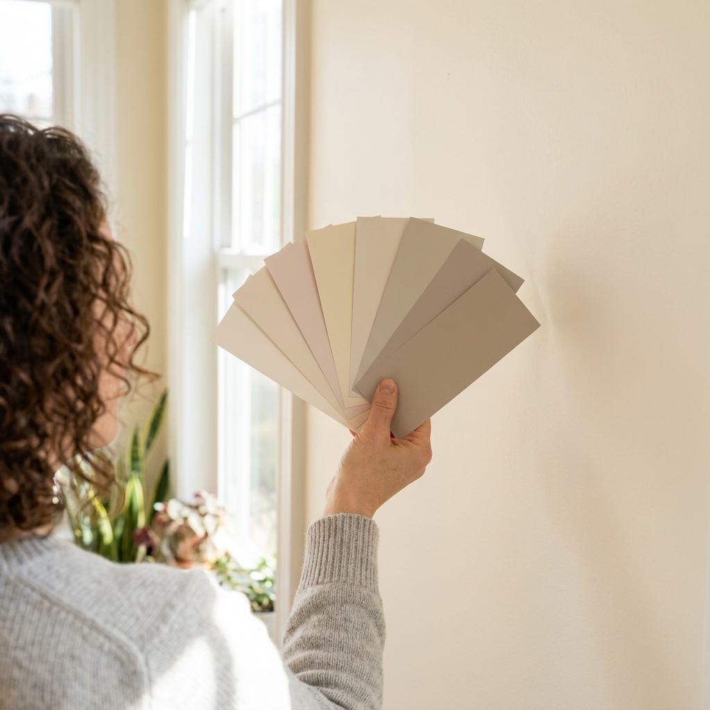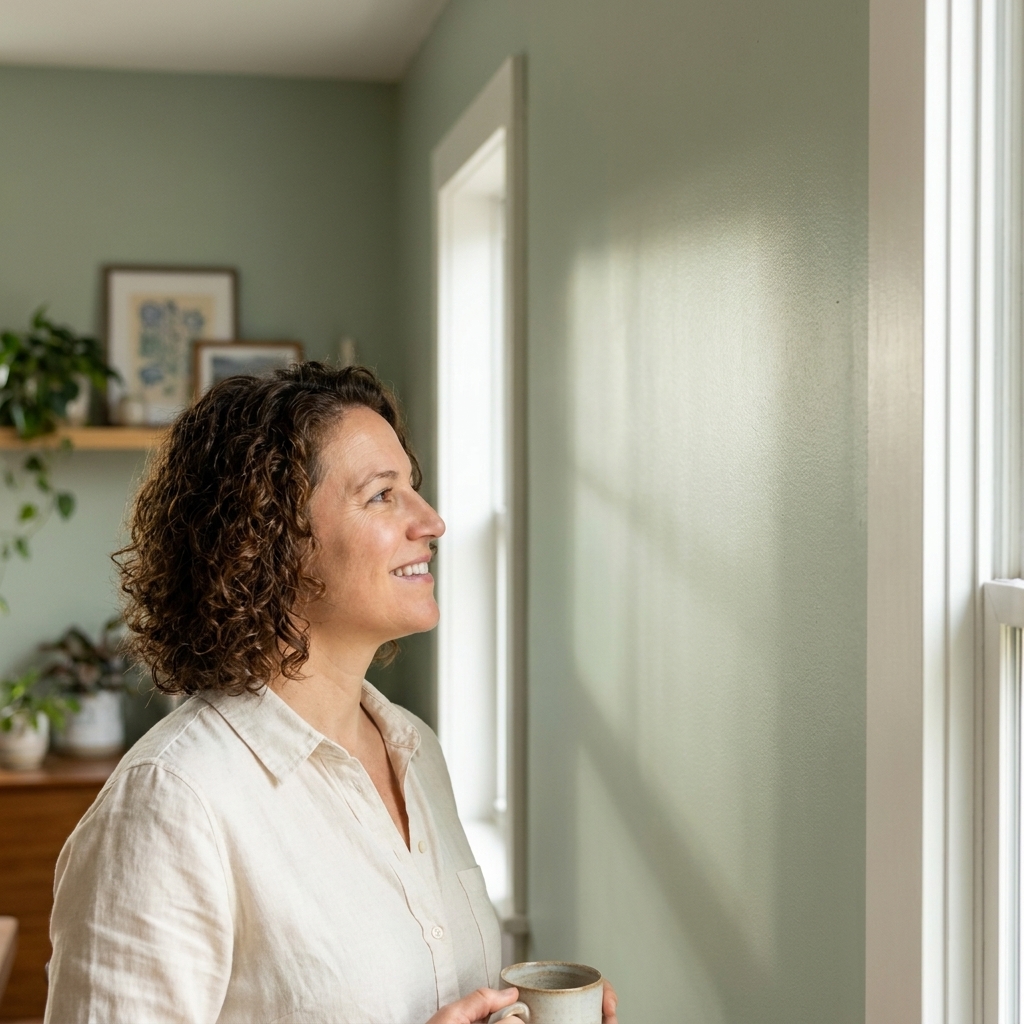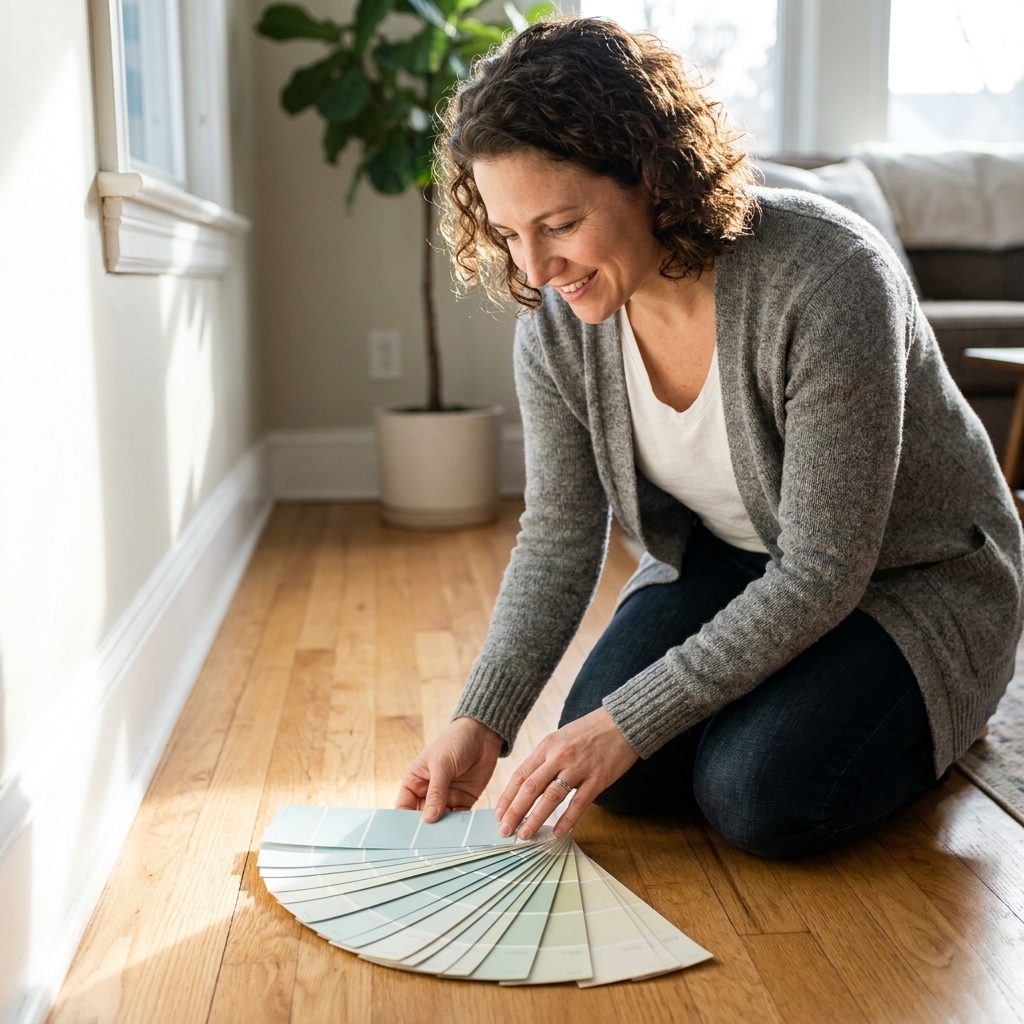
Your bedroom walls are one of the biggest drivers of the room’s mood. When the color is too sharp, too bright, or just a little bit off under your nightstand lamps, your whole space can feel busy even when it is tidy. If you want a more restful feel at bedtime, aim for a color that stays soft in the morning light, looks steady at sunset, and does not turn unexpectedly loud under warm bulbs.
Below are 10 calming paint color families that tend to read as relaxing in many homes, plus the undertones and finishes that help them look smooth and quiet.
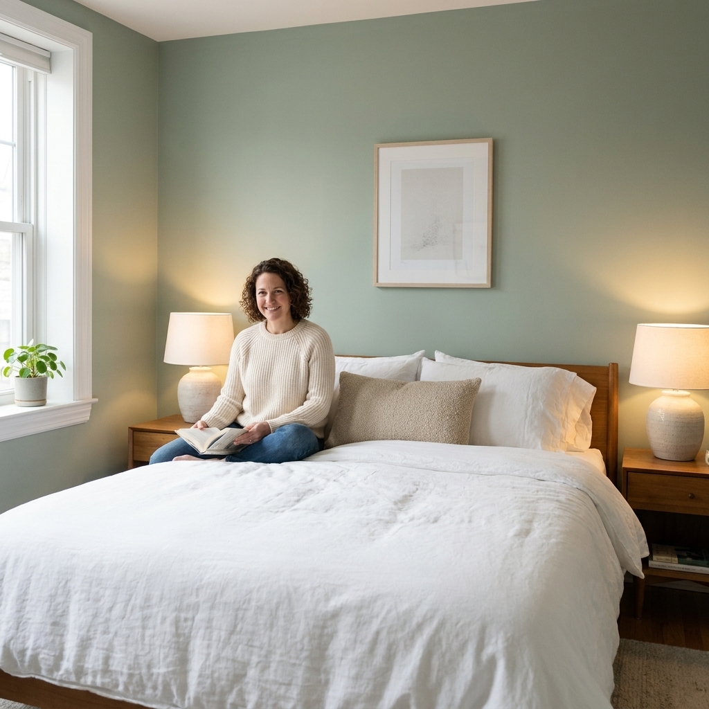
What feels calming at night
I love a dramatic color as much as the next DIYer, but if your number one goal is a calmer room at night, there are a few reliable rules that work in most homes.
- Keep saturation low. Muted colors with a touch of gray or brown feel quieter than clear, candy-bright versions.
- Watch undertones under warm light. Many bedrooms lean warm at night, and warmer bulbs can pull yellow, pink, or green undertones forward.
- Choose a low-sheen finish. Lower sheen usually means less glare and sparkle, although overall brightness also depends on the color itself.
- Make contrast gentle. High contrast, like bright white trim against a strong wall color, can feel crisp instead of restful. Softer whites help.
- Consider window direction. Light can shift depending on region, trees, nearby buildings, and your glazing. In general, north light can make colors feel cooler and flatter, south light can warm them up, east light is often brightest earlier in the day, and west light can turn golden later on.
- Think about lightness. Mid-range, muted colors often feel calmer than very bright whites (which can feel lively) or very dark tones (which can feel dramatic), unless you are intentionally going for a cocooning look.
10 calming bedroom colors
Instead of chasing a single perfect shade, pick a family and then fine-tune the exact paint chip based on your flooring, bedding, and the direction your room faces. Each option below includes what it does best and what to pair it with.
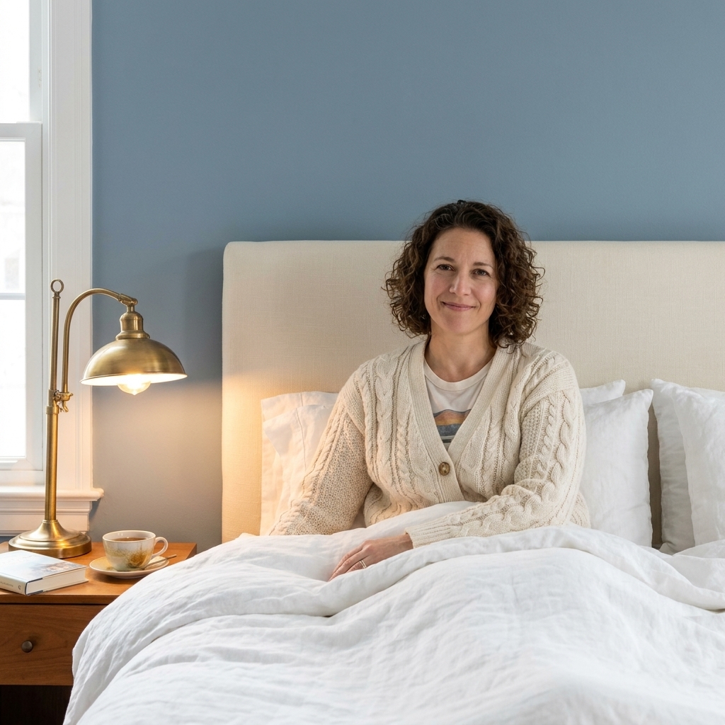
1) Dusty blue
Dusty blue is a classic sleep-friendly shade because it reads cool, steady, and quiet, especially with warm lamp light. Look for a blue that is grayed out rather than nautical or saturated.
- Best for: Rooms that get lots of afternoon sun or feel visually hot.
- Undertone tip: If your room has warm wood floors, a slightly gray-blue helps keep it from going baby-blue.
- Pairs well with: Creamy whites, light oak, brass, and oatmeal linens.
2) Blue gray
If you love the idea of blue but want it even more subdued, blue gray is your friend. It feels tailored and grown-up, and it tends to be forgiving with mixed lighting.
- Best for: Bedrooms with cool daylight or LED lighting that makes colors look harsher.
- Undertone tip: Test at night. Some blue grays can lean slightly green under warmer bulbs.
- Pairs well with: White trim that is not too bright, charcoal accents, and soft wood tones.
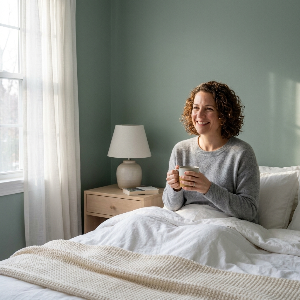
3) Misty green
Misty green is calming in a spa way. Think eucalyptus, not lime. In a primary bedroom, a muted green can feel grounding without getting heavy.
- Best for: High-energy spaces that need a quieter, exhale feeling.
- Undertone tip: If your carpet or bedding has warm beige in it, choose a green with a tiny bit of gray to prevent it from looking minty.
- Pairs well with: Warm whites, natural linen, rattan, and light walnut.
4) Gray sage
Sage is popular, but the most sleep-friendly sages are the ones that are slightly smokier and less yellow. A gray-leaning sage stays calm from day to night.
- Best for: Bedrooms with lots of plants, textured bedding, or a cozy layered look.
- Undertone tip: If the paint chip looks cheerful next to pure white paper, it may be too bright for a sleep-first room. Go a little muddier.
- Pairs well with: Soft black accents, ivory textiles, and aged brass.
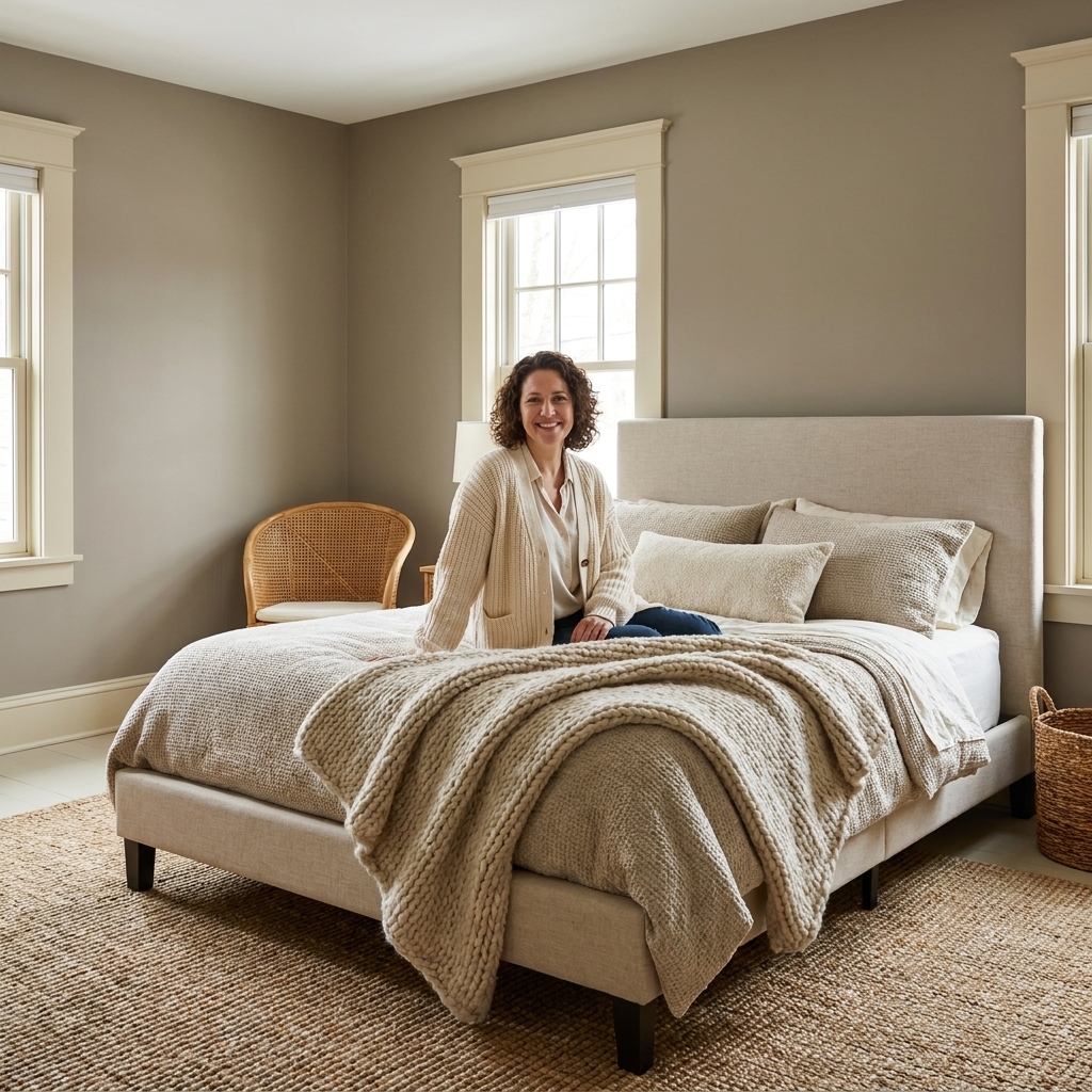
5) Warm greige
Greige is the workhorse of calming bedrooms: part gray, part beige, and usually very easy to live with. The key is choosing a warm greige that does not go pink or peach under lamplight.
- Best for: Open-concept homes where the bedroom needs to connect to warmer hallways or adjoining spaces.
- Undertone tip: Compare two greiges side by side. One may suddenly look lilac or rosy. Skip that one for a bedroom.
- Pairs well with: Cream trim, warm oak, and taupe or sand bedding.
6) Soft taupe
Taupe can be incredibly soothing because it sits in that quiet middle zone. It is warmer than gray but still muted, which makes the room feel settled and cozy.
- Best for: North-facing bedrooms that need warmth without turning yellow.
- Undertone tip: Taupe shifts a lot. Test it next to your bedding and at night under your actual bulbs.
- Pairs well with: Off-white trim, walnut furniture, and soft black frames.
7) Lavender gray
Before you picture a kid’s room, hear me out. Lavender gray is not purple. It is a barely-there whisper that can look like a soft neutral until evening, when it turns dreamy and hushed.
- Best for: Bedrooms with lots of warm lighting where beige feels too expected.
- Undertone tip: Keep it gray-dominant. If the chip reads obviously purple, it will feel more energizing.
- Pairs well with: Crisp white bedding, brushed nickel, and pale woods.
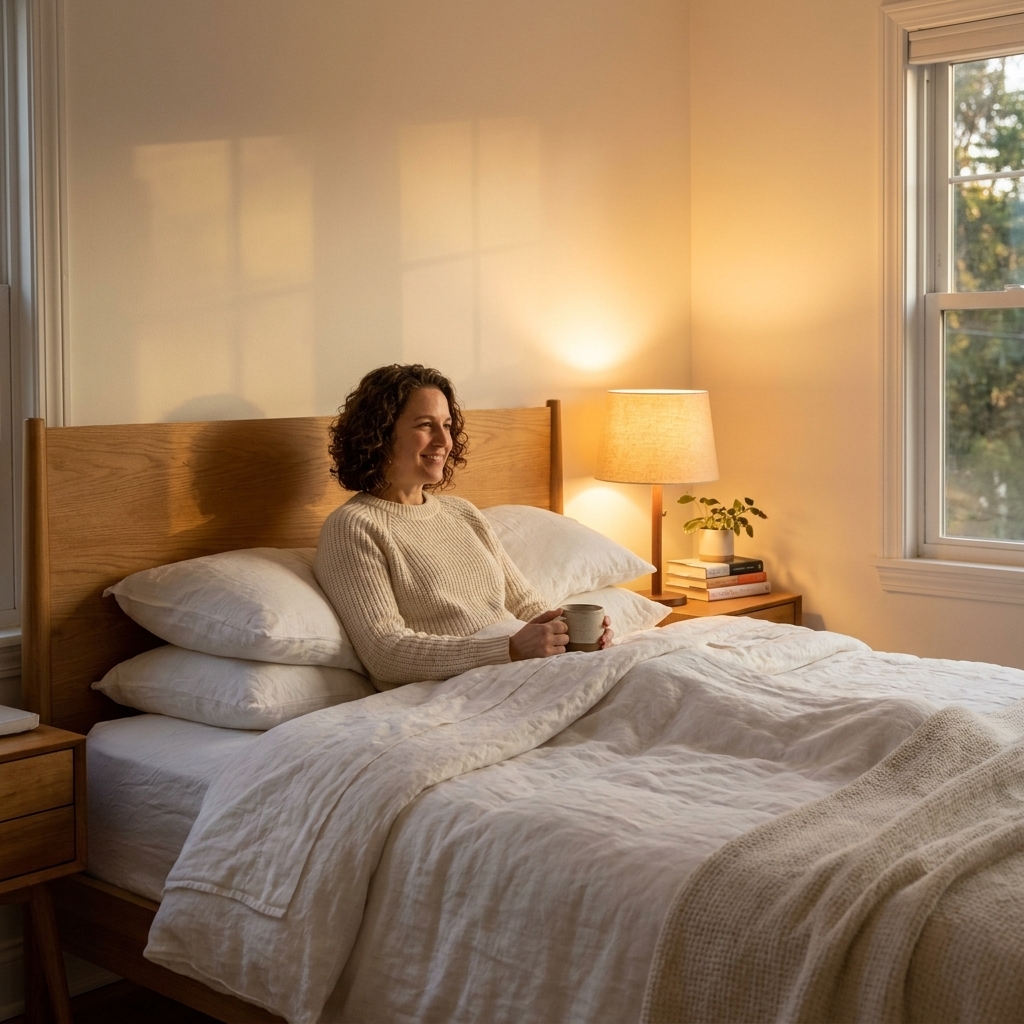
8) Warm white
A warm, gentle white can be wonderfully calming, especially if you want your bedroom to feel airy and minimal. The trick is avoiding bright, icy whites that bounce light and feel clinical at night.
- Best for: Small bedrooms, low ceilings, or spaces with a lot of dark furniture.
- Undertone tip: Look for a white with a soft cream or beige base, not a sharp blue base.
- Pairs well with: Any wood tone, tonal textiles, and soft contrast art.
9) Mushroom beige
Mushroom is that earthy, modern neutral that feels grounding and easy to live with. It is beige with a gray-brown cast that reads calm and sophisticated, especially with textured bedding and natural materials.
- Best for: Bedrooms with medium to low natural light where cool grays can look flat.
- Undertone tip: If your room has lots of greenery outside, mushroom can help balance the extra green reflection coming through the windows.
- Pairs well with: Ivory, camel leather, linen curtains, and warm metals.
10) Warm charcoal
Yes, dark can be calming. A softened charcoal, one that has a touch of brown or warmth, can make a primary bedroom feel cocoon-like. The key is choosing a shade that looks rich, not inky blue-black.
- Best for: Large bedrooms, rooms with good lamps, or anyone who sleeps better in a darker-feeling space.
- Undertone tip: Avoid charcoals that go navy at night unless you truly want a moody blue vibe.
- Pairs well with: Warm white bedding, natural wood, and layered lighting.
- Planning note: Dark walls often need extra coats, and sometimes a primer, for an even finish. If you go dark, plan on dimmers or at least two warm light sources so the room stays cozy, not cave-like.
Best finish for bedrooms
If you have ever painted a bedroom in eggshell and then wondered why every little wall ripple caught the lamp light, you already get why finish matters. For most bedrooms, I recommend:
- Matte: My top pick for a calming look. In most paint lines, it hides minor wall flaws and reduces nighttime glare.
- Flat: Even softer than matte, but it can mark more easily depending on the product. Great for adult bedrooms that do not get a lot of scuffs.
- Eggshell: A good compromise if you want a little extra wipe-ability, especially in homes with kids or pets that brush the walls.
Ceilings typically look best in flat. Trim is its own category and usually does well in satin or semi-gloss, but if you want the room to feel extra serene, choose a softer white on the trim rather than a bright, high-contrast one. As a quick rule, try to keep undertones in the same family: warm wall colors tend to look best with warm or creamy whites, while cooler wall colors usually pair better with neutral or slightly cooler whites.
How to test colors
The paint chip you love under store fluorescents can turn into a completely different personality at 10 p.m. in your bedroom. Here is the low-drama way to test.
- Test at least two close shades. In many cases, one will feel more relaxed once it is on the wall.
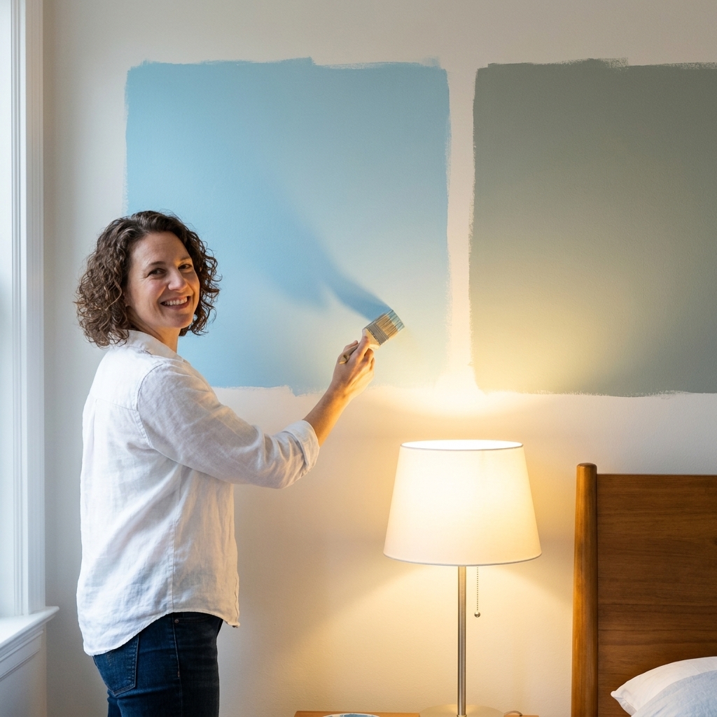
- Paint large samples. Aim for at least 2 feet by 2 feet, or use big peel-and-stick samples.
- Move the sample around. Put one near the window and one near where your lamps hit the wall.
- Check it in three moments: morning daylight, late afternoon, and full nighttime lighting with your actual bulbs.
- View it next to your bedding. Your duvet color can shift undertones more than you would think.
Quick pairing tips
- Choose softer whites. Instead of a bright, icy white, try a creamy white for trim, ceiling, and doors so the room feels less contrasty.
- Match undertones. If your wall color leans warm, keep your whites warm. If your wall color leans cool, avoid creamy trim that turns it muddy.
- Keep sheen consistent. Mixing higher-sheen walls with matte ceilings can create a little sparkle at night. Matte walls and flat ceilings feel smoother.
- Layer warm lighting. Two bedside lamps plus a dimmable overhead light makes almost any calming color look better.
- Limit bold accent colors. If you love color, keep it to textiles and art so the walls stay restful.
FAQ
Are blue bedrooms better for sleep?
Blue is often perceived as calming, but the real win is choosing a muted blue with controlled undertones. A bright, saturated blue can feel lively. A dusty blue or blue gray usually reads quieter, especially at night.
Should a bedroom be light or dark?
Either can work. Light colors tend to feel airy and open. Darker, softened tones can feel cocooning and help the room feel visually darker at bedtime. Your lighting plan often matters more than the paint depth.
What if my calming color looks different at night?
That shift is most often undertone plus bulb temperature, but nearby colors and materials matter too. Bedding, rugs, wood tones, and even daylight spill from a hall can all change what your walls look like after sunset. Try warmer bulbs around 2700K, or go warmer at 2200K for a candlelit feel. If you prefer a slightly clearer warm light, 3000K can also work. Then re-check your samples next to your textiles. If the color still shifts too much, move one step more muted and more neutral on the paint strip.
My shortlist method
If you are standing in the paint aisle feeling stuck, here is my go-to filter: pick one muted color family you love (dusty blue, misty green, warm greige), then select the two calmest chips on that strip. Take them home, sample them big, and only decide after you have seen them under your bedside lamps. Your future well-rested self will thank you.