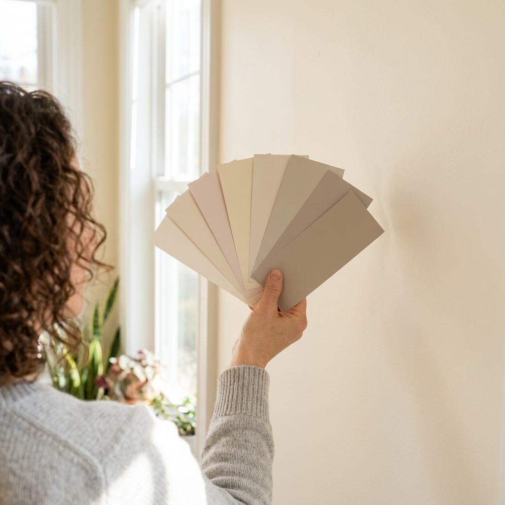
If your floors are staying put, they’re the biggest “color sample” in your house. I have watched plenty of friends fall in love with a wall color on a tiny swatch, paint the whole room, and then realize the floor makes it look oddly pink, sickly green, or just… off. The fix isn’t magic; it’s undertones. Once you learn to read the warm, cool, or neutral bias in your hardwood or tile, wall color choices get a lot less stressful.
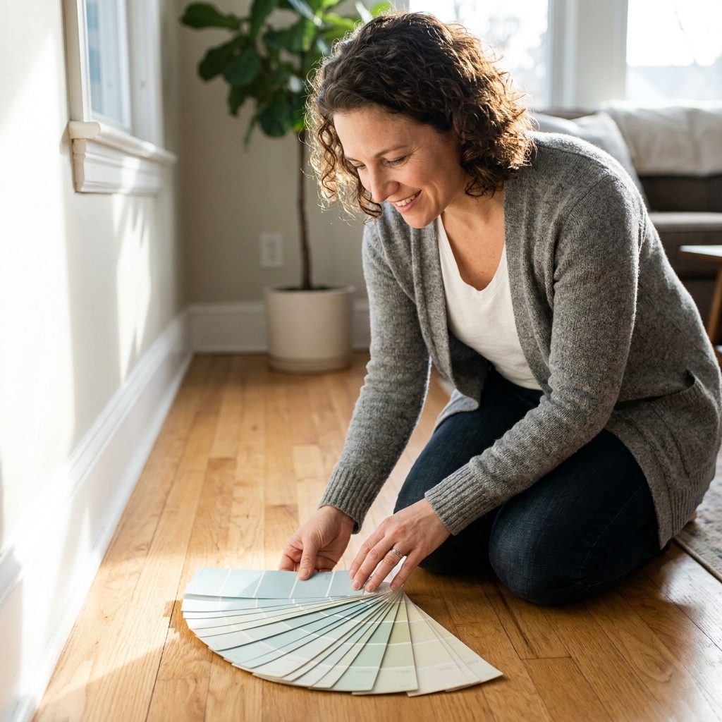
This guide walks you through a simple undertone check, then gives you reliable pairings for common hardwood and tile looks, including what to do when your floor has mixed tones or strong variation.
Start with undertones
Most paint advice starts with “light floors go with X, dark floors go with Y.” That is only half the story. A light floor can be warm (honey oak), cool (gray-washed), or neutral (paler natural oak), and each one behaves totally differently next to the same wall color.
Undertone basics
- Warm undertones read as yellow, orange, red, or pink. Think honey oak, Brazilian cherry, terracotta tile, warm beige stone.
- Cool undertones read as blue, green, or violet. Think gray-stained wood, slate, blue-gray porcelain, and certain travertines that can lean taupe-green.
- Neutral undertones sit in the middle. Think balanced oak, many light maples, some “greige” tiles, true off-whites, and stones without a noticeable cast.
A quick undertone check
Grab two things: a sheet of bright white printer paper and a known neutral gray item (a gray towel or gray T-shirt). This is a clue, not a verdict, and it only works if your “gray” is actually neutral. If it has a blue tint or a brown tint, it can flip the read. If you can, use a purchased neutral gray sample card to reduce guesswork.
- Step 1 (white paper): Place the white paper on the floor in daylight. If the floor suddenly looks more yellow, orange, or pink, it is likely warm. If it looks more bluish or greenish, it is likely cool. If it does not seem to shift much, it may be neutral.
- Step 2 (neutral gray): Now place the gray item on the floor. If the gray starts to look slightly bluish next to the floor, that can suggest the floor is warm. If the gray starts to look slightly brownish or taupe next to the floor, that can suggest the floor is cool. If it feels inconsistent from spot to spot, trust the overall read from standing height.
If the results feel mixed: repeat the test near a window (not under warm bulbs at night) and trust the dominant impression from across the room. Real floors have variation, so you are looking for the overall vibe, not a laboratory result.
This comparison trick helps because our eyes judge color relative to what is next to it, and lighting can change those relationships fast.
Undertone first, contrast second
Once you know if the floor is warm, cool, or neutral, you get to decide the vibe. In most homes, you will land in one of these three options:
- Harmonize: Keep undertones aligned for a calm, cohesive look.
- Soft contrast: Stay in the same undertone family but shift lighter or deeper.
- Intentional contrast: Use opposing undertones carefully, with a bridge color (trim, rug, or furniture) so it feels designed, not accidental.
If you are unsure, start with harmonizing. It is the easiest route to “this looks right” in real life.
Quick note on rugs and carpet: If a big area rug or wall-to-wall carpet is not changing, treat it like part of your “floor.” That color can influence your walls just as much as wood or tile.
Another fixed-finish reminder: Trim, cabinets, and stone counters are “staying put” surfaces too. If you are not repainting them, let them weigh in on your undertone decision.
Hardwood: wall colors by undertone
Warm hardwood
Warm wood already brings a lot of color. Your paint job often looks best when it either (1) calms the warmth or (2) intentionally leans into it.
- Strong neutrals: creamy off-whites, warm whites, light beiges, soft warm greiges.
- Great colors: muted greens (olive, sage), warm clay tones, dusty terracotta, soft warm blues (more denim than icy).
- Proceed carefully: icy grays and stark cool whites can make warm wood look extra orange.
My favorite safe move with warm wood: a creamy white on walls and a slightly cleaner white on trim. It lets the floor be the warmth without the room feeling yellow.
Cool hardwood
Cool floors can look sleek and modern, but they are also quick to make a wall color feel muddy if the undertones fight.
- Strong neutrals: crisp whites (not creamy), cool off-whites, true grays, cool greiges that lean a bit violet or blue.
- Great colors: blue-grays, smoky navy, soft charcoals, cool sages (more eucalyptus than olive).
- Proceed carefully: warm beige walls can turn “peachy” next to cool floors.
My favorite safe move with cool wood: a clean white with a hint of gray. It keeps the floor looking intentional instead of dingy.
Neutral hardwood
Neutral floors are the most flexible, but that flexibility can be its own form of decision paralysis.
- Strong neutrals: warm whites or cool whites both work, as long as you keep them consistent with the rest of the fixed finishes (countertops, tile, stone, cabinets, trim).
- Great colors: nearly anything muted: soft blues, sages, dusty blush, charcoal, warm taupes.
- Proceed carefully: ultra-trendy, one-note grays can read flat if you have neutral floors and neutral furniture.
My favorite safe move with neutral wood: a very light greige and a brighter white trim. You get warmth, but still crisp edges.

Tile: wall colors by type
Warm tile
Warm tile often has subtle pink, peach, tan, or yellow notes that get louder when paired with the wrong white.
- Strong neutrals: creamy whites, warm off-whites, light taupes, warm greiges.
- Great colors: sage green, muted olive, dusty warm blues, soft cinnamon, clay.
- Avoid: bright blue-white walls can make warm tile look dingy or “dirty beige.”
Cool tile
Cool tile loves cleaner whites and cooler neutrals. Warm paint can look like a film over the walls next to cool gray grout.
- Strong neutrals: crisp whites, light cool grays, cool greiges.
- Great colors: smoky blues, blue-grays, charcoal, cool green-grays.
- Avoid: buttery creams in rooms with a lot of cool tile, unless you intentionally want contrast and have warm wood or textiles to bridge it.
Neutral tile
Neutral tile will pick up color from your paint, rugs, and lighting, so swatch testing matters more here.
- Strong neutrals: either direction works, just stay consistent with nearby finishes.
- Great colors: muted tones with a little gray in them tend to look the most sophisticated and hide day-to-day scuffs.
Picking the right white
Whites are not neutral in the way we wish they were. The wrong white is responsible for more “why does this look yellow” texts than any bold color ever will.
White paint logic
- Warm floors: choose a soft warm white (creamy, not stark). If your floor is very orange, pick a white that is warm but not buttery.
- Cool floors: choose a clean white or a white with a whisper of gray.
- Neutral floors: pick based on other fixed finishes (stone counters, tile, cabinets, trim). Let the biggest fixed surface besides the floor break the tie.
Trim tip: If you use a warmer wall white, go a step cleaner on trim for contrast. If your walls are clean and cool, keep trim similarly clean so it does not look creamy by comparison.
Starter paint colors (sample first)
If you just want a few “starting line” options that are widely available, these are popular for a reason. Still sample them in your light.
- Warm white: Benjamin Moore White Dove
- Clean white: Sherwin-Williams Pure White
- Light greige: Sherwin-Williams Agreeable Gray
- Cool-leaning gray: Benjamin Moore Gray Owl
Room tips that matter
Living rooms and open plans
If your hardwood runs through multiple spaces, treat it like a constant backdrop. I like choosing one anchor neutral for the main area, then shifting accent colors in adjacent rooms through textiles and decor rather than totally different wall undertones.
- With warm hardwood, try warm white walls plus muted green accents.
- With cool hardwood, try clean white or pale gray walls plus navy or charcoal accents.
Kitchens
Kitchens are where undertone fights happen. You are balancing floors, cabinets, counters, backsplash, and often stainless steel.
- Match wall paint undertone to the largest fixed surface after the floor (often cabinets).
- If cabinets are a strong warm white but the floor is cool gray tile, choose a wall color that is neutral-leaning to bridge both.
- When in doubt, pick a soft greige that does not go pink or green in your light.
Bathrooms
Bathrooms are usually heavy on artificial light and reflective surfaces. That can exaggerate blue or green undertones.
- With cool tile, avoid super icy paint unless you want a spa-cold look.
- With warm tile, avoid overly creamy paint if your lighting is very warm. It can go yellow fast.
Bathroom reality check: always view your paint sample at night with the vanity lights on. That is when most bathrooms are actually used.
Lighting (the sneaky factor)
- 2700K bulbs read warmer and can amplify yellow, cream, and red undertones.
- 3000K is a popular middle ground that still feels warm, but less golden.
- 3500K to 4000K reads cleaner and can pull out blue or gray undertones.
LEDs vary by manufacturer, and CRI (color rendering) affects how true colors look. If you are chasing a picky neutral, better bulbs can be as important as better paint.
North-facing rooms also tend to feel cooler, which can make some neutrals read more gray (or more flat) than you expected.
Finish and sheen
Even the perfect color can look wrong if the finish fights your floors.
- Hardwood with a glossy finish: consider eggshell or matte walls to reduce overall glare and keep the room from feeling overly shiny.
- Rustic or wire-brushed wood: matte walls look beautifully soft, but choose a durable washable formula for high-traffic areas.
- Tile floors with lots of grout lines: wall colors that are too dark can highlight dust near baseboards. Mid-tones and soft neutrals hide everyday life better.
If you are repainting a room with kids, pets, or busy hallways, I usually land on eggshell for walls and semi-gloss or satin for trim. Semi-gloss is classic and wipeable, satin is a little more forgiving if your trim is not perfectly smooth.
My sampling routine
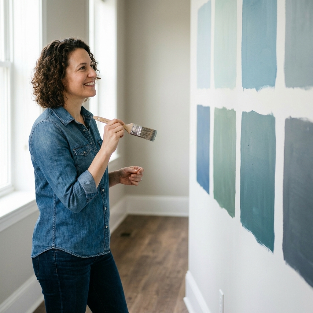
Swatches can lie. Lighting changes everything. Here is the routine I use in my own house and in every “help, my floors are weird” text thread.
- Narrow to 3 to 5 colors. Any more and your eyes get confused.
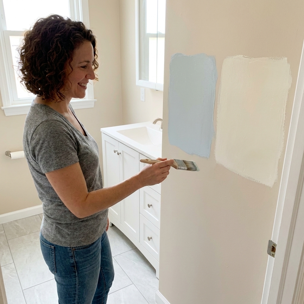
- Buy sample pots or peel-and-stick samples. Go large, at least poster board-size if painting.
- Place samples vertically. Walls read differently than floors. Tape the sample near where the light hits.
- Check morning, afternoon, and night. Hardwood especially can throw golden light in late day sun.
- View next to the floor and the trim. Undertones show up at the edges, not in the middle of a wall.
One more thing: some colors shift under different light sources (daylight vs LED at night). If a sample looks perfect at noon but weird after dinner, that is not you being picky. That is the paint reacting to the light.
Common floor situations
“My wood floor is orange”
Orange-leaning oak is real, and it is not a character flaw. Pair it with paint that either feels clean and calm, or earthy and intentional.
- Try: creamy off-whites, warm greiges that do not go pink, muted sages, soft clays.
- Skip: icy grays and cool whites that make the orange shout.
“My tile has pink or peach undertones”
Lean into warm neutrals and avoid stark whites. A white that is too bright can make pink-beige tile look dated even if it is perfectly fine.
- Try: warm off-white walls, light taupe, muted olive.
“My floor is gray, but also kind of brown”
That is usually a greige floor. Treat it as neutral and let your other finishes decide the direction.
- If your furniture is warm wood, choose a warmer wall neutral.
- If your counters and tile are cool, choose a cooler wall neutral.
“I have mixed floors”
This is super common in open-concept homes. Your goal is a wall color that does not pick a fight with either.
- Choose a wall color with a neutral backbone (often a light greige or a balanced off-white).
- Use rugs to visually separate zones and help each floor look intentional.
- Keep trim color consistent throughout to unify the spaces.
“My floors used to look less orange”
If you have older polyurethane or oil-based finishes, they can amber over time. That warm shift is one reason a paint color that worked years ago suddenly feels yellower. It does not mean you did anything wrong, it just means you should sample with today’s floor color in mind.
Quick cheat sheet
| Floor type | Undertone | Wall colors that usually work | Common pitfall |
|---|---|---|---|
| Honey oak or golden maple | Warm | Creamy white, warm greige, muted sage, clay | Icy gray walls making the floor look orange |
| Cherry or red-toned stain | Warm | Soft warm white, light taupe, dusty green | Pink-beige walls amplifying red |
| Gray-washed hardwood | Cool | Clean white, pale gray, blue-gray, charcoal | Warm beige walls looking peachy |
| Terracotta tile | Warm | Warm white, sand, sage, muted denim blue | Stark white making tile look dull |
| Slate or blue-gray tile | Cool | Crisp white, cool greige, smoky blue | Overly creamy whites turning yellow |
| Greige porcelain tile | Neutral | Balanced off-white, light greige, muted colors | Picking a paint that swings green or pink in your light |
FAQ
Should wall paint be warmer or cooler than the floor?
Most of the time, it is easiest when the undertone is similar and the contrast comes from lightness or darkness. You can go opposite undertones, but do it intentionally and use a bridge element (a rug, curtains, or cabinetry) so it feels designed.
How do I know if my floor is warm or cool if it has a lot of variation?
Look at the floor from standing height in natural daylight, then identify the dominant read from across the room. For highly varied wood, your wall color should be calmer and more neutral so the movement in the floor can be the star.
Can I use gray paint with warm wood floors?
Yes, but pick a gray that has a soft warm base (often called greige), and sample it next to the floor. Many popular cool grays will make warm wood look more orange.
What if I hate my floor undertone?
You do not have to match it perfectly, but you do need to acknowledge it. A paint color that tries to “cancel” an undertone too aggressively can make the room feel sour. Aim for a neutral wall that makes the floor feel calmer, then use decor to push the style where you want it.
Final sanity check
Stand in the doorway and ask one question: Does the wall color make the floor look better, or worse? If it makes the floor look more yellow, more pink, more gray, or more dingy than you want, keep sampling. The right pairing makes everything in the room feel cleaner and more intentional, and it is worth an extra day of testing to get there.