Browse categories

Category

Color Palettes & Pairing

Expert advice on color theory, matching different shades, and creating cohesive interior color schemes for your home.

Pair Wall Paint with Hardwood and Tile Floors

Pair Wall Paint with Hardwood and Tile Floors

If your floors are staying put, they’re the biggest “color sample” in your house. I have watched plenty of friends fall in love with a wall color on a tiny swatch, paint the whole room, and then realize the floor makes it look oddly pink, sickly green, or just… off. The fix isn’t magic; it’s...

Read more →
Monochromatic Color Palettes That Don’t Look Flat

Monochromatic Color Palettes That Don’t Look Flat

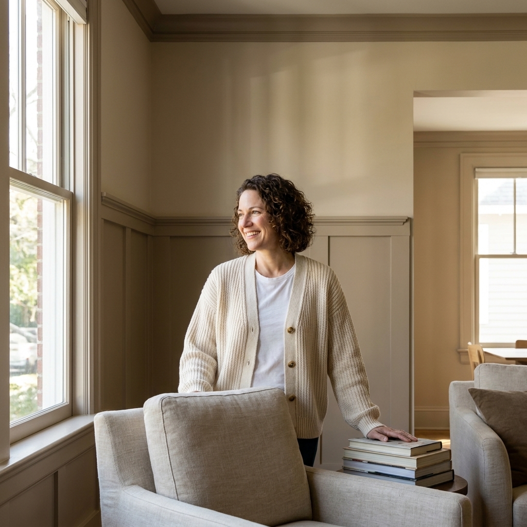
A monochromatic palette sounds simple: pick one color, paint everything, call it done. In real life, that can go one of two ways: effortlessly elevated or weirdly blank, like your room forgot the finishing touches. The difference is layering. When you build a monochromatic scheme with intentional...

Read more →

Beyond White: Choosing a Ceiling Color That Works

Beyond White: Choosing a Ceiling Color That Works

Most of us were taught that ceilings are supposed to be white, full stop. And honestly, a classic white ceiling can look crisp and clean. But if your room has ever felt a little unfinished, like the walls are doing all the work and the top of the space just disappears, your ceiling color is a big...

Read more →

How Light Direction Changes Your Paint Colors

How Light Direction Changes Your Paint Colors

If you have ever carried the same paint swatch from room to room and thought, “Wait, is this even the same color?” you are not imagining it. Natural light direction is one of the biggest reasons a perfectly coordinated palette in the store turns into a weird undertone party at home. Light coming...

Read more →

Mixing Warm and Cool Paint Colors: Dos and Don’ts

Mixing Warm and Cool Paint Colors: Dos and Don’ts

Mixing warm and cool paint colors in one space is one of my favorite ways to make a room feel layered and lived-in. It is also one of the fastest ways to end up with a room that feels slightly… queasy. Not because warm and cool cannot coexist, but because undertones rarely forgive. The good news:...

Read more →
Paint Colors That Work with Brass, Black, and Silver Hardware

Paint Colors That Work with Brass, Black, and Silver Hardware

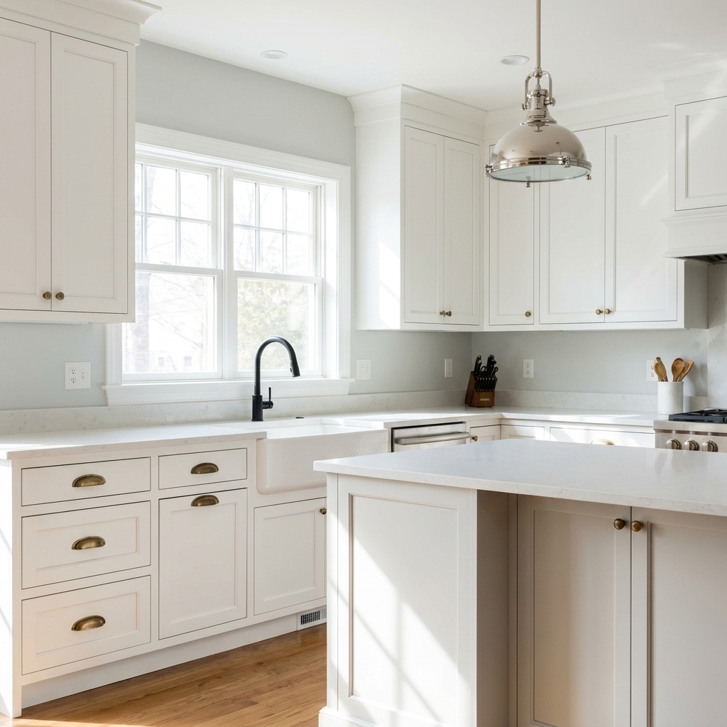
Hardware is basically jewelry for your home. Metals are picky, though. A paint color that looks perfect next to a brass sconce can make chrome feel icy, and the same “safe” greige can turn matte black hardware into a flat silhouette. Let’s make this easy: your wall color should either echo the...

Read more →
The 60-30-10 Color Rule for Room Paint

The 60-30-10 Color Rule for Room Paint

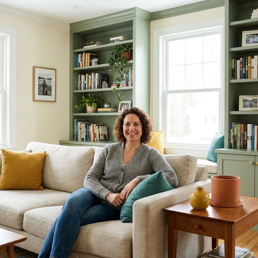
If you have ever stood in the paint aisle holding six “perfect” swatches and suddenly none of them look like they belong together, the 60-30-10 rule is your new best friend. It is not a rigid design law. It is a simple ratio that keeps your room from feeling either too matchy or too chaotic. Here...

Read more →
Cohesive Paint Colors for Open Concept Kitchens and Living Rooms

Cohesive Paint Colors for Open Concept Kitchens and Living Rooms

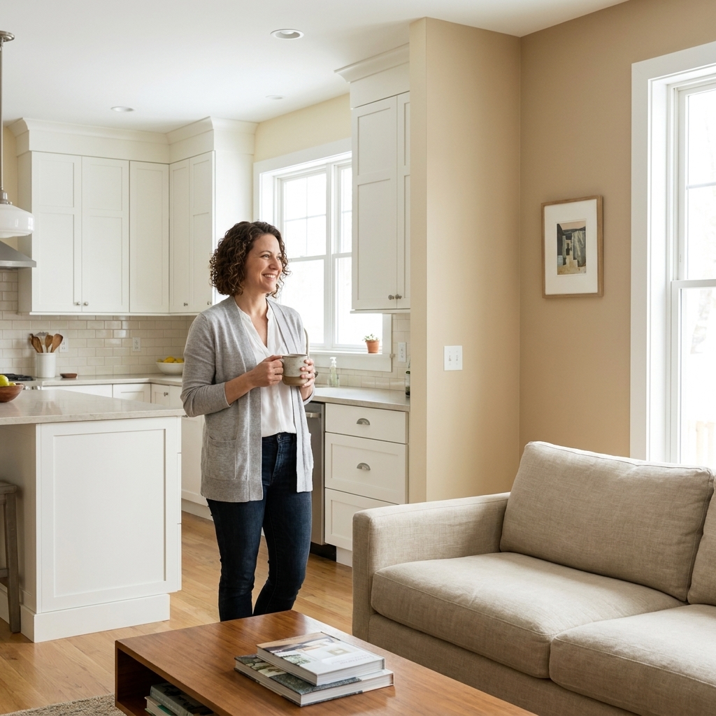
Open concept spaces are wonderful until you're standing in the paint aisle holding six “warm whites” that somehow all look different in your house. The trick isn't forcing one color everywhere. It's building a small, intentional palette that repeats, transitions, and makes the kitchen and living...

Read more →
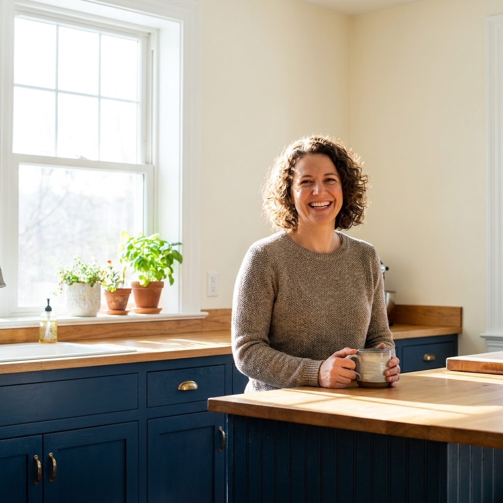
Coordinating Kitchen Cabinet and Wall Paint Colors

Coordinating Kitchen Cabinet and Wall Paint Colors

Kitchen color decisions feel higher-stakes than almost any other room because you are coordinating fixed surfaces that sit inches apart. Cabinets, walls, counters, backsplash, floors, and lighting all bounce color onto each other. The good news is that you do not need a perfect eye. You need a...

Read more →

Welcoming Entryway Paint Colors

Welcoming Entryway Paint Colors

Your entryway works harder than almost any other spot in the house. It is your welcome mat, a traffic lane, a drop zone, and the first place your paint color introduces itself. The goal is not just “pretty.” It is inviting, forgiving in real-life lighting, and able to transition smoothly into the...

Read more →
Color Palettes & Pairing | Room Tint
Browse categories

Category

Color Palettes & Pairing

Expert advice on color theory, matching different shades, and creating cohesive interior color schemes for your home.

Pair Wall Paint with Hardwood and Tile Floors

Pair Wall Paint with Hardwood and Tile Floors

If your floors are staying put, they’re the biggest “color sample” in your house. I have watched plenty of friends fall in love with a wall color on a tiny swatch, paint the whole room, and then realize the floor makes it look oddly pink, sickly green, or just… off. The fix isn’t magic; it’s...

Read more →
Monochromatic Color Palettes That Don’t Look Flat

Monochromatic Color Palettes That Don’t Look Flat

A monochromatic palette sounds simple: pick one color, paint everything, call it done. In real life, that can go one of two ways: effortlessly elevated or weirdly blank, like your room forgot the finishing touches. The difference is layering. When you build a monochromatic scheme with intentional...

Read more →
Beyond White: Choosing a Ceiling Color That Works

Beyond White: Choosing a Ceiling Color That Works

Most of us were taught that ceilings are supposed to be white, full stop. And honestly, a classic white ceiling can look crisp and clean. But if your room has ever felt a little unfinished, like the walls are doing all the work and the top of the space just disappears, your ceiling color is a big...

Read more →
How Light Direction Changes Your Paint Colors

How Light Direction Changes Your Paint Colors

If you have ever carried the same paint swatch from room to room and thought, “Wait, is this even the same color?” you are not imagining it. Natural light direction is one of the biggest reasons a perfectly coordinated palette in the store turns into a weird undertone party at home. Light coming...

Read more →
Mixing Warm and Cool Paint Colors: Dos and Don’ts

Mixing Warm and Cool Paint Colors: Dos and Don’ts

Mixing warm and cool paint colors in one space is one of my favorite ways to make a room feel layered and lived-in. It is also one of the fastest ways to end up with a room that feels slightly… queasy. Not because warm and cool cannot coexist, but because undertones rarely forgive. The good news:...

Read more →
Paint Colors That Work with Brass, Black, and Silver Hardware

Paint Colors That Work with Brass, Black, and Silver Hardware

Hardware is basically jewelry for your home. Metals are picky, though. A paint color that looks perfect next to a brass sconce can make chrome feel icy, and the same “safe” greige can turn matte black hardware into a flat silhouette. Let’s make this easy: your wall color should either echo the...

Read more →
The 60-30-10 Color Rule for Room Paint

The 60-30-10 Color Rule for Room Paint

If you have ever stood in the paint aisle holding six “perfect” swatches and suddenly none of them look like they belong together, the 60-30-10 rule is your new best friend. It is not a rigid design law. It is a simple ratio that keeps your room from feeling either too matchy or too chaotic. Here...

Read more →
Cohesive Paint Colors for Open Concept Kitchens and Living Rooms

Cohesive Paint Colors for Open Concept Kitchens and Living Rooms

Open concept spaces are wonderful until you're standing in the paint aisle holding six “warm whites” that somehow all look different in your house. The trick isn't forcing one color everywhere. It's building a small, intentional palette that repeats, transitions, and makes the kitchen and living...

Read more →
Coordinating Kitchen Cabinet and Wall Paint Colors

Coordinating Kitchen Cabinet and Wall Paint Colors

Kitchen color decisions feel higher-stakes than almost any other room because you are coordinating fixed surfaces that sit inches apart. Cabinets, walls, counters, backsplash, floors, and lighting all bounce color onto each other. The good news is that you do not need a perfect eye. You need a...

Read more →
Welcoming Entryway Paint Colors

Welcoming Entryway Paint Colors

Your entryway works harder than almost any other spot in the house. It is your welcome mat, a traffic lane, a drop zone, and the first place your paint color introduces itself. The goal is not just “pretty.” It is inviting, forgiving in real-life lighting, and able to transition smoothly into the...

Read more →