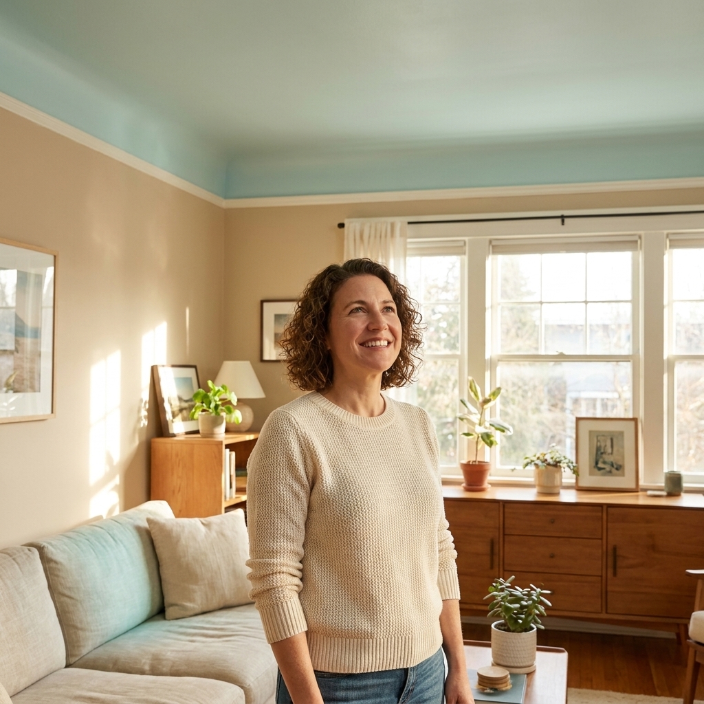
Undertones are the reason a “simple” greige can lean pink at night, a clean white can look a little dull next to your trim, and your dreamy sage can suddenly feel minty. The good news is you do not need perfect color vision or a designer degree. You need a repeatable process and a couple of reliable comparisons that usually tell the truth.
This is the method I use when I am standing in the paint aisle with a fistful of swatches and the very real fear of picking the one that changes the second it hits the wall.
What an undertone is
Most wall colors are not “pure.” A gray is rarely just gray. It often leans a little blue, green, violet, or even brown. That lean is the undertone, and it is what your eye reads as warm or cool.
- Overtone: the color you think you are seeing at first glance, like “light gray.”
- Undertone: the subtle color bias underneath, like blue-gray, green-gray, violet-gray, taupe, or pink-beige.
- Why it matters: undertones are what make colors either harmonize (calm, cohesive) or fight (muddy, mismatched, oddly pink).
Two paint chips can have the same depth, meaning they look equally light or dark, but still clash because their undertones point in different directions.
The fastest way to spot undertones
1) Stop looking at the middle, look at the edges
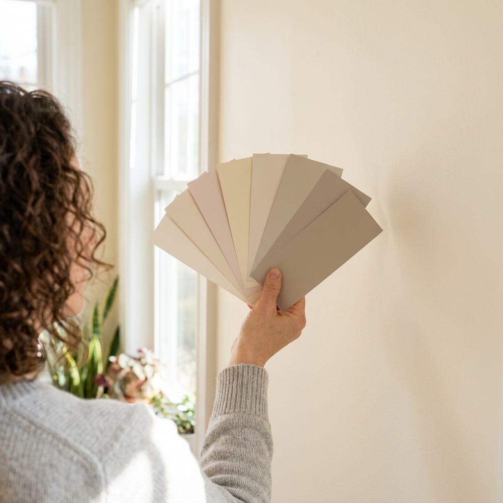
Hold the swatch at arm’s length and pay attention to the outer edge and corners. Many people find the undertone is easier to spot where the color meets white space.
2) Compare it to a reference, not another random swatch
Undertones reveal themselves through comparison. Use one of these anchors:
- Bright white paper: Plain printer paper works. Against white, a “white” paint often shows whether it has a creamy yellow pull, a pink cast, or a cool blue tint. If your room lighting is very warm or very cool, check the swatch by a window too.
- A neutral gray card: Truly neutral grays are rare, but a manufactured gray reference card is usually more consistent than comparing to another paint chip. It can help you spot a green or violet lean faster.
- Your actual fixed finishes: flooring, countertops, brick, stone, cabinets. These are the colors you are really matching, and they matter more than a swatch pile.
3) Slide the swatch up and down
In many rooms, lighting is not uniform from floor to ceiling because of windows, shadows, and reflections. Hold the swatch low near the floor and then higher on the wall. If it suddenly looks greener, rosier, or icier, you just learned something important about that space.
Warm vs cool undertones
If you are not sure whether a color is warm or cool, use these practical tells. You are looking for the direction the color drifts when compared to something more neutral.
Warm-leaning undertones often show up as
- Yellow or cream in whites and beiges
- Pink, peach, or red in beiges and taupes
- Brown in greiges, mushroom tones, and many “modern neutrals”
Cool-leaning undertones often show up as
- Blue in grays and whites
- Green in grays, off-whites, and many sages
- Violet in grays and some cool beiges
A helpful gut check: Warm colors tend to feel softer and cozier. Cool colors tend to feel crisper and airier. That does not mean cool automatically equals “clinical.” In the right room, cool can feel calm, modern, and clean. If your space starts reading “icy” in a way you do not like, you are probably in cool-undertone territory for that lighting.
How lighting changes undertones
Undertones are not only in the paint. They are also in your light, and in whatever color is bouncing around the room.
Natural light direction
- North-facing rooms: cooler, steadier light. Warm undertones often feel balanced here. Cool paints can look extra blue or gray.
- South-facing rooms: warm, bright light. Cool undertones can look clean and calm. Warm paints can tip more yellow or beige.
- East-facing rooms: bright, warm morning light and cooler afternoons. Watch for colors that shift noticeably by mid to late afternoon.
- West-facing rooms: cooler mornings and warm, golden afternoons. This is where pink and orange undertones can glow.
Bulb temperature matters
Bulbs can strongly influence your paint.
- 2700K to 3000K (warm white): boosts yellow, red, and pink undertones. Can make some cool grays look a bit muted or muddy.
- Around 3500K (neutral white): a good compromise in many homes.
- 4000K (cool or bright white) to 5000K+ (daylight): can boost blue and green undertones and make warm whites feel sharper. Labeling varies by brand, so go by the Kelvin number when you can.
If you are planning to swap bulbs, do it before you commit to a paint color. Otherwise you are choosing paint for lighting you will not keep.
The pro move: test with a sample board
I know it is tempting to slap sample paint right onto the wall. But wall testing can trick you because the existing color influences what you see at the edges.
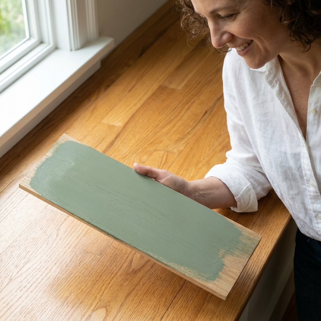
Make a movable sample board
- Use foam board, poster board, or primed scrap drywall.
- Paint two coats of each sample.
- Leave a clean white border around the painted area.
That border is your built-in reference. It makes undertones easier to spot.
Test in three places
- Next to a window: see the truest read in daylight.
- On the darkest wall: see how it deepens in shadow.
- Near fixed finishes: hold it next to flooring, tile, stone, or cabinetry.
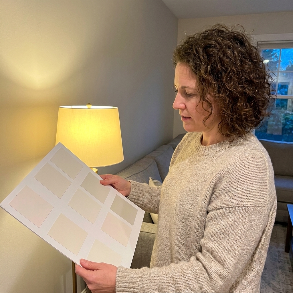
Check it in the morning, late afternoon, and at night with lamps on. A paint that feels perfectly neutral at noon can reveal a color bias later.
Reflections and metamerism
Sometimes the undertone mystery is not the paint. It is what the paint is reflecting.
- Color cast from nearby surfaces: A green lawn through a big window, a red brick fireplace, a bold rug, or even a saturated sofa can bounce color onto your walls and push undertones around.
- Metamerism: Some colors match under one light source and look different under another. That is why a swatch can feel “right” in daylight and slightly off under LEDs at night. Testing in multiple lighting conditions is the fix.
How to pair wall and accent colors
Pairing colors is less about matching the exact color family and more about keeping undertones in the same temperature lane.
Rule 1: Match temperature first
Start with warm-with-warm or cool-with-cool. Once temperature matches, you can go higher contrast (light wall, dark accent) or lower contrast (tone-on-tone) without things getting weird.
- Warm wall paint tends to pair best with warm whites, warm woods, creamy trims, earthy greens, and terracotta accents.
- Cool wall paint tends to pair best with crisp whites, cooler grays, charcoals, navy accents, and cooler greens.
Rule 2: Avoid undertone opposites side by side
Opposites are where accidental clashes happen. Common culprits:
- Green-leaning gray next to purple-leaning gray
- Pink-beige next to yellow-beige
- Warm creamy white trim next to cool icy white walls (or vice versa)
They might both be “neutral,” but they can make each other look more extreme.
Rule 3: Use a bridge color
If you want a warm white wall with a cool navy, or a cool gray with warm wood, add a bridge element that contains a little of both. Think rugs, art, or textiles that blend temperatures so the room feels designed, not conflicted.
Undertones in common colors
Whites
White paint is where undertones are the sneakiest. A white can lean:
- Warm: creamy, yellow, sometimes peach
- Cool: blue, gray, sometimes slightly green
Tip: If your white looks “dirty” next to trim, your trim is likely a different undertone or simply a brighter white. Compare both to plain white paper, then double check by a window.
Grays and greiges
Gray undertones often show up as:
- Blue-gray: crisp, modern, can feel cold in low light
- Green-gray: earthy, can swing “sage-y” or slightly murky in some rooms
- Violet-gray: sophisticated, but can flash purple next to warm woods
- Brown-leaning greige: cozy and forgiving, but can read beige in warm light
Beiges and taupes
These live in warm territory, but they can still skew:
- Pink/peach beige: flattering and soft, can look rosier under warm bulbs
- Yellow beige: sunny, can turn “buttery” fast in strong warm light
- True taupe (gray-brown): steadier, often the safest if you hate surprise pink
Greens
Green is a big umbrella. Your “sage” might be:
- Gray-green: muted and calm
- Yellow-green: warmer and more lively, sometimes reads sharper in bright sun
- Blue-green: cooler and spa-like, can feel crisper
Trim, ceilings, and cabinets
Walls do not live alone. Trim, ceilings, and cabinets create constant comparison lines, which means undertones show up fast there.
Trim
- If your walls are warm, a warm white trim usually looks seamless.
- If your walls are cool, a cleaner, cooler white trim often looks sharper.
If you mix a creamy trim with a cool wall, the wall can look bluer and the trim can look yellower. Sometimes that is charming. Often it is accidental.
Ceilings
Ceilings pick up shadows and reflected color from walls. A ceiling white that is too warm can look beige. Too cool can look stark. If you are unsure, test your ceiling white on a board and hold it flat overhead and also upright against the wall.
Cabinets
Painted cabinets have undertones too, and they are usually a more fixed commitment than walls. If your cabinets are staying, match your wall undertone to them first, then choose accent colors.
Troubleshooting
“My gray looks purple.”
- It may be a violet-leaning gray in a room with warm bulbs.
- Check what is reflecting into the room. Warm wood floors and tan furniture can add warm reflections that make certain cool or violet undertones “flash” more.
- Try a gray with a slightly green or brown undertone to calm the purple read.
“My white looks yellow.”
- Warm lighting and south or west sun can amplify cream undertones.
- Compare your white to a sheet of paper to confirm.
- If you want it cleaner, choose a white with a subtle gray undertone rather than jumping straight to a stark blue-white.
“My beige looks pink.”
- Many beiges are pink-based. Evening warm light can make it louder.
- Hold the swatch next to something truly neutral and also next to your flooring. Floors often reveal the pink.
- Look for a beige or taupe labeled as “mushroom,” “stone,” or “sand” because those often have more balanced brown-gray structure.
“Everything looks different once it dries.”
That is normal. Wet paint reflects light differently and can look darker, lighter, or patchier until it is fully dry and evenly coated. Judge undertone after the second coat has dried, ideally the next day.
Drying vs curing
Dry is not the same as cured. Paint can continue to settle in sheen and uniformity for several days. If you can, live with your sample board for a bit before you commit to gallons.
Undertone checklist
- Did you compare your top 2 to 3 choices to white paper?
- Did you check the color in daylight and lamplight?
- Did you hold the sample next to flooring, counters, tile, and trim?
- Did you test on a movable board with a white border?
- Did you confirm your bulb temperature in the room?
- Did you avoid relying on phone or monitor color for undertones and make decisions from real samples instead?
If you can say yes to most of these, you are not guessing anymore. You are choosing.
FAQ
How do I tell undertones apart when paint chips look identical?
Compare them against a bright white sheet of paper and then against a fixed finish in the room. Move them into shadow and into direct window light. The undertone difference usually shows up quickly once you change the reference.
Can I mix warm and cool undertones in the same room?
Yes, but do it intentionally. Keep your main surfaces aligned (walls, trim, big upholstery), then add contrast through accents. Use a bridge element like a rug or artwork that contains both warm and cool notes so the mix feels cohesive.
Is there a “best” undertone for resale?
In my experience, the safest choices are balanced neutrals that do not swing hard green or pink in typical home lighting. That said, the best undertone is the one that works with your home’s fixed finishes. A perfect neutral on a swatch can still look off next to your floors.
Do paint finishes change undertones?
They can change how strongly you notice them. Higher sheen reflects more light, which can make undertones feel sharper and more obvious. Flat and matte finishes soften the look a bit, especially on walls.