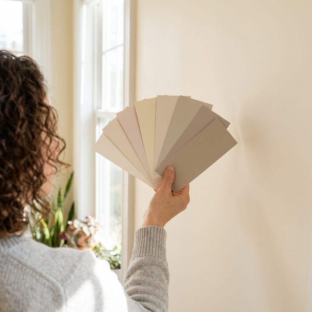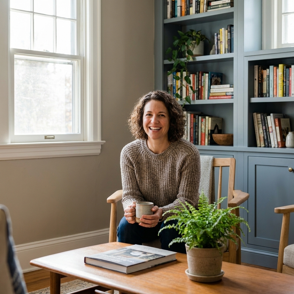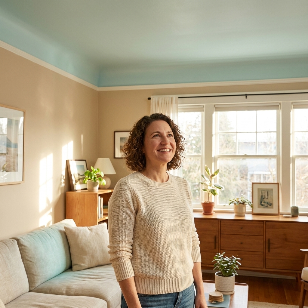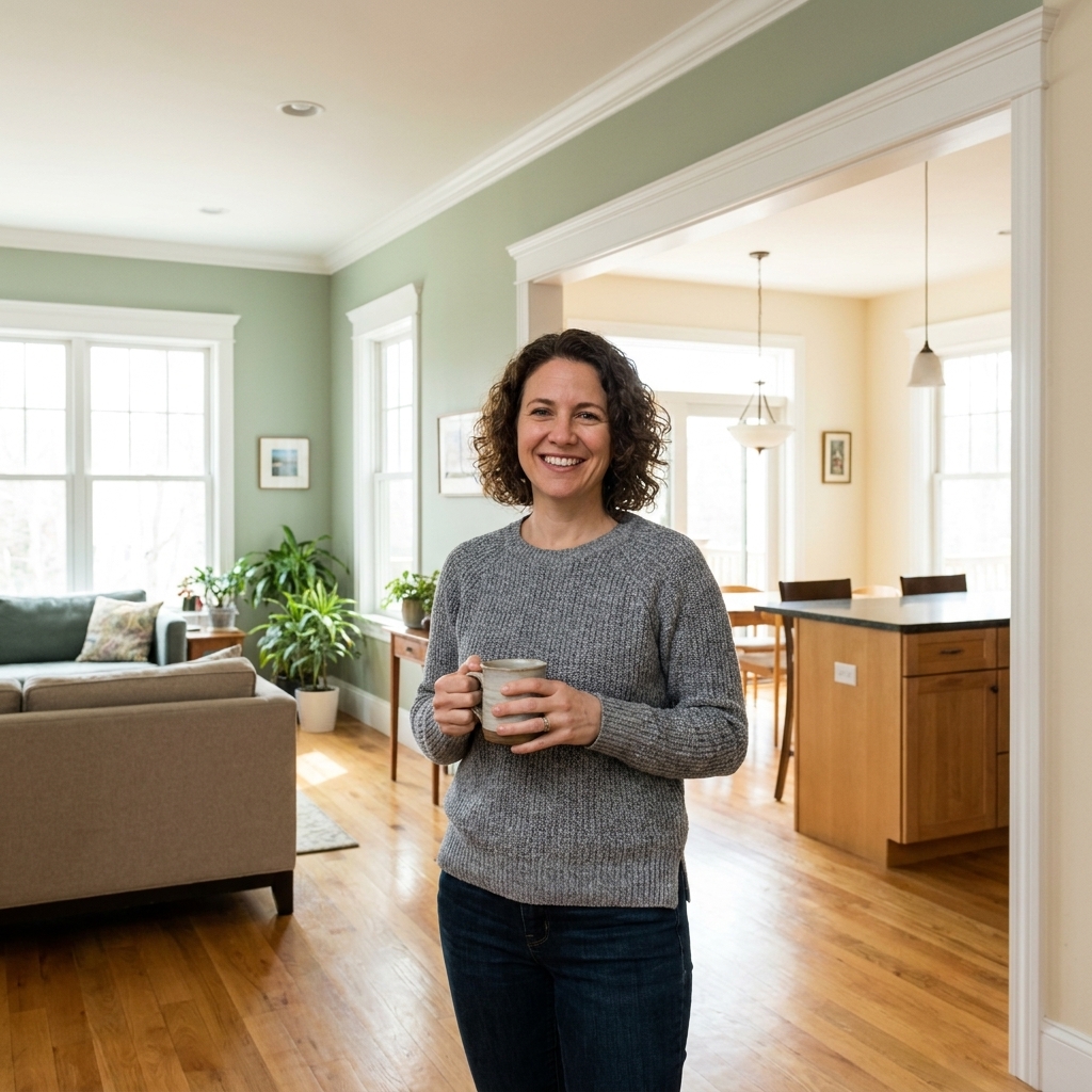
If you have ever carried the same paint swatch from room to room and thought, “Wait, is this even the same color?” you are not imagining it. Natural light direction is one of the biggest reasons a perfectly coordinated palette in the store turns into a weird undertone party at home.
Light coming from different directions changes three things that matter for wall color: color temperature (warm vs cool), intensity (bright vs muted), and timing (how it shifts from morning to night). Once you know your room’s exposure, you can choose pairings that stay steady instead of swinging dramatically all day.
One quick reality check: these patterns are rules of thumb, not laws of physics. Season, latitude, cloud cover, nearby trees or buildings, and even what is outside the window can all change how warm or cool your “typical” light feels. And if you live in the Southern Hemisphere, the north and south behaviors are often reversed.
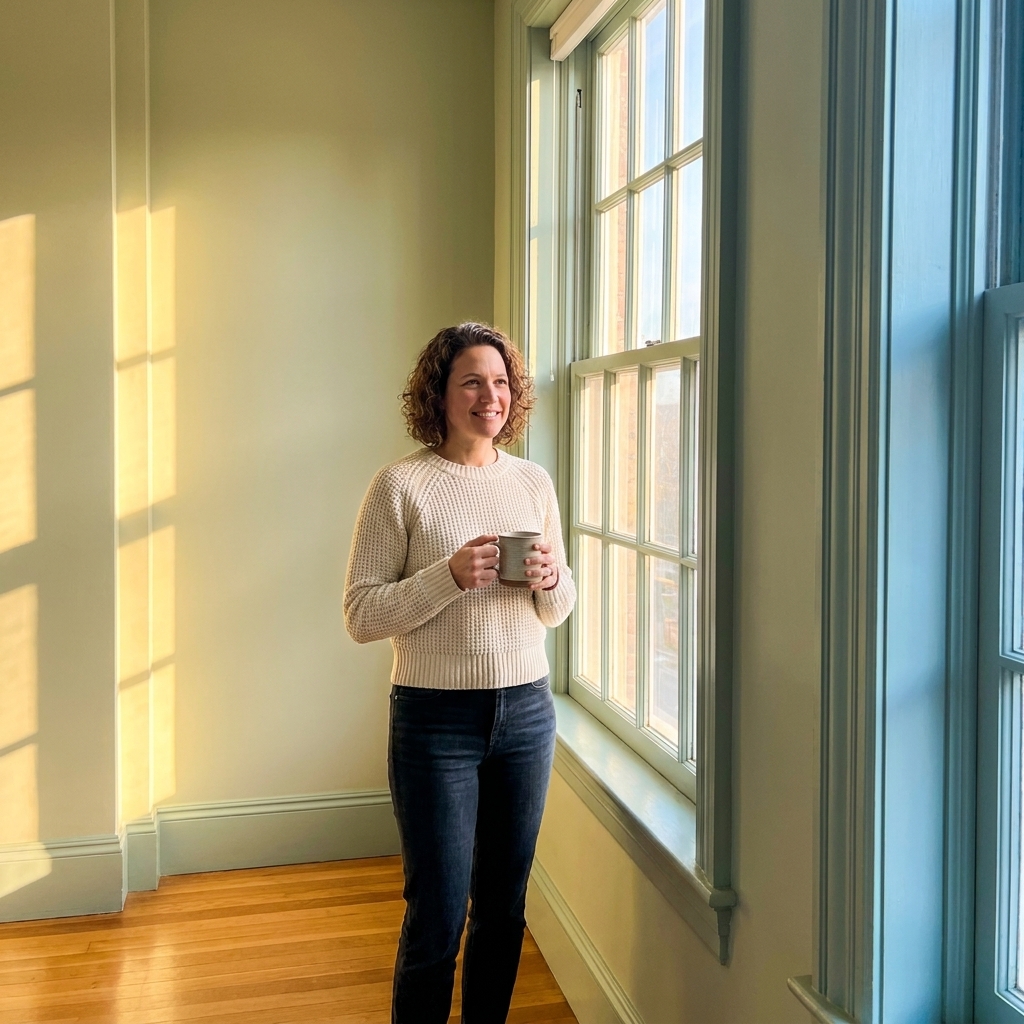
First, figure out your room’s exposure
You do not need a compass app if you do not want one, but it helps. The simplest way is to stand at your biggest window and look outside. The direction you are looking is the window’s exposure.
- If you are looking north, your room is north-facing.
- If you are looking south, it is south-facing.
- If you are looking east, you tend to get morning sun.
- If you are looking west, you tend to get afternoon and evening sun.
Corner rooms can behave like a blend of two exposures, and heavy trees, deep porches, insect screens, tinted glass, and neighboring buildings can soften intensity. Still, direction gives you the baseline behavior of the light.
How undertones get amplified
Paint is not just “gray” or “white” or “beige.” It is a mix of pigments, and those pigments lean warm (yellow, red, pink) or cool (blue, green, violet). Natural light acts like a filter, and reflected light (from floors, cabinets, lawns, brick, and even nearby houses) can act like a second filter.
- Cooler light tends to make cool undertones look more obvious and can make warm colors look dull or slightly muddy.
- Warmer light tends to boost warm undertones and can shift the balance of a “neutral,” revealing a secondary undertone you did not notice at first (like a gray that suddenly looks a bit violet, or a beige that suddenly looks a bit pink).
This matters most when you are pairing colors. A wall color that looks “neutral” can suddenly look blue next to a creamy trim in a north room, or a soft greige can read pink at sunset in a west room.
North-facing rooms: cooler and steadier
North light is indirect most of the day. In the Northern Hemisphere it tends to be cooler and more consistent than other exposures, especially on clear days. The upside is you do not get wild swings hourly. The downside is many colors look more muted, and neutrals can slide colder than you expected.
What happens in north light
- Whites can look crisp or slightly icy. Warm whites often look more balanced than stark whites.
- Grays and greiges often pull blue, violet, or green depending on undertone.
- Beiges and tans can look flatter, especially if they rely on golden warmth to feel lively.
- Deep colors look rich, but can feel heavier because the room lacks direct sun to lift them.
How to adjust
- Choose warmer neutrals than you think you need. If you want “neutral white,” start with a white that has a soft creamy or beige undertone.
- Pair cool wall colors with warm trim thoughtfully. If your wall is a cool gray, a very creamy trim can exaggerate the blue. Try a cleaner warm white or a neutral white instead.
- Use contrast to keep it from feeling flat. North rooms love a slightly deeper trim, a warmer wood tone, or a more saturated accent color to add life.
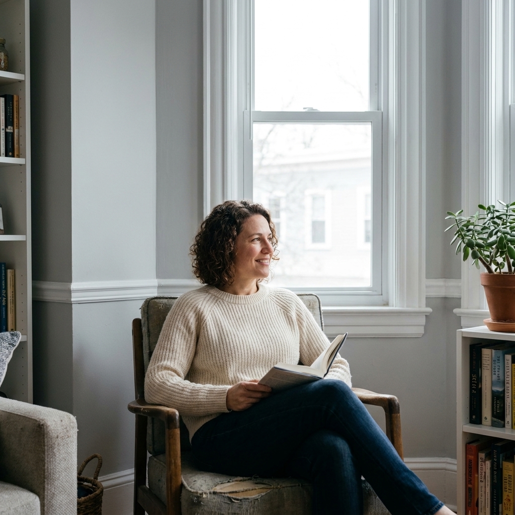
South-facing rooms: bright and color-boosting
South light is the golden retriever of daylight. In the Northern Hemisphere it is typically bright, often warmer, and it sticks around. Colors generally look more vivid and more welcoming. The trap is that already-warm colors can tip too yellow, too peach, or too creamy, especially in strong sun.
What happens in south light
- Warm whites can look extra creamy, sometimes buttery.
- Greiges often read warmer and more beige.
- Earth tones get glowier and can feel very cozy fast.
- Cool colors (blue-grays, blue-greens) often look more balanced and livable.
How to adjust
- If you love warm neutrals, pick a calmer version. Choose a warm neutral that is less yellow and more “tinted neutral.”
- Do not fear cooler undertones. A slightly cool white or a true neutral gray often lands exactly right in south light.
- Watch the trim. Super creamy trim next to a warm wall in a south room can feel like a vanilla overload. A cleaner white can sharpen everything nicely.

East-facing rooms: bright mornings
East light is all about that fresh morning sun. Early in the day it is often bright and can feel slightly warm. By afternoon, the room usually cools down and can feel more neutral or a bit flat depending on the window size, weather, and any exterior shade.
What happens in east light
- Warm colors can look fantastic in the morning, then a little quieter later.
- Cool colors may feel crisp early and then calmer in the afternoon.
- High-contrast pairings can look punchy in the morning and gentler later.
How to adjust
- Decide when you use the room most. Breakfast nook that shines at 8 a.m.? Lean into it. Home office used at 3 p.m.? Test for the later light.
- Pick middle neutrals. True neutrals and balanced greiges tend to behave best across the day.
- Test your pairing together. Sample wall color, trim, and any adjacent room color at the same time so you can see how the relationships change after lunch.

West-facing rooms: dramatic evenings
West light is the one that makes people text me at 6 p.m. like something is wrong with their paint. Mornings can feel dim or neutral. Late afternoon and evening often bring strong, warm light that can push undertones into overdrive, especially on sunny days.
What happens in west light
- Warm neutrals can go orange, peach, or pink at sunset.
- Whites can look creamy later in the day even if they seemed clean in the morning.
- Greens can look more yellow-green in golden light.
- Blues can look gorgeous and saturated at golden hour, but may feel cooler and flatter earlier.
How to adjust
- Be careful with red and orange undertones. If you are already sensitive to “peachy,” avoid warm off-whites and pink-leaning beiges in west rooms.
- Try more neutral or slightly cool versions of what you love. Want a cozy greige? Pick one that leans a bit cooler so it warms up into balance later.
- Use evening testing. Paint swatches and peel-and-stick samples can look totally different at 5 to 7 p.m. in west rooms. That is your truth window.
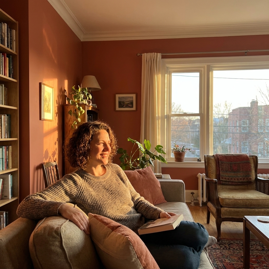
How direction changes pairings
Most paint regret is not the wall color alone. It is the relationship between surfaces.
Wall and trim
- In cooler rooms (north, some east afternoons): very bright white trim can look extra stark, which can make the wall color look darker and colder. A slightly warmer or softer white trim often smooths the contrast.
- In warmer rooms (south, west evenings): creamy trim can read yellower. A cleaner neutral white can keep the palette from drifting too warm.
Wall and ceiling
Ceilings are usually painted a white, but that white is still a color. In north rooms, a blue-leaning ceiling white can feel chilly. In west rooms, a creamy ceiling can go buttery at sunset. If you want a calmer ceiling, choose a ceiling white that is closer in undertone to your trim.
Main color and accent color
Accent colors are where direction can be your best friend.
- North light: accents look sophisticated and slightly moody. Great for inky blues, forest greens, and deep charcoals.
- South light: accents look energized. Great for saturated colors that might feel too loud elsewhere.
- East light: soft accents feel cheerful in the morning. Great for muted greens, soft blues, dusty roses.
- West light: accents can glow at night. Great for cooler navies, blue-grays, and balanced greens that can handle warmth.
My weekend sampling routine
If you do one thing from this article, do this. Sampling correctly saves money and sanity.
Step-by-step
- Sample on multiple walls. Put one sample on the wall with the window and one on the wall perpendicular to it. Light hits them differently.
- Make it big. Aim for at least 12 by 12 inches if you are painting, or use two peel-and-stick samples next to each other.
- Test your pairing together. Put trim white next to wall color. Add your second palette color too, even if it is for an adjacent room.
- Check four times: morning, midday, late afternoon, and after dark with your lamps on.
- Hold up your actual finishes. Flooring sample, countertop, sofa fabric, and any wood tones. Undertones love to bounce.
Natural light is only half the story. Night lighting can shift undertones just as dramatically, especially with warm LEDs.
Quick fixes if the color feels off
Sometimes you already painted, and the room exposure is doing exactly what it does. Before you repaint, try these practical tweaks.
- Change bulbs. A too-warm bulb makes most colors look yellower at night. A too-cool bulb can make neutrals look gray and lifeless. Choose a bulb temperature that matches the mood you want, then evaluate the paint again.
- Adjust sheen. Higher sheen reflects more light and can make a color feel brighter, but it also creates more glare and highlights wall imperfections. Flat and matte absorb light and can make colors feel deeper. If a north room feels dull, eggshell can help without going full shiny.
- Use textiles and art to rebalance. If your west room makes the walls feel peachy, bring in cooler accents like blue, black, or crisp white to neutralize the vibe.
- Repaint trim before repainting walls. Swapping trim white is often cheaper and can change how the wall color reads.
Exposure cheat sheet
| Exposure | Light feel | Colors that often thrive | Common pitfalls |
|---|---|---|---|
| North | Cooler, consistent, muted | Warm whites, balanced greiges, rich deep tones | Neutrals turning blue or flat |
| South | Bright, often warm, steady | True neutrals, slightly cool whites, blues and blue-greens | Warm colors turning too yellow |
| East | Bright morning, calmer afternoon | Balanced neutrals, gentle colors that can soften later | Choosing only for morning light |
| West | Neutral morning, warm evening | Neutral to slightly cool palettes, colors that can handle golden light | Peachy or orange shifts at sunset |
FAQs
Why does my gray paint look blue in one room and beige in another?
Two reasons usually stack: the room’s natural light direction and what is reflecting around the room (floors, cabinets, nearby trees, even a big colorful rug). In north light, many grays reveal blue or violet undertones. In south light, that same gray can look warmer and more beige. Always sample in the actual room, next to your trim and flooring.
Is there a “safe” neutral that works in every exposure?
The closest thing to safe is a balanced neutral that is not extremely warm or extremely cool, paired with a trim white that also stays fairly neutral. Even then, exposure will still shift it a bit. The goal is not zero shift. It is a shift you still like.
Do sheer curtains change color perception?
Yes. Sheers diffuse and soften light, which can reduce harsh contrast but also make colors look slightly more muted. A warm-toned fabric can warm up the whole room. If you plan to keep curtains closed most of the day, sample with them in place.
Do window glass and screens matter?
They can. Low-E coatings, tinted glass, and insect screens often cut brightness and can slightly shift how a color reads. If you are choosing between two similar shades, sample with the windows treated the way they will be day to day.
What if my room faces two directions?
Corner rooms often have mixed light. Treat it like a stronger version of whichever window is larger or gets more direct sun. In these spaces, sampling on multiple walls matters even more.
Pick palettes for real life
Light direction is not a rule that limits you. It is a shortcut to fewer surprises. Once you know whether your room tends cool, warm, bright, or dramatic, you can choose a palette that stays intentional across the day.
If you are stuck between two colors, sample both, then check them at the time you actually use the room. Your walls should look good on a random Tuesday, not only at noon on a sunny weekend.