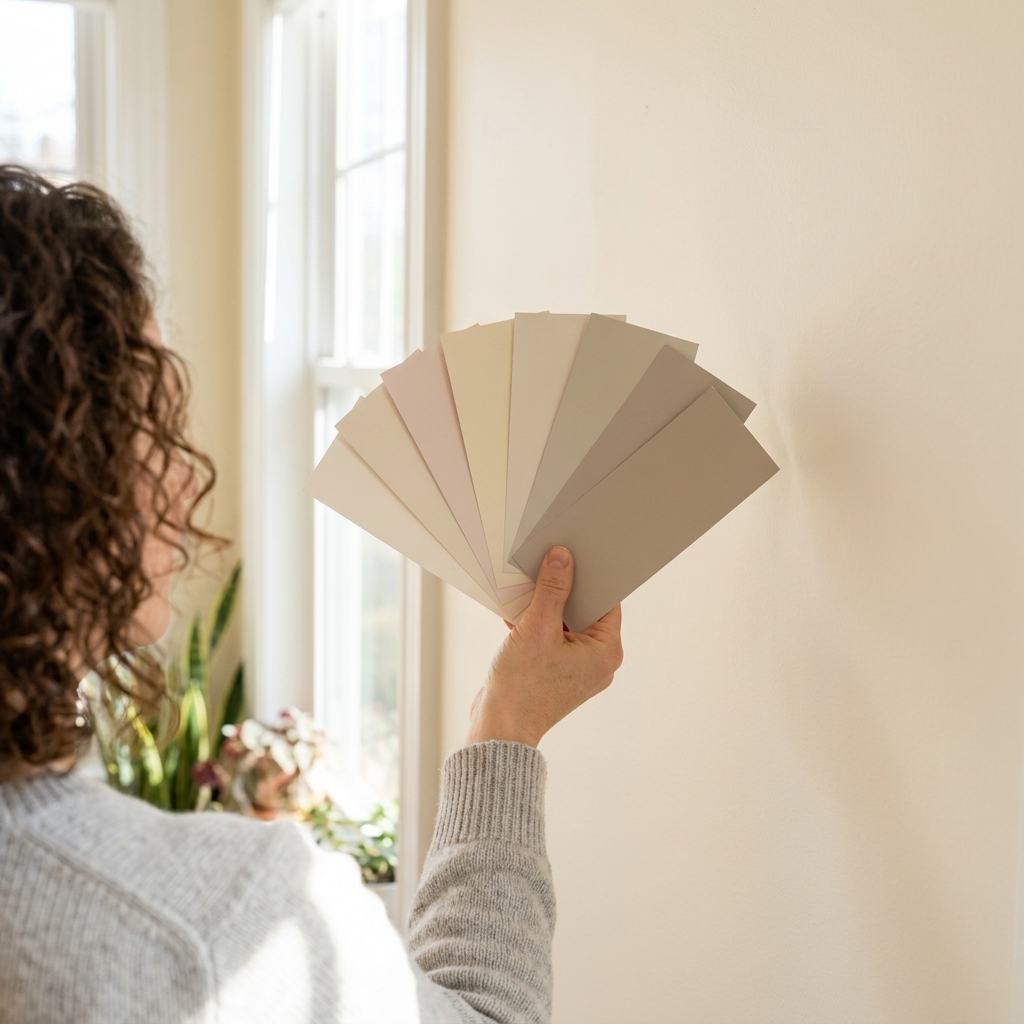
Picking a nursery color sounds simple until you are standing in that paint aisle, holding six “almost the same” swatches, wondering which one will feel calm at 2 a.m. and still look cool when your kid is thirteen. My favorite gender-neutral nursery colors do two things well: they play nicely with changing decor (crib to twin bed, animals to astronomy posters) and they hold up in different lighting, especially the warm bulbs most nurseries end up with.
Below are 12 versatile, non-traditional paint color directions that age beautifully. I am including undertone cues and what to pair them with because undertones are the whole game in a room you will see at every hour of the day.
How to choose a nursery color
- Lean into complex neutrals. Greige, mushroom, and warm off-whites tend to hide scuffs better than stark whites, especially when paired with the right sheen and a durable paint line.
- Pick one clear undertone. If the floor is warm oak, warm-leaning paint looks intentional. If you have cool gray carpet, cooler paints can feel cleaner.
- Test in morning and night. Nursery lighting shifts hard: daylight, warm lamps, night lights. Tape up 12x12 (or larger) samples, or use peel-and-stick samples, on multiple walls and check them after sunset.
- Choose the sheen strategically. For most nurseries, eggshell is the sweet spot. It usually wipes better than traditional matte and is less likely to highlight wall texture than satin can, especially on less-than-perfect walls. (If you are using a modern washable matte, you may get similar cleanability.)
If you are painting before baby arrives, do it as early as you can. Low- and zero-VOC options are great, but fresh paint still benefits from airflow and time to settle.
12 gender-neutral nursery paint colors
1) Warm off-white
A warm off-white makes the room feel soft and glowy instead of “new construction white.” It is the easiest backdrop for colorful books, quilts, and toys later.
- Undertone to look for: creamy, buttery, or a whisper of beige
- Pairs well with: light oak, cane, woven baskets, warm metals
- Works best in: low-light nurseries that need brightness without turning icy
- If you want specific options: Benjamin Moore White Dove (OC-17), Sherwin-Williams Alabaster (SW 7008)
2) Light greige
Greige is the nursery peacekeeper. It sits between gray and beige, which makes it feel modern now and still neutral when the decor changes.
- Undertone to look for: balanced, slightly warm
- Pairs well with: black accents, white trim, natural linen
- Pro tip: Under very warm bulbs, some greiges can pull a little purple. Sampling at night catches this fast.
3) Mushroom taupe
This is my go-to when someone wants “neutral” but not boring. Mushroom tones feel grounded and cozy, and they are forgiving on imperfect walls.
- Undertone to look for: taupe with a hint of gray
- Pairs well with: cream textiles, walnut, warm white ceilings
- Vibe shift over time: nursery cozy becomes teen calm with darker woods and graphic art
4) Soft clay beige
Clay-beige reads warm and welcoming without going full peach. It looks beautiful with both traditional and modern furniture, which is handy when nursery pieces get repurposed.
- Undertone to look for: sandy, clay, light terracotta
- Pairs well with: olive greens, dusty blues, rattan
- Best for: rooms with cooler light that need warmth
5) Dusty blush
Yes, blush can be gender-neutral if you keep it muted and dusty. Done right, it feels like a soft neutral with a rosy glow, not bubblegum.
- Undertone to look for: beige-pink, not bright pink
- Pairs well with: warm whites, camel, charcoal, aged brass
- Tip: Blush can intensify under warm bulbs, so sample it at night.
6) Pale sage green
Sage is the color I reach for when a nursery needs calm. It is nature-adjacent and flexible, and it looks equally good with sweet baby decor and more graphic teen styling.
- Undertone to look for: gray-green, slightly warm
- Pairs well with: light wood, cream, matte black picture frames
- Works best in: bright rooms where you want to soften the light
- If you want a specific option: Sherwin-Williams Sea Salt (SW 6204) in a well-lit room
7) Muted olive
Olive brings in depth without feeling heavy. It is one of those colors that makes inexpensive furniture look more intentional.
- Undertone to look for: earthy green with a touch of brown
- Pairs well with: crisp white trim, tan leather, natural jute
- Kid-to-teen transition: add bolder art and darker bedding and it reads instantly more mature
8) Misty blue-gray
This is the “I want color but I get scared” option. A misty blue-gray stays soothing for sleep and feels clean as the room evolves.
- Undertone to look for: soft blue with gray to quiet it down
- Pairs well with: white, warm wood, oatmeal textiles
- Tip: Blue can look more intense on a whole wall than on a chip. Going one shade lighter is often the safer move.
9) Deep denim blue
Denim blue is a nursery color that does not scream “nursery.” It is cozy, hides marks well, and looks great with simple white trim.
- Undertone to look for: classic blue with a bit of gray
- Pairs well with: white oak, leather, warm white bedding
- Best use: accent wall behind the crib if the room is small or low light
10) Stormy blue-green
This one hits when you want mood without going too dark. Blue-green shades feel sophisticated and timeless.
- Undertone to look for: balanced teal that is more muted than tropical
- Pairs well with: creamy whites, brushed brass, medium woods
- Lighting note: Under warm bulbs, many blue-greens skew greener. Under cooler LEDs, they read bluer.
11) Soft charcoal
Charcoal in a nursery sounds bold, but in practice it can feel calming and cocoon-like, especially with warm lamps. It also makes art and shelves pop later.
- Undertone to look for: charcoal with brown or slate undertones, not pitch black
- Pairs well with: warm white trim, pale woods, textured knits
- My rule: If the room has one small window, keep the ceiling and trim a soft warm white to balance it.
12) Putty beige-gray
Putty shades sit in that perfect “not gray, not beige” zone, with a subtle earthy feel. They are adaptable as tastes change.
- Undertone to look for: a little green or taupe, very muted
- Pairs well with: almost everything, especially black, cream, and muted pastels
- Best for: renters and homeowners who want a safe, designer-looking neutral
Easy color combos
If you want a little more personality than one solid color, these combos age well and do not lock you into a theme.
- Warm off-white walls + deep denim built-ins or bookshelf.
- Light greige walls + sage ceiling. Subtle, cozy, and unexpectedly polished.
- Mushroom taupe walls + warm white trim + black frames.
- Misty blue-gray walls + clay beige textiles. Soft contrast, very calming.

Trim and ceiling basics
If you want the simplest default, do warm white trim and a flat or matte warm white ceiling, then bring in color on the walls. Matching trim and ceiling keeps things calm, and warm whites play nicely with most woods and woven textures.
If your wall color is dark (charcoal, denim, stormy blue-green), keeping trim and ceiling lighter helps the room feel open. If your wall color is very light (off-white, greige, putty), you can match the trim to the wall for a soft, modern look, just expect a little more prep to make the lines crisp.
Prep tips that help
I learned these the annoying way, usually while peeling painter’s tape off trim at midnight.
- Patch and sand first. Even tiny bumps show up in side lighting from a lamp or night light.
- Use stain-blocking primer if needed. Water stains, old crayon marks, or wood knots can telegraph through light nursery colors.
- Cut in slowly and keep a damp rag nearby. Fresh paint on baseboards is easier to wipe immediately than to scrape later.
- Ventilation and cure time matters. Even low-VOC paint benefits from airflow. Follow the manufacturer’s guidance for recoat times and full cure time. Many paints feel dry quickly but take longer to fully cure, often a couple weeks. If you can, paint well before the room is fully set up so everything has time to air out.
FAQ
What finish is best for a nursery?
Most nurseries do best in eggshell on walls. It is typically easier to wipe than traditional matte and is less likely to show wall texture than satin. If you expect lots of fingerprints near a changing table, you can do satin on that one wall and eggshell everywhere else.
Are dark colors okay in a nursery?
Yes, if you balance them. Keep trim and ceiling lighter, add layered lighting (overhead plus a warm lamp), and use lighter textiles so the room does not feel cave-like. Dark neutrals like charcoal and denim are especially forgiving as kids grow.
How do I keep a neutral nursery from feeling boring?
Add contrast and texture. Think warm wood, woven baskets, a chunky knit throw, linen curtains, and a patterned rug. Neutral walls are the perfect backdrop for rotating art and colorful books as your child’s interests change.