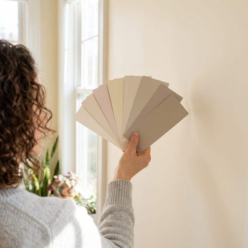
Most of us were taught that ceilings are supposed to be white, full stop. And honestly, a classic white ceiling can look crisp and clean. But if your room has ever felt a little unfinished, like the walls are doing all the work and the top of the space just disappears, your ceiling color is a big reason why.
The ceiling is a huge surface. When you treat it like part of the palette, not an afterthought, you can make a room feel taller, cozier, brighter, more modern, or more collected. The trick is choosing a ceiling paint color that plays nicely with your walls, trim, and lighting without turning your room into a circus tent.

Start with the ceiling’s job
I think of ceilings in three roles. Pick the role first, then the color gets much easier.
- Ceilings that disappear: You want height, airiness, and a clean backdrop. Whites and barely-there tints tend to shine here.
- Ceilings that connect: You want the room to feel cohesive, like the ceiling is part of the envelope, not a separate plane. Lighter versions of your wall color are great for this.
- Ceilings that make a statement: You want drama, coziness, or architecture emphasis. This is where contrast, deeper tones, and color matching come in.
Undertones matter
Here’s the sneaky part: ceilings often read differently than walls because they’re lit more by bounce light and overhead fixtures than by direct, eye-level light. That can exaggerate undertones. A white with a pink cast can look extra rosy overhead. A cool white can look icy. A beige can look more yellow than you expected.
Before you commit, identify the undertone family of your wall color and trim.
- Warm walls (creamy, yellow, red, peach undertones) usually look best with warm whites, warm light neutrals, or warm tints of the wall color.
- Cool walls (blue, green, violet undertones) tend to prefer cool whites, soft blue-grays, and cool tints.
- Complex neutrals (greige, taupe) can swing warm or cool depending on the light, so the ceiling choice should be tested at multiple times of day.
If you are unsure, hold your wall swatch flat on the ceiling for a minute, then hold it on the wall. The shift tells you what your room lighting is doing.
Option 1: Tint the wall color
This is my go-to recommendation for people who want something beyond white but still want it to feel calm and “normal” in the best way.
Why it works
- It makes the room feel cohesive and intentional.
- It softens harsh corners, especially in older rooms with uneven drywall.
- It minimizes that stark line where wall meets ceiling.
How to choose the tint
Ask the paint store to mix your wall color at 25% to 50% strength for the ceiling. Naming varies by brand, so you may need to ask for a reduced tint formula or a formula reduction. That range tends to read as a related ceiling color without looking like you accidentally used the wrong can.
If your walls are already very light, 50% may still read like the same color. In that case, try a 10% to 25% tint or choose a ceiling color that is one to two steps lighter on the same swatch strip.

Option 2: Go for contrast
Contrast is where ceilings get fun. A ceiling that is intentionally darker or more saturated than the walls can bring instant architecture to plain boxes, and it can make a large room feel grounded.
What contrast does best
- Highlights height changes: Great for tray ceilings or vaulted ceilings.
- Adds coziness: Especially in bedrooms, dining rooms, and libraries.
- Creates a focal point: Useful when the room has minimal trim detail.
Pairings that rarely fail
- Warm white walls + soft clay ceiling: Inviting, modern, and not too trendy.
- Cool light gray walls + smoky blue ceiling: Calm, tailored, a little dramatic.
- Greige walls + muted olive ceiling: Earthy and elevated, especially with natural wood.
- White walls + pale sky ceiling: Classic, especially in bathrooms and nurseries.
A practical rule: if you go darker on the ceiling, keep the walls and trim simpler so the room still feels balanced.
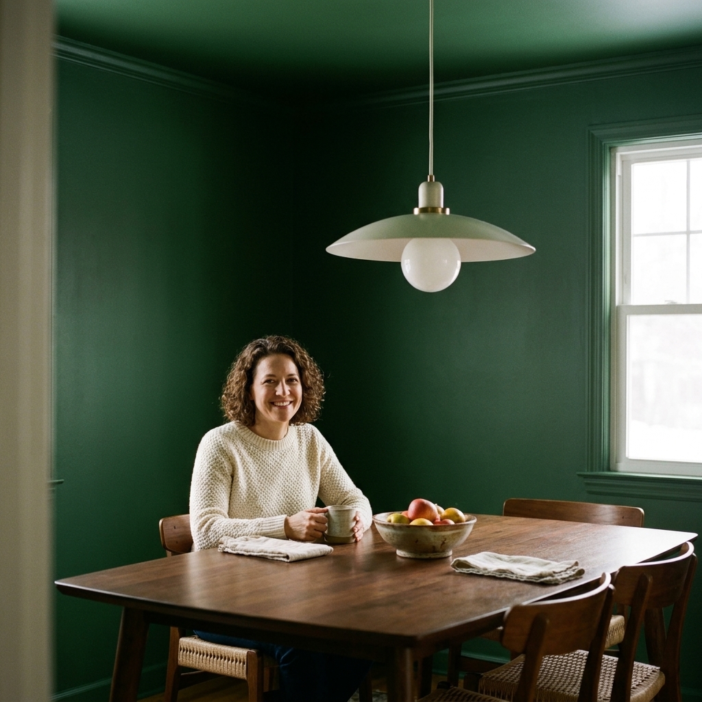
Option 3: Color-drenching
Color-drenching is painting the walls and ceiling the same color. It can look incredibly high-end, but it has to be done with intention.
When it looks best
- Rooms with awkward angles or lots of little planes, like attics and stairwells.
- Smaller rooms where you want a wrapped, cocooned feel, like powder rooms.
- Spaces with great natural light that can handle deeper color overhead.
The tweak that looks polished
Use the same color, but adjust the finish. For example, do walls in eggshell and the ceiling in flat. You get the drench effect without the ceiling reflecting light like a gymnasium.
Option 4: Not-quite-white
If your main goal is brightness, but you want something softer than a stark builder white, choose a ceiling color that is a gentle off-white with the right undertone.
How to pick one
- Match the temperature of the room. Warm room, warm off-white. Cool room, cool off-white.
- Check it next to your trim. If your trim is a creamy white and your ceiling is a cool bright white, the mismatch will shout.
- Use the ceiling to nudge the vibe. A slightly warm ceiling can make a north-facing room feel less cold. A slightly cool ceiling can calm down a very sunny south-facing room.
Trim is the bridge
Trim is the mediator between wall and ceiling. If you change the ceiling color, trim becomes even more important.
- For subtle ceilings: Keep trim the same as your usual trim white, just make sure it shares the same undertone family as the ceiling.
- For high contrast ceilings: Decide whether trim belongs with the wall or with the ceiling. Either choice can work, but a random third white is where things get messy.
- For color-drenching: Paint trim the same color as the walls and ceiling if you want seamless. Paint trim in a contrasting color if you want to frame the room.
One easy coordination move: many people use the same white for ceiling and trim, then change the sheen (flatter on the ceiling, glossier on trim). It keeps the undertones calm and the lines clean.
Choose the right sheen
Most ceilings look best in flat because it hides surface imperfections and avoids glare. But there are exceptions.
- Flat: Best for most rooms, especially if the ceiling has patches, texture, or waves.
- Matte: Often a bit more washable than flat with modern formulas, and still low glare. Great compromise for hallways and kids’ rooms.
- Eggshell or satin: Usually best when you truly need wipeability, like in a kitchen with poor ventilation or a bathroom ceiling that gets steamy. Some designers do use satin on perfectly smooth ceilings, but be prepared to see more flaws.
If you are going darker or more saturated on the ceiling, I strongly prefer flat or matte so it reads velvety instead of shiny.
How to paint it cleanly
Ceilings are unforgiving, and lap marks love to show up right when you think you’re done. A few small technique choices make a huge difference.
- Use the right roller nap: 3/8-inch for smooth ceilings, 1/2-inch for lightly textured, and 3/4-inch for heavier texture.
- Keep a wet edge: Work in sections and overlap while the paint is still wet to avoid stripes.
- Roll in one direction for the final pass: Pick a direction (often toward the main window) and stick with it for your last roll so the finish reads consistent.
- Box your paint: If you need more than one can, mix them together in a larger bucket so the color stays consistent.
Test in your lighting
A ceiling color can look perfect at noon and totally wrong at 8 pm. Test with the lighting you actually use.
My quick testing routine
- Paint a large sample, at least 2 feet by 2 feet, on the ceiling near the main light source.
- Check it in the morning, midday, and at night with your lamps on.
- Stand in the doorway and look in. Doorway views reveal undertone clashes fast.
- Look at it next to trim and wall, not in isolation.
If your bulbs are very warm (2700K) or very cool (5000K), factor that in. Ceiling colors can make bulb warmth or coolness feel more noticeable because light is reflecting off that surface all night.
Room-by-room ideas
Living rooms
- Try a 25% tint of the wall color if you want subtle sophistication.
- Use a soft contrast ceiling to define a big open room, especially if walls are neutral.
Bedrooms
- Bedrooms handle darker ceilings surprisingly well. It can feel like a canopy.
- Muted colors overhead, like dusty blue or warm taupe, help the room feel restful.
Bathrooms
- If you want color overhead, keep it light. Pale blue, pale green, and warm off-whites work beautifully.
- If moisture is an issue, use a bath-rated, mildew-resistant paint (and run the fan). A slightly higher sheen can help with moisture resistance, but it will show more flaws, so matte is usually my sweet spot.
Kitchens
- Consider a ceiling that ties into your cabinets or backsplash undertones.
- In busy kitchens, a quiet ceiling color often looks best, like a warm off-white or a gentle tint.

Common mistakes
- Choosing a ceiling white that fights the trim. Two whites with different undertones can look dirtier than a bold color choice.
- Going too saturated too fast. A ceiling color often reads stronger overhead. If you are nervous, start with a tint.
- Ignoring the transition line. Crown molding, no molding, or painted trim all change how loud the ceiling feels.
- Using shiny paint to brighten the ceiling. It usually just adds glare and highlights every seam.
Quick cheat sheet
- If you want safe but elevated, use a 25% to 50% tint of your wall color in flat.
- If you want bright and soft, choose an off-white that matches undertones with your trim.
- If you want cozy and dramatic, go one to two steps darker than the walls and keep the finish flat.
- If you want designer seamless, color-drench and vary the finish, not the color.
FAQ
Should ceiling paint be lighter or darker than the walls?
Most of the time, slightly lighter reads the most natural and makes the room feel taller. Darker ceilings can be gorgeous for cozy rooms, but they change the mood fast, so test first.
Can I paint the ceiling the same color as the walls?
Yes, and it can look incredibly intentional. Use a flat or matte finish on the ceiling to avoid glare, and consider whether you want trim to match or contrast.
Will a darker ceiling make my room look smaller?
It can make the ceiling feel lower, but that is not always bad. In a bedroom or den, that lower feeling often translates to cozy. In a cramped room with low ceilings, keep the ceiling lighter or use a very muted darker tone. If you have crown molding, painting the crown the same color as the ceiling can also soften the transition and make the top edge feel less choppy.
Do I need special ceiling paint?
Not necessarily. A high-quality interior paint in flat or matte works well. In bathrooms and kitchens, look for a formula that can handle humidity and light cleaning.
The easiest next step
If you are standing in your room right now feeling tempted but unsure, do this: pick your current wall color, get a sample mixed at 25% strength (or the closest reduced formula your brand offers), and paint a big square on the ceiling. It is the least scary way to go beyond white, and it is often the choice that makes the whole room click.