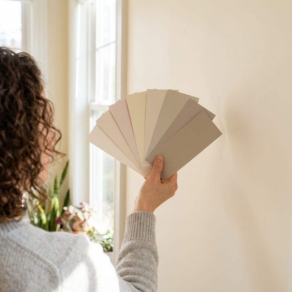
Mixing warm and cool paint colors in one space is one of my favorite ways to make a room feel layered and lived-in. It is also one of the fastest ways to end up with a room that feels slightly… queasy. Not because warm and cool cannot coexist, but because undertones rarely forgive.
The good news: you do not need a design degree to pull off warm earth tones with cool blues and grays. You just need a plan for undertones, light, and where each temperature “lives” in the room.

Warm vs cool basics
Most people think “warm” means beige and “cool” means gray. In real life, a color’s temperature is about its undertone.
- Warm undertones: yellow, red, orange, golden brown, pink, peach.
- Cool undertones: blue, green, violet, icy gray.
- Neutral undertones: balanced mixes that do not lean strongly warm or cool, although light can push them either direction.
Here is the key: two colors can look great as tiny swatches and still clash when they cover four walls. That clash is often undertone friction, not the main color family.
A few quick translations, because paint names can feel like their own language:
- Greige: a beige-gray blend that can lean warm or cool depending on the formula.
- Mushroom: a soft taupe-beige with a muted, earthy cast.
- Slate: a deeper gray that often carries blue or green undertones.
The Dos
Do pick a “boss” temperature
Decide which temperature is the main character in the room, then let the other one play a supporting role. This keeps the space intentional instead of accidentally mismatched.
- If warm is the boss: think warm off-white or earthy greige on most walls, with a cool blue-gray on a built-in, a door, a vanity, or a smaller accent area.
- If cool is the boss: think cool light gray or dusty blue on most walls, with warm clay, tan, or mushroom tones in an accent wall, niche, or adjoining space.
Do match undertone families
Instead of pairing “a beige and a gray,” pair undertones that share a common ingredient.
- Warm clay + cool blue-gray often works when the blue-gray is slightly muted, not icy.
- Warm greige + cool slate often works when the greige is not overly yellow.
- Warm taupe + cool green-gray often works when both feel a little grounded and dusty.
My quick check: if one color looks like it belongs in a sunny desert and the other looks like it belongs in a fluorescent office, they are not friends.
Do use a bridging neutral
A bridging neutral is the peacekeeper that helps warm and cool share the same room. Great bridge colors include:
- Greige that sits between beige and gray
- Taupe with a gentle violet or brown base
- Soft, creamy off-white that is not too yellow and not too stark
- Weathered wood tones and warm white oak floors, which naturally soften cool paints
Even if you do not paint a full wall in a bridge color, you can “bridge” with trim, ceiling paint, or a large painted built-in.
Do consider light first
Light is the director of the whole show. The same warm beige can look cozy at noon and strangely pink at sunset. The same cool gray can look crisp in one room and oddly green in another.
- North-facing rooms typically amplify coolness. Warm colors can help, but avoid anything too yellow.
- South-facing rooms typically bring warmer, stronger light. Cool colors can look cleaner here, and warm colors can get extra golden.
- East-facing rooms tend to get warmer, direct light in the morning, then cooler, bluer, indirect light later in the day.
- West-facing rooms get dramatic warm light late day. Cool colors can turn moody, warm colors can glow.
Note: these light directions are a helpful starting point (especially in the Northern Hemisphere), but outdoor conditions matter. Trees, overhangs, nearby buildings, and reflected light can change everything.
When mixing temperatures, test your samples on two walls that get different light. Stand at your typical viewing distance and peek from adjoining rooms or hallways. If they only work on one wall, the pairing might not be stable enough.
Do repeat each temperature
This is the secret to making mixed temperatures look intentional. If your walls are warm and you add one cool moment, repeat the cool tone elsewhere.
- Cool paint on a built-in plus the same cool note echoed in a rug pattern.
- Warm wall color plus warm wood shelves plus a warm-toned lampshade.
Repetition calms the eye. One-off colors can read like a mistake.
Do use sheen to control intensity
Warm and cool colors can both get intense when they reflect light. Sheen is a quiet but powerful balancing tool.
- Walls: matte or eggshell keeps undertones calmer.
- Trim and doors: satin or semi-gloss adds crispness and can help separate warm walls from cool adjacent colors.
- Accent areas: a slightly higher sheen can make a cool color feel cleaner, or a warm color feel richer.
Do separate temperatures cleanly
If you are changing temperature from one wall to the next, give it a break so your eye understands it is a choice.
- Use consistent trim color throughout the space.
- Use clear architectural stops like a corner, a doorway, a beam, or a wainscoting line.
- In open concept spaces, define zones with one unifying neutral and then assign warm or cool to specific areas.
The Don’ts
Don’t mix icy cool with buttery warm
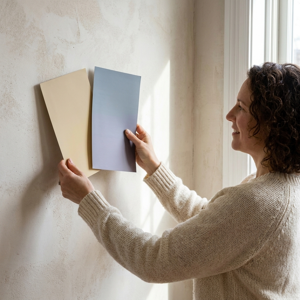
This is the pairing that can make a room feel unsettled. If the cool color is very icy and blue-based, the warm color needs to be cleaner and less yellow. If the warm color is creamy and golden, the cool color needs to be softer and more muted.
Don’t ignore fixed finishes
Your floors, countertops, and big upholstery pieces are part of your color temperature whether you like it or not.
- Honey oak floors read warm. Many cool grays can look harsher next to them unless you choose a gray with a softer, warmer undertone (often greige).
- Cool white quartz with gray veining reads cool. Very creamy wall paint can look extra yellow beside it.
- Red brick fireplaces are warm and strong. Cool wall colors can be gorgeous here, but choose a cool paint that is slightly muted so it does not fight the brick.
Don’t rely on one tiny sample
Those little paint chips are a confidence trap. Tape up larger samples, use peel-and-stick samples, or paint primed poster board so you can move it around the room.
Leave samples up for 48 to 72 hours and check them morning, afternoon, and evening. Clashes often show up at night under lamps, but daylight can reveal issues too.
Don’t let trim white pick a side
Trim color is often the real reason mixed palettes feel wrong. A bright, cool white trim can make warm walls look more yellow. A creamy trim can make cool gray walls look a little muddy.
If you are committed to mixing temperatures, aim for a trim white that is fairly flexible: not stark, not buttery. Then stick with it consistently across the room.
Don’t assume all grays behave
“Gray” can be blue, green, purple, or brown. Two grays can clash as badly as orange and teal if their undertones are different.
When you bring a cool gray into a warm room, be cautious with grays that flash green under warm bulbs unless you are intentionally pairing them with green-based earth tones.
Don’t confuse value with temperature
Sometimes the “clash” is not warm vs cool. It is value (how light or dark a color is). A very dark cool accent can feel harsh next to a very light warm wall, even if the undertones are compatible.
If your pairing feels jumpy, try adjusting the lightness or darkness first. Keep the temperatures, soften the contrast.
Don’t put competing temps on huge adjacent planes
Warm walls next to cool walls can look sharp in a good way, but it needs a reason. If two big planes meet at a corner and they both want attention, the room can feel busy.
A safer approach is: one temperature for the majority of large surfaces, the other temperature for smaller moments.
Bulbs matter too
If your paint samples look perfect in daylight and weird at night, it might not be the paint. It might be your bulbs.
- 2700K is warm and cozy, but it can pull warm paints yellower and push some cool grays toward green.
- 3000K is a popular middle ground for living spaces and often reads more neutral.
- 3500K to 4000K is crisper and can make cool colors feel cleaner, but it can also make warm colors feel flatter.
Also check CRI (color rendering index). Low-CRI LEDs can distort undertones and make everything feel slightly off. If you can, choose bulbs with a CRI of 90+ for rooms where you care about color.
Easy pairings
If you want a starting point, these mixes tend to behave well in real homes because they rely on muted, complex colors rather than extremes.
Warm earth walls + cool blue-gray
- Walls: warm greige, mushroom, light tan
- Accent: dusty blue-gray or slate
- Why it works: the warm base feels welcoming, and the cool accent adds depth
Cool gray walls + warm clay
- Walls: soft cool gray (not icy)
- Moment: a warm terracotta powder room wall, a painted arch, a niche, or a single built-in
- Why it works: cool walls feel calm, and the warm note keeps it from feeling sterile
Warm off-white + cool green-gray
- Walls: creamy off-white that is not too yellow
- Cabinets: muted green-gray (sage-leaning but grounded)
- Why it works: the off-white acts like sunlight, the green-gray reads sophisticated and steady

Weekend test method
- Choose your anchor: the color that will cover the most square footage.
- Pick the counterbalance: the warm or cool partner color, but keep it muted at first.
- Grab a bridge: a trim white or greige that can sit between them.
- Test large: paint two 2 ft by 2 ft areas for each color on different walls (or use painted poster board).
- Let it dry fully: paint often dries darker and undertones can settle as it cures.
- Check under your real bulbs: overhead lights, lamps, and any under-cabinet lighting.
- Look next to fixed finishes: floors, tile, countertops, and the biggest fabric in the room.
If one color suddenly looks neon, dirty, or strangely pink or green, do not force it. In many cases, swapping to a version that is slightly more muted or slightly more neutral is all it takes.
Remember these
If you only remember three things, make it these:
- Undertones matter more than labels.
- Pick a boss temperature, then repeat the supporting one.
- Test in your actual light, day and night.
Quick FAQs
Can you mix warm and cool in open concept?
Yes, but use one unifying neutral for trim and transitions, then assign warm or cool to specific zones. Think: warm living area, cool kitchen cabinetry, and a bridging greige or consistent white trim tying it together.
How do I keep cool grays from looking blue?
Avoid icy, blue-forward grays. Choose a gray softened with a little warmth (often labeled greige), and test it at night under your bulbs. Lighting and bulb temperature are common culprits.
What is the safest way to add a cool color?
Use the cool tone on a smaller surface first: a door, built-ins, a vanity wall, or a bookcase. Then repeat that cool note elsewhere with textiles so it reads intentional.
Does finish matter?
It matters more than people expect. Higher sheen reflects more light and makes undertones louder. When in doubt, keep walls in matte or eggshell and use satin or semi-gloss for trim and doors.