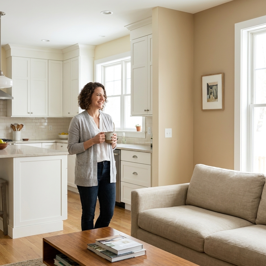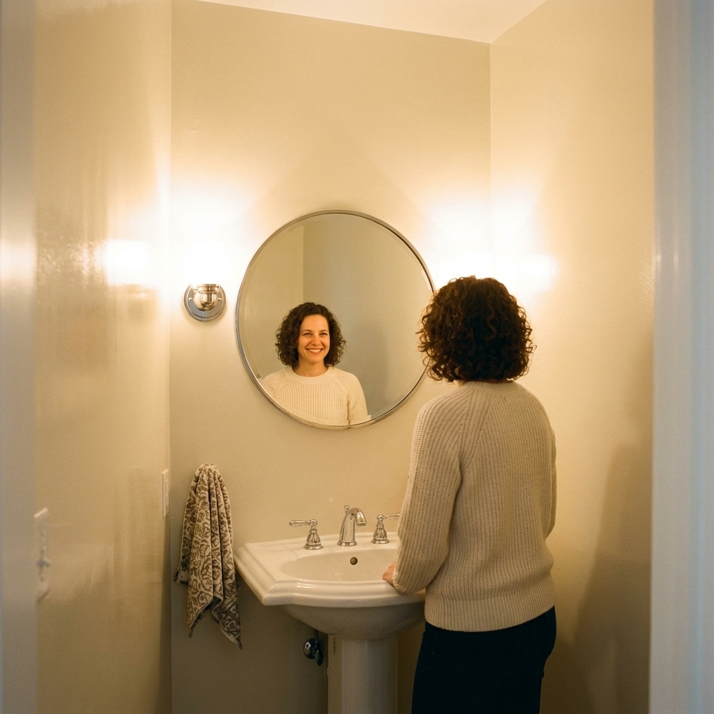
There are two very different ways to “frame” a room with paint. You can color drench, meaning walls, trim, and often the ceiling all go the same color. Or you can go high contrast, the classic approach where trim and doors are noticeably lighter, darker, or simply crisper than the walls.
I have used both in real homes, on real budgets, with baseboards that were not as straight as I wanted them to be. The right choice depends less on what is “correct” and more on what you want the room to do: feel more open or more tailored, cozy or architectural, calm or energetic.

Quick definitions
What color drenching means
Color drenching is painting the walls and trim the same paint color. Many people also paint the ceiling, doors, and sometimes even built-ins the same color to fully wrap the room. The architecture does not disappear, it just reads more quietly because there is no outline color calling attention to every edge.
What high contrast means
High contrast is the traditional pairing: a wall color plus a contrasting trim color. That contrast can be bold (inky trim with light walls), soft (warm white trim with a greige wall), or modern (same undertone, different depth). The key is that the trim is intentionally separate.
How each strategy changes a room
Color drenching: calm, cozy, and often more open
- It reduces visual breaks. When your eye is not stopping at bright baseboards and white crown molding, the perimeter reads smoother. In many rooms, that can make the space feel less chopped up, and sometimes even a touch larger.
- It can make awkward architecture look cleaner. Short walls, soffits, random bump-outs, and too-many-doorways situations often feel less busy when everything is wrapped in one tone.
- It amplifies mood. Drenching in a deep olive, a smoky blue, or a warm clay is like turning up the mood of the room.
Watch-outs: Drenching can make surface issues more noticeable up close, especially where light skims across trim (raking light) or where sheen is higher. The flip side is that from across the room, the reduced contrast can be more forgiving. Prep and sheen choices are what decide which way it goes.
High contrast: crisp, tailored, and more architectural
- It outlines the bones of the room. Trim becomes a frame, which can be gorgeous in older homes with detailed casing.
- It can brighten the perimeter. Light trim often reflects more light than dark trim, which can help edges feel cleaner and a little brighter, depending on your lighting, sheen, and how much natural light the room gets.
- It makes color feel safer. If you are nervous about a bold wall, white or off-white trim can keep things grounded.
Watch-outs: High contrast shows every wavy caulk line and every slightly crooked cut-in. If you have lots of doors and windows, you are also signing up for more detailed painting time.

When color drenching is the better choice
1) Small rooms that feel chopped up
Powder rooms, hallways, laundry rooms, and small bedrooms often feel larger when you remove that “white outline” effect. If the room has multiple doors, drenching can make it feel less like a set of rectangles.
2) Rooms with fussy angles or awkward ceiling lines
Attic bedrooms, finished basements with soffits, and rooms with bulkheads can look more intentional when everything is wrapped in one color.
3) Spaces where you want a cocoon effect
Bedrooms, TV rooms, libraries, and reading nooks love drenching. It is the paint equivalent of lowering the lights and settling in.
4) When your trim is basic or mismatched
If you have a mix of trim profiles, or builder-basic casing that is not adding much character, drenching stops it from competing with the room.
When high contrast is the better choice
1) Rooms with beautiful historic trim
If you have tall baseboards, ornate crown, or wide casings, contrast helps showcase the craftsmanship. In these rooms, trim is not just functional, it is decor.
2) Open layouts where you want clear boundaries
High contrast can help define the “edge” of a space in open concept areas, especially when adjacent rooms have different wall colors or different light conditions.
3) Very dark wall colors in low light
Dark walls can be stunning, but in a naturally dim room, pairing them with lighter trim can keep the room from feeling heavy at eye level. You can still go moody without going full cave.
4) Rental-friendly refreshes
If you are painting walls but leaving trim alone, high contrast is often the simplest path. Clean the trim well, touch up scuffs, and let it stay the “frame.”
Finish matters
You can make either strategy look expensive or sloppy depending on sheen choices. Here is what tends to work in real life.
Color drenching finish options
- Safest and most common: Walls in eggshell or matte, trim in satin, all tinted to the same color. You get the wrapped look, but trim still has a subtle shift because light hits satin differently.
- Ultra modern: Everything in matte. This is gorgeous, but trim takes more hits, so choose a durable washable matte formulated for trim or cabinets.
- Traditional but dramatic: Walls in eggshell, trim and doors in semi-gloss, same color. This highlights profiles through sheen, not through a different color.
High contrast finish options
- Classic pairing: Walls in eggshell, trim in satin or semi-gloss.
- Soft contrast look: Walls in matte, trim in satin. The sheen difference alone can add polish even if your trim color is only slightly different.
My rule of thumb: If you have kids, pets, or a narrow hallway, pick a finish on trim that you can wipe without panic. Satin is usually the sweet spot.
Undertones
Whether you drench or contrast, undertones decide if things feel cohesive or accidentally weird.
If you are color drenching
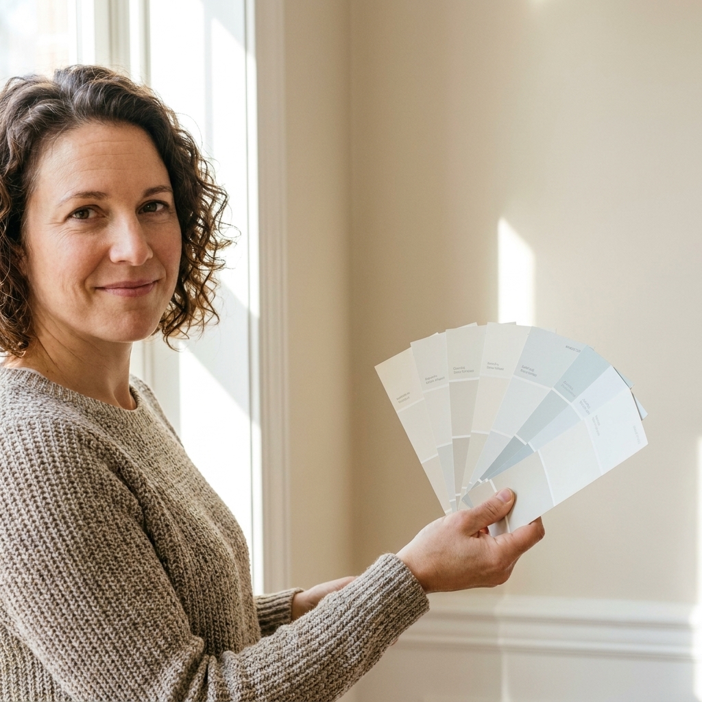
The undertone challenge is simpler because you are using one color. The bigger issue is lighting shifts. A green-gray can look serene in morning light and muddy at night under warm bulbs. Sample the color on multiple walls and check it at least twice: daytime and nighttime.
If you are using high contrast
Trim whites are not neutral. Pairing a cool, crisp white trim with a warm wall color can create a subtle clash that reads “off” without you knowing why.
- Warm walls (creams, beiges, warm greiges, terracotta): pair with a warm white trim.
- Cool walls (blue-grays, crisp grays, blue-greens): pair with a cooler white or a neutral white.
- Very saturated walls (navy, forest, aubergine): either go crisp white for a clean pop or go tinted off-white for a softer edge.
Room by room
Living room
Go high contrast if you want a classic, airy feel and you have nice trim worth highlighting. Go drench if your living room is a pass-through space and you want it to feel calmer and more intentional.
Bedroom
Bedrooms are one of the easiest wins for color drenching, especially with medium to deeper colors. If you love the look of a painted ceiling but fear commitment, start by drenching walls and trim first. You can always bring the ceiling in later.
Bathroom
Drenching can make a small bath feel like a jewel box. For bathrooms with lots of white porcelain and chrome, a drenched color gives those fixtures a clean, crisp contrast automatically.
Kitchen
Most kitchens already have a lot of visual movement: cabinets, counters, backsplash, appliances. High contrast trim is often not the star here. If your cabinets are already a bright white, stark white trim can feel redundant, so a slightly softer trim white or low contrast trim can look more intentional. If your kitchen has painted trim and doors, I usually lean high contrast but quiet, like a soft wall color with a slightly warmer or cleaner trim. Full drenching can work in a breakfast nook or pantry, where it feels more contained.
Hallways and stairwells
These areas are often shadowy and full of doorways. Color drenching is fantastic here because it reduces the “outline” effect around every opening. Choose a durable wall finish and do not skip the washable factor.
Primer and paint type
If you want the finished look to last, this is the unglamorous part that matters.
When to prime
- Glossy trim: Clean, lightly scuff sand or degloss, then use a bonding primer so your paint actually sticks.
- Stained wood or tannin-prone trim: Use a stain-blocking primer to prevent bleed-through, especially on older wood.
- Previously oil-painted trim: You can repaint successfully, but adhesion is the whole game. Good cleaning, scuffing, and a bonding primer go a long way.
Use the right paint on trim
Wall paint is made to look great on broad surfaces. Trim takes hands, bags, vacuums, and life. For trim and doors, a trim enamel (often labeled as a waterborne enamel or alkyd hybrid) typically levels better and cures harder than standard wall paint. You will usually get a smoother finish and better durability, whether you are drenching or contrasting.
Prep and technique
For color drenching
- Clean and degloss trim. Especially if it is glossy or oily from years of hands.
- Fill and sand. Dings in baseboards and door casings can show more when everything is one color, because your eye is not distracted by contrast.
- Caulk intentionally. A smooth caulk line is the difference between “designer” and “DIY weekend.” Use paintable acrylic latex caulk, and paintable siliconized acrylic latex caulk is also a solid option.
- Expect multiple coats on trim. Trim paint needs coverage and leveling. Use a quality angled brush and do not overwork it.
For high contrast
- Prioritize tape where it matters. If you are not confident cutting in against crisp white trim, tape is your friend. Press it down firmly and remove it while paint is still slightly tacky.
- Paint order helps. There is more than one workable sequence, but a common approach is ceiling, trim, then walls. It lets you be less precious when cutting walls to trim than trim to walls.
- Use the right brush. A 2 to 2.5 inch angled sash brush makes the cleanest trim lines with less wobble.
Two hybrid options
Drenched walls and trim, lighter ceiling
If you like the wrapped feeling but worry a dark ceiling will shrink the room, keep the ceiling a softer white or a lighter tint of the wall color. It still feels cohesive, just a bit more breathable overhead.
Low contrast trim
This is my “I want something special but I do not want drama” option. Choose trim that is a shade or two lighter or darker than the wall, or use the same undertone family. You get definition without the stark outline.
Decision checklist
- Do you want to highlight trim details? Yes: high contrast. No or trim is basic: consider drenching.
- Is the room small or awkwardly shaped? Drenching often helps it feel smoother.
- Is the room dark? High contrast can make edges feel brighter. Drenching can still work, just consider a mid-tone instead of the deepest shade.
- How much time do you want to spend cutting in? High contrast takes more patience. Drenching is simpler at the edges but demands better prep on trim.
- Do you want cozy or crisp? Cozy: drench. Crisp: contrast.
FAQ
Does color drenching make a room look smaller?
Not automatically. Reducing contrast can make the perimeter feel less chopped up, which often reads bigger. Very dark drenching can feel more intimate, though, especially with limited natural light.
Do I have to paint the ceiling when color drenching?
No. Painting walls and trim the same color gets you most of the look. Bringing the ceiling into the same color just makes it more immersive.
Can I color drench with white?
Yes, and it is quietly beautiful. The room will still have depth because shadows define trim profiles. Use different sheens to keep it from feeling flat.
What if my trim is stained wood?
Then you are naturally in high contrast territory, unless you plan to paint the trim. Wood trim with colored walls can be gorgeous. Just make sure the wall color plays nicely with the wood undertone, especially orange or red oak.
Which strategy is more forgiving for beginners?
High contrast is less forgiving at the edges, but more forgiving about trim imperfections because trim is often white and familiar. Drenching is more forgiving at edges, but less forgiving if your trim is beat up or glossy. If you are new, pick the strategy that matches your patience level: steady cut-ins (contrast) versus thorough prep (drench).
My take
If you are craving a room that feels elevated fast, color drenching is a bold move with surprisingly practical benefits. If you love that clean, finished look where every window and doorway feels “framed,” high contrast is timeless for a reason.
Either way, the secret sauce is not just color. It is prep, sheen, and lighting. Once those are right, you can commit to your choice and roll with confidence.