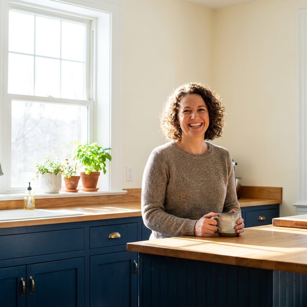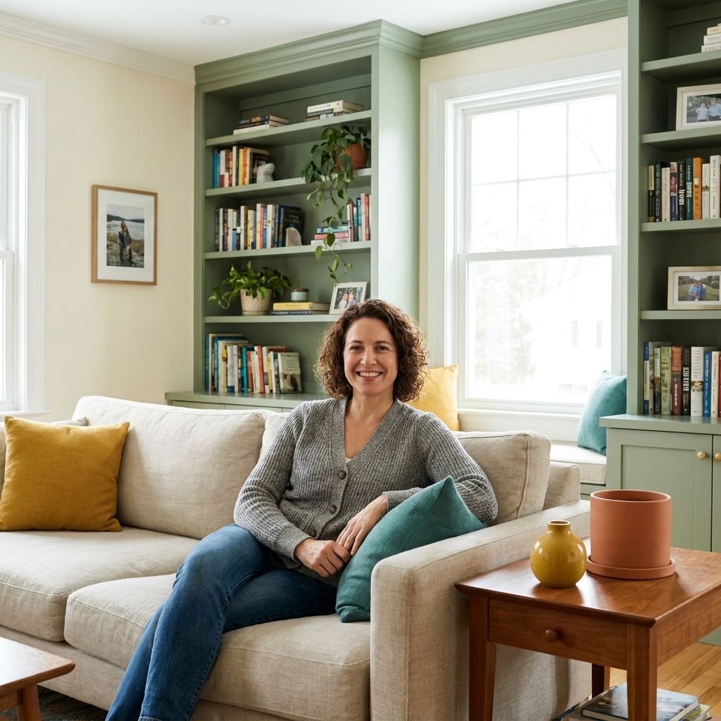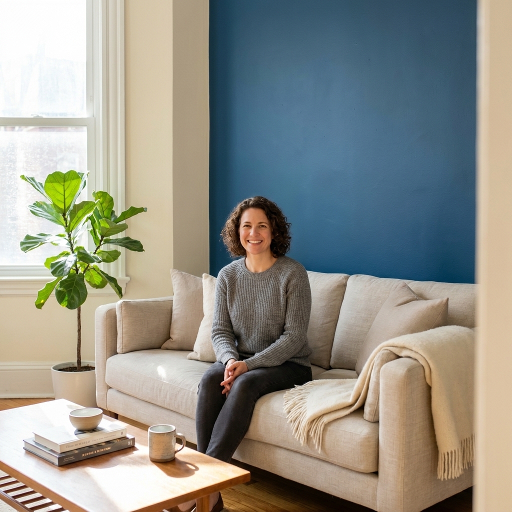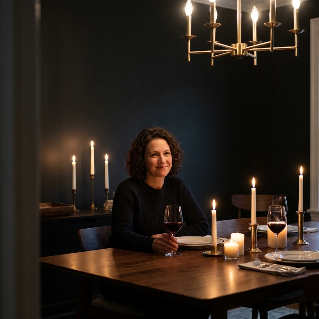
Open concept spaces are wonderful until you're standing in the paint aisle holding six “warm whites” that somehow all look different in your house. The trick isn't forcing one color everywhere. It's building a small, intentional palette that repeats, transitions, and makes the kitchen and living area feel like they belong to the same home.
Below is the approach I use when a kitchen flows straight into a living room. We'll keep it cohesive with color zoning and transition shades, plus a few very practical rules about undertones, sheen, and where to stop and start paint lines.
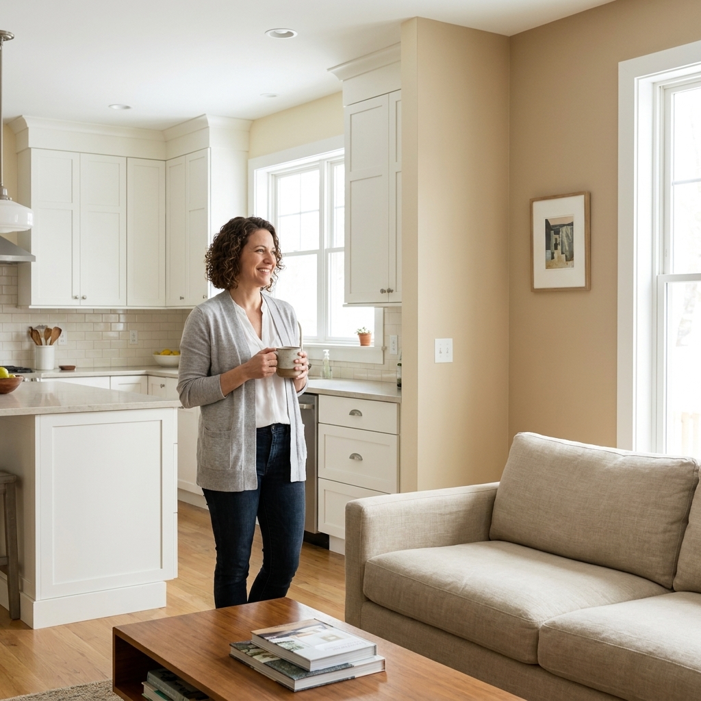
Start with the anchors you can't easily change
Before you pick a wall color, take inventory of the “bossy” finishes that already dominate the space. In open concept layouts, these anchors show up everywhere, so they'll either help your palette feel seamless or fight it.
- Kitchen cabinets (painted or wood tone)
- Countertops (especially quartz patterns and granite with strong movement)
- Flooring (usually the biggest unifier across zones)
- Backsplash (small but loud if it has a cool gray or creamy beige cast)
- Upholstery and rugs in the living room
Pick one anchor to match most closely, usually the countertop or flooring. Then choose wall colors that share the same undertone family. This is where cohesive open concept palettes are won or lost.
Undertones first, color second
If you only remember one thing: undertone matters more than whether a paint color is technically beige, greige, or white. In an open plan, you can walk five steps and watch a color shift. That's normal. What you don't want is a shift that reads like two different decisions.
Quick undertone checks (no fancy tools required)
- Hold paint swatches against your countertop and look for any sudden pink, green, or violet cast you didn't notice in the store.
- Compare swatches to a true white sheet of paper. The paper helps reveal if the paint is creamy (yellow), cool (blue/gray), or leaning olive or green-brown.
- Check morning and evening light. Kitchens often have cooler task lighting while living rooms pick up warm lamps. Your palette has to survive both.
If your kitchen finishes lean warm (honey oak, creamy quartz, brass), keep your wall colors warm-leaning. If they lean cool (blue-gray tile, bright white quartz with gray veining, chrome), stay in the cooler lane. Mixing temperatures can work, but it needs a deliberate transition plan, not accidental drift.
Build a 3-color palette
For most open concept kitchen and living spaces, I recommend a simple three-part system. It gives you variety without chaos.
1) A whole-home neutral
This is your connective tissue. Use it on the majority of walls, especially hallways, transitional walls, and any area you can see from multiple viewpoints.
- Best for: open walkways, stair walls, ceilings (if you're keeping them the same color), and any wall shared by both zones
- Look for: a neutral with a clear undertone and a comfortable mid-range lightness
2) A living zone color
This is where you can add depth or softness without making the kitchen feel disconnected. Often it's one step deeper or one step warmer or cooler than the whole-home neutral.
- Best for: the TV wall, fireplace wall, built-in wall, or the wall behind a large sofa
- Look for: a shade that's related, not random. Same undertone, different depth.
If you like a practical target: “one to two steps deeper” is often about 10 to 20 LRV points lower than your main neutral, while keeping the undertone consistent.
3) A kitchen-adjacent transition shade
This one's optional, but it's magic when you have a kitchen with a lot of cabinets (and therefore fewer painted walls). A transition shade can live in the dining nook, pantry hall, or the short wall that sits between kitchen and living.
- Best for: a breakfast area, a small hallway to a mudroom, or the wall behind a bar or beverage station
- Look for: either a half-step between your two main colors, or a quieter version of your living zone color
When you use three related colors, your eye reads “intentional.” When you use five unrelated ones, your eye reads “we ran out of paint and changed our mind.”
Where to change colors
The easiest way to make zoning look clean is to change color at a natural stopping point. You're looking for architectural reasons, not arbitrary lines in the middle of a wall.
Good stopping points
- Inside corners where walls meet
- Major openings, like a wide cased doorway or an arched opening
- Ceiling changes, like a soffit, beam, or tray ceiling
- Built-ins or a fireplace surround that visually frames a wall
- Back wall of a defined dining nook, especially if it has a chandelier centered over the table
Tricky spots and what to do
Long shared wall that runs from living room into kitchen: Keep that wall one color. Let zoning happen on perpendicular walls, accent walls, or via sheen and trim.
Kitchen peninsula that faces the living room: This is a visual bridge. Try to keep the wall color consistent nearby, and use the island color, stools, or lighting to define the kitchen zone instead.
Open concept with a small dining area between: Treat the dining area as the transition zone. Paint it the whole-home neutral, and use the deeper living color where the living room truly begins.
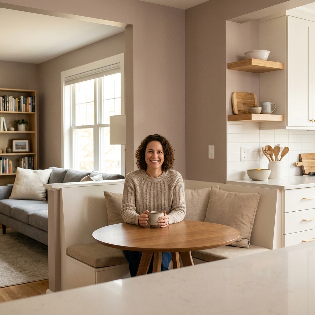
How to handle openings
Open doorways and cased openings are where open concepts can get messy fast. A simple rule: keep trim consistent, and let the wall color change at a place that looks intentional.
- If you have cased openings: paint the casing and any baseboards the same trim color throughout. For the wall color, it's usually cleanest to stop at the inside corner where the wall meets the casing.
- If you have no casing (drywall returns): pick one of two strategies and stick with it. Either wrap the wall color into the return so it looks like a continuation of that zone, or paint the return the same color as the adjacent main space to keep the transition quiet. Don't alternate from opening to opening.
- If you can see both rooms at once: prioritize sightlines. The color you see most from the main viewpoint should carry through the opening so you don't get a chopped-up look.
Transition shades
If you want the living room moodier than the kitchen, you don't need to give up. You just need a transition that keeps the undertone consistent and the contrast reasonable.
Three transition methods
- Same color, different depth: Choose one paint line and go 1 to 2 steps deeper in the same family for the living area. This reads calm and cohesive.
- Same undertone, different hue: For example, a warm greige in the kitchen-adjacent walls and a muted clay-tan in the living room. Different, but still related.
- Use trim as the buffer: If the walls change color, keep the trim color consistent throughout. That clean white or soft white line helps your eye accept the change.
A personal rule: if you can see both colors in the same glance, they should feel like cousins, not strangers.
Sheen matters
In open concept spaces, sheen is part of the palette. Kitchens have grease, moisture, and more wiping. Living rooms usually want softness and low glare. You can meet in the middle without creating a patchwork effect.
A reliable sheen plan
- Walls (most open concept spaces): eggshell for durability with minimal shine
- Kitchen walls near cooking zones: eggshell or satin if you wipe often
- Living room walls: eggshell, or matte if you have pristine walls and gentle lighting
- Trim and doors: satin or semi-gloss, consistent across both zones
- Ceilings: flat ceiling paint
One important nuance: sheen labels aren't perfectly standardized. One brand's matte can behave like another brand's eggshell. If you're switching product lines, check the sheen in person and test a small patch before you commit.
If you use satin in the kitchen and matte in the living room, keep the color the same on shared sightline walls. Otherwise the sheen change can look like a color change.
Ceilings and trim strategy
If you want the whole space to feel calm, keep the “outline” consistent.
- Trim: one trim color across the entire open area is almost always the cleanest choice.
- Ceilings: in most open concepts, one ceiling color throughout looks tallest and most cohesive, even if the wall colors change.
- Soffits and beams: if a beam or soffit is a true feature, you can highlight it on purpose (often in the trim color). If it's purely functional, painting it the ceiling color usually helps it fade back.
Palette recipes
Instead of giving you a random list of paint names, here are palette structures you can translate into any brand. Take these to your swatches and match undertones to your fixed finishes.
Recipe 1: Light and airy
- Whole-home neutral: soft warm white or creamy off-white
- Living zone: light warm greige, 1 step deeper
- Transition: the warm white repeated in the dining nook
Recipe 2: Cozy contrast
- Whole-home neutral: pale greige
- Living zone: medium greige or mushroom, same undertone
- Transition: a half-step shade between them on the wall nearest the dining table or entry
Recipe 3: Modern and clean
- Whole-home neutral: cool off-white or very light gray with a crisp undertone
- Living zone: muted blue-gray or charcoal-leaning gray for a single focal wall
- Transition: keep everything else the whole-home neutral and repeat the blue-gray in textiles
Recipe 4: Warm and earthy
- Whole-home neutral: warm beige-leaning greige
- Living zone: soft clay, tan, or camel in a muted finish
- Transition: paint the dining nook the whole-home neutral, then bring clay in through the living room wall or built-ins
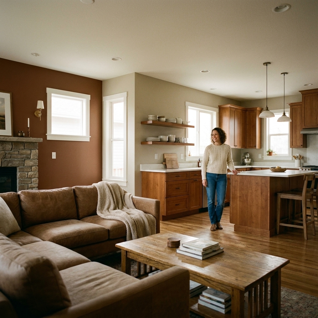
Test the right way
Swatches lie. Lighting lies. Even your cabinets can distort color. The fastest way to get confident is to test correctly, and you don't need to paint your whole wall in five colors to do it.
The quick sample routine
- Pick 3 contenders max for your whole-home neutral.
- Paint poster boards (two coats) or use large peel-and-stick samples.
- Let coats dry fully. This isn't hard, but it does take drying time. Think of it as about 20 minutes of active work spread over a day.
- Move the samples between kitchen, dining, and living sightlines.
- Check at four times: morning, midday, evening, and with only lamps on.
- Stand at the transition point and look back and forth. If one sample suddenly goes pink or green, it's out.
When you find your whole-home neutral, choosing the zone color gets much easier because you're matching to a known quantity.
Make it feel intentional
Cohesion isn't just wall paint. It's repeating the same color note across the open space so it feels designed.
Easy repetition ideas
- Repeat the living zone color in pillows, art, or a rug that's visible from the kitchen.
- Repeat the kitchen's metal finish (brass, black, chrome) in living room lamps or frames.
- Use the same trim color across the entire open area.
- If you're painting cabinets or an island, treat that as part of your palette, not separate from it.
Think of it like getting dressed. You don't need a matching set. You need colors that talk to each other.
Quick FAQ
Should an open concept be all the same color?
No. One color everywhere can look flat, especially if your layout is large. A better approach is one main neutral plus one or two related zone colors that change at natural stopping points.
How many paint colors is too many?
For connected kitchen, dining, and living areas, three wall colors is usually the sweet spot. If you go beyond that, keep additional colors to small spaces (like a powder room) so your main level still reads cohesive.
Can I do an accent wall?
Yes, as long as it's anchored to a focal point (fireplace, TV wall, built-ins) and the accent color relates to the rest of your palette by undertone.
What if my kitchen is warm but my living room furniture is cool?
Choose a bridge neutral that's genuinely balanced, not extremely warm or icy cool. Then repeat warm notes and cool notes on purpose through textiles and decor so it feels blended rather than conflicting.
A simple weekend plan
- Step 1: Identify your fixed anchors (floors, counters, cabinets) and decide if they read warm or cool.
- Step 2: Choose a whole-home neutral that matches those undertones.
- Step 3: Add a living zone color that's either deeper or slightly different in hue, but in the same undertone family.
- Step 4: Decide where the color will stop and start using inside corners, cased openings, and natural breaks.
- Step 5: Test large samples at multiple times of day before you commit.
When your palette is cohesive, open concept stops feeling like one giant room you have to match. It starts feeling like a connected set of spaces that each get to have their own personality.