An accent wall is basically the living room’s spotlight. Done well, it adds depth, cozy contrast, and a little personality without demanding you replace your sofa. Done poorly, it can feel like your room is wearing a loud shirt it cannot pull off.
The secret is not finding the boldest color. It is choosing a color that plays nicely with three things: your main wall color, your lighting, and your biggest pieces of furniture. Here’s the process I use when I’m helping friends commit to a color without regret.
Step 1: Choose the right wall first
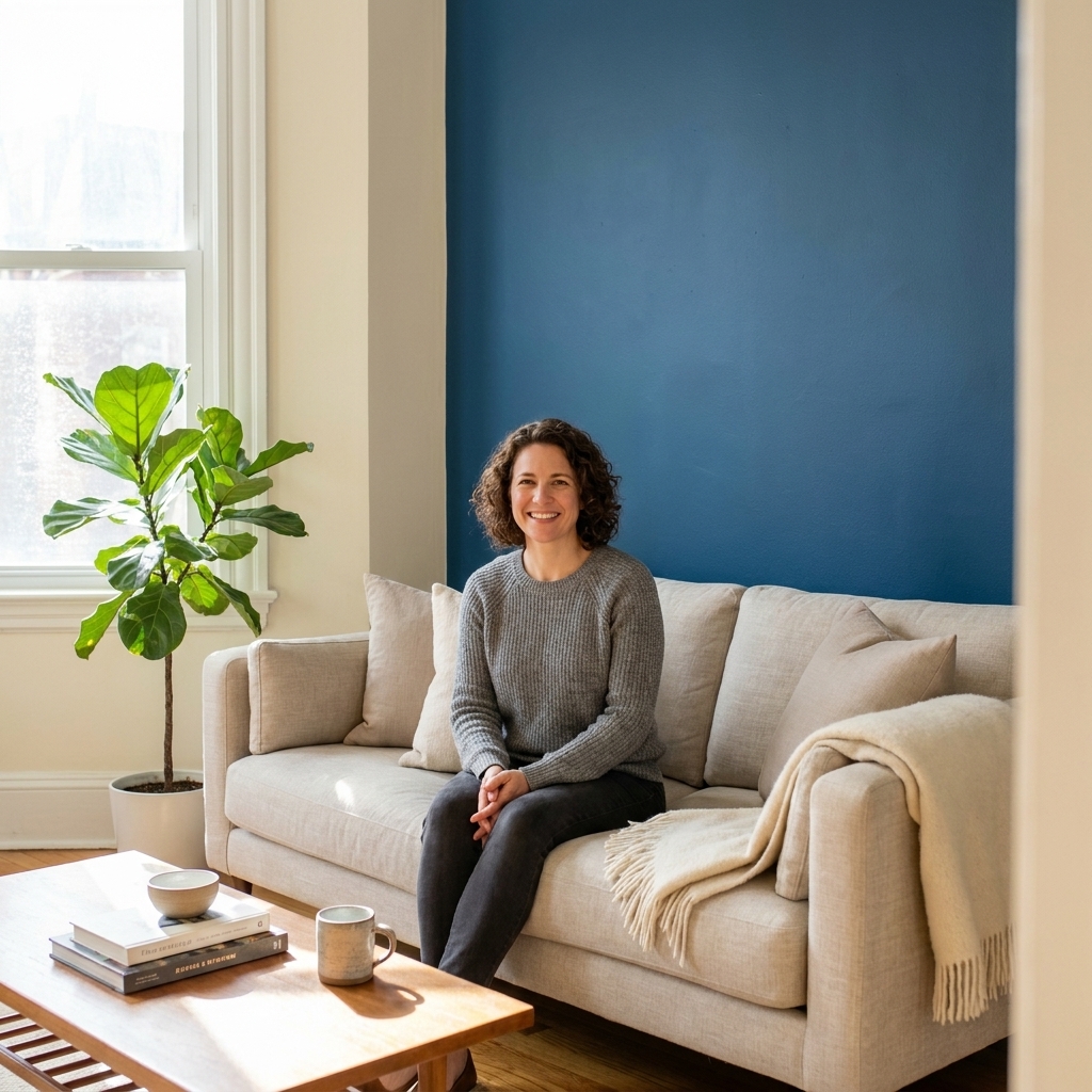
Before we talk color, make sure you are accenting the wall that makes the most sense visually. The best accent walls are the ones your eyes naturally land on when you enter the room.
- Great candidates: the wall behind the sofa, the wall with a fireplace, built-ins, or a large piece of art, or the wall framing a TV if you want it to blend in.
- Walls to avoid: a chopped-up wall with lots of doorways, a wall with awkward vents or off-center windows, or any wall that already looks busy.
If you are stuck between two walls, pick the one with the cleanest shape. Color looks more intentional on a simple rectangle than on a wall with a lot of interruptions.
Step 2: Identify your “fixed” colors
In living rooms, these are the items you are least likely to change soon. They should influence your accent color far more than a throw pillow you might swap next season.
- Sofa upholstery (especially if it is leather or a textured fabric)
- Rug (big patterns count as multiple colors)
- Flooring and wood tones (warm oak vs cool walnut matters)
- Major case goods like a media console or built-ins
- Stone, brick, or tile on a fireplace
Quick trick: stand in the room and take a photo, then use your phone’s black-and-white filter (or turn saturation all the way down). The items with the strongest contrast are the ones that will fight a new paint color if you ignore them.

Step 3: Check your main wall undertone
Most accent wall regret comes from undertones, not darkness. Two colors can look “beige” on a paint chip and still clash once they are on the wall.
How to spot undertone (the non-annoying way)
- Use a true-white reference: Hold a clean sheet of white cardstock (or a paint chip labeled “bright white”) next to your main wall color. If the wall looks pinker, greener, yellower, or grayer, that is the undertone. (Regular printer paper can skew cool because of optical brighteners.)
- Check in two lighting conditions: daytime (natural light) and evening (lamps on). Some undertones only show up at night.
- Look at your trim: If your trim is a creamy white, your walls will read warmer. If your trim is a crisp white, your walls will look cooler.
Write it down: “Main wall color is warm greige” or “cool light gray” or “creamy off-white.” That one sentence will keep you from accidentally picking an accent that feels like it belongs in a different house.
Step 4: Pick the job of the accent wall
Accent walls can do different jobs. Pick your goal first, then choose color second.
- Make the room feel cozier: go deeper and warmer than your main walls.
- Make the room feel bigger: aim for lower contrast. That can mean a mid-tone close to your main wall value, or a slightly deeper version with the same undertone so the room feels less visually “chopped.”
- Highlight architecture: pick a color that creates definition against trim, built-ins, or molding.
- Make art pop: choose a darker, calmer background so frames and colors stand out.
- Help the TV disappear: pick a deeper charcoal, navy, or near-black with the right undertone for the room.
Step 5: Choose a color method
These are the three approaches that rarely fail. Pick the one that fits your comfort level.
Option A: Same color, deeper
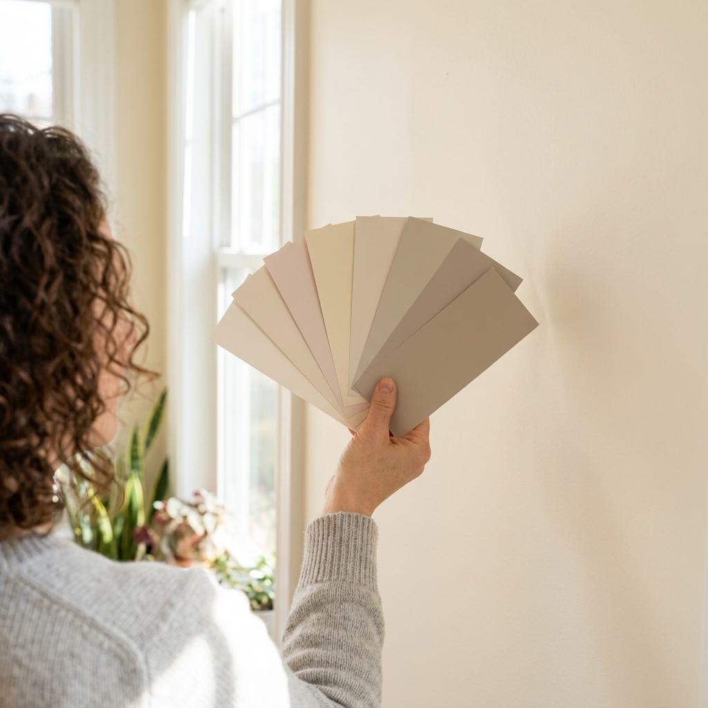
This is my favorite “I want it to look designer but I am nervous” approach. Stay in the same hue family as your main walls, then go deeper on the same fan deck card. If you have the full strip, it is usually 1 to 3 steps down, not a completely different color.
- Works beautifully with open layouts because it stays cohesive.
- Less likely to clash with rugs and wood tones.
Option B: Pull from the rug
If you have a rug you love, it is already doing the hard work of harmonizing colors. Pull one of these:
- A mid-tone background color for subtle sophistication.
- A darker outline color for a bolder accent.
- A muted version of an accent color so it feels grown-up, not theme-y.
Option C: Complementary contrast
This is where you introduce contrast across the color wheel, like warm walls with a cool accent. To keep it from feeling loud, mute it a bit. Think “dusty” and “smoky,” not “primary.”
Step 6: Match the color to your light
Light is a sneaky co-designer. The same color can look calm and moody in one home and weirdly bright in another. Room direction is a helpful clue, but so are things like latitude, season, window size, trees outside, and even what color house sits next door. Use these as starting points, not laws.
North-facing living rooms
- Often get cooler, grayer daylight. Warm accents can help: warm taupe, clay, mushroom, olive, or a warmer navy.
- If the room already feels chilly, skip icy blues and super cool grays.
South-facing living rooms
- Typically get stronger, warmer light. You can usually handle cooler accents: blue-gray, charcoal, deep teal.
- Watch very warm reds and oranges. In strong afternoon light they can glow more than you expect.
East-facing living rooms
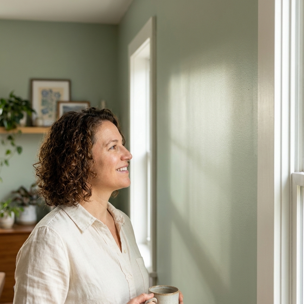
- Bright mornings, flatter afternoons. Soft mid-tones often behave best: sage, dusty blue, muted terracotta.
- Test at midday too, when the room can look surprisingly neutral.
West-facing living rooms
- Moody mornings, warm afternoons. Pick colors that do not go neon in late-day sun: muted greens, warm grays, clay tones.
- Test at 4 to 7 pm. That is when the “why is this so orange?” moment happens.

Step 7: Pick a finish you can live with
Color gets all the attention, but sheen changes the whole vibe.
- Matte: soft, modern, hides wall flaws best. My pick for most accent walls.
- Eggshell: a touch more wipeable, still low-shine. Great if you have kids or pets.
- Satin: noticeable glow, very cleanable. Use if the wall takes a beating, but know it highlights texture and patchwork.
If your main walls are eggshell, you can still do a matte accent. That slight shift often looks intentional and high-end, especially with deeper colors.
Reliable accent color families
These are dependable families that tend to complement common living room neutrals and typical wood tones. The key is choosing the right undertone and depth for your specific room.
Deep, cozy neutrals
- Charcoal: anchors a room and makes art and brass accents pop.
- Warm taupe: softer than charcoal, beautiful with beige or greige main walls.
- Near-black: dramatic, especially behind a fireplace or TV wall.
Moody blues and blue-greens
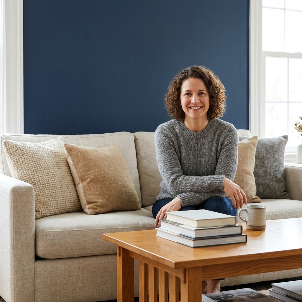
- Navy: classic, works with warm woods and white trim.
- Deep teal: richer and a little playful without feeling juvenile.
- Dusty blue: calmer, great when you want contrast without going dark.
Greens that feel collected
- Sage: easy with creams, warm whites, and natural textures.
- Olive: sophisticated with leather, walnut, and brass.
- Forest green: bold but grounding, especially in larger rooms.
Warm earth tones
- Clay: warm and inviting, plays nicely with oak and linen textures.
- Terracotta: energetic, but best muted and not too orange.
- Cocoa brown: surprisingly luxe when paired with lighter walls and layered lighting.
If you do not want paint
Paint is the easiest accent wall tool, but it is not the only one. If you want a statement with a little more texture (or a little less commitment), these options can be just as good:
- Wallpaper: great for pattern and depth. If your rug is busy, look for quieter wallpaper patterns with a softer contrast so the room does not start shouting.
- Limewash or plaster: gives movement and a soft, old-world look. It is beautiful for cozy neutrals and moody colors because it adds dimension without needing a bold pattern.
- Wood slats or paneling: adds architecture fast. You can paint it the accent color for a built-in look, or keep it natural if your room needs warmth.
Trim, niches, and built-ins
This is where accent walls look “planned” instead of “painted in a hurry.”
- Return walls: If the accent wall wraps around a corner (a short return), consider painting the return too. Stopping color right at the corner can look abrupt in some layouts.
- Niches and alcoves: Painting just the back wall can add depth. Painting the whole niche (back and sides) looks more intentional and can feel more architectural.
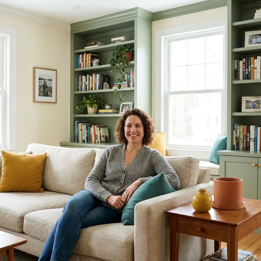
- Built-ins: If you want a subtle effect, paint only the back panels behind shelves. If you want a bigger moment, paint the entire unit. Use a more durable sheen for cabinetry surfaces and doors, and keep walls lower-sheen if you want them to recede.
Test before you paint
I know. You want to pick the color and be done. But testing is where you catch undertone issues before they become a weekend-long repaint.
My low-stress testing routine
- Buy two to three samples in the same color family, one lighter and one deeper than your first pick.
- Paint big swatches at least 12 inches by 12 inches, or larger if you can. Tiny swatches can mislead.
- Place swatches on the accent wall and also on an adjacent wall to see how the color behaves as you move through the room.
- Check morning, midday, and night with lamps on. Most living rooms are used at night, so your evening opinion matters most.
- Hold your sofa pillow or rug near it and look for harmony, not matching.
If your sample looks oddly purple, sour green, or chalky, that is an undertone mismatch. Try a similar depth with a different undertone, not a completely different color category.
Keep it balanced
This is the balancing act. You want “wow,” not “why is the couch yelling?”
Use 60-30-10 as a gut check
The 60-30-10 rule is a classic decorating guideline, not a strict math problem. Think of it as a quick way to check visual balance.
- 60%: your main wall color and big background surfaces
- 30%: furniture and textiles (sofa, rug, curtains)
- 10%: the “punch,” which can include an accent wall color, art, and smaller decor
An accent wall can absolutely feel like more than 10% depending on sightlines, wall size, and how much contrast you choose. If it feels like it is taking over, you may need to mute the color, go one step lighter on the same fan deck card, or simplify what sits in front of it.
Coordinate with what sits in front
- Behind a sofa: deeper colors look gorgeous, but avoid anything that matches the sofa too closely. Similar depth can make the sofa look flat.
- Behind a TV: darker, low-reflective colors help screens blend. Matte is your friend.
- Behind shelves: a rich color makes objects look curated. Just keep the shelf styling simpler so it does not feel chaotic.
Paint it clean
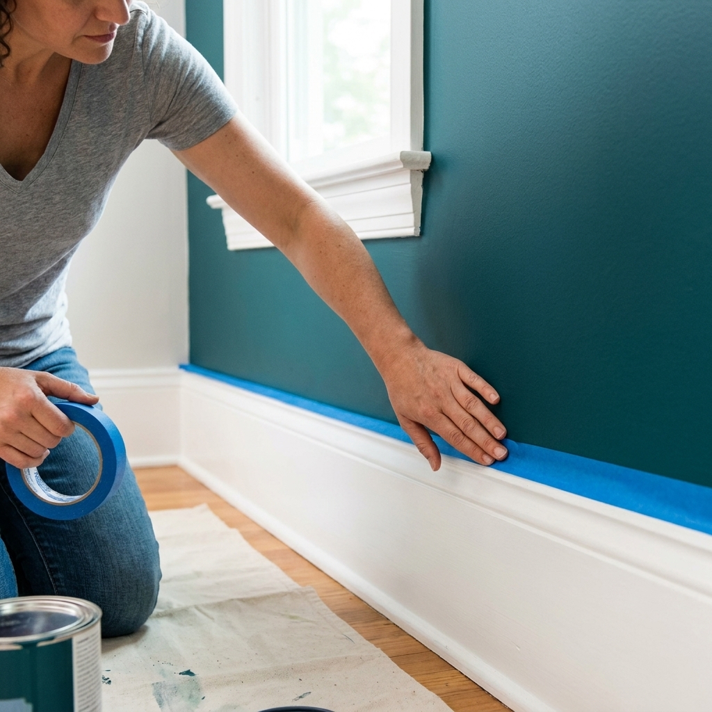
This is the part I learned the hard way in my twenties, usually while crouched on the floor, scraping paint off baseboards and promising myself I would “tape next time.” Tape next time.
- Patch and sand first: dark accent colors highlight every ding.
- Use painter’s tape on adjacent walls and trim: press it down firmly and remove it while paint is still slightly damp.
- Cut in carefully: do your edges before rolling, and keep a wet edge so you do not get lap marks.
- Prime if needed: if you are going from very light to very dark, or covering stains, primer saves coats.
- Plan for two coats: most accent colors look patchy until the second coat dries, and deep bases sometimes need a third.
Practical note: crack a window or run a fan while you paint for ventilation, and give the wall time to cure before you scrub it. Many paints feel dry fast but take longer to fully harden, so go easy on washing for the first week or two.
Common mistakes
- Picking a color in store lighting: always test at home, where your bulbs and daylight will change it.
- Ignoring undertones: match undertone first, then choose depth.
- Choosing a color that competes with the rug: if your rug is busy, keep the accent wall calmer and more muted.
- Going too glossy: shine can make the wall feel louder than the color itself.
- Accent wall on the wrong surface: if it is chopped up, the accent reads accidental.
Quick FAQ
Should the accent wall be darker than the other walls?
Most of the time, yes. A darker or more saturated color reads as an accent more naturally. A lighter accent wall can work, but it is subtler and usually relies on texture, like paneling or molding, to feel intentional.
Can I use a bold color if my furniture is colorful?
You can, but keep one of them muted. If the sofa or rug is already saturated, choose a smoky, toned-down wall color in the same family so it supports the furniture instead of competing with it.
Do accent walls work in open-concept living rooms?
Yes, as long as it connects to the overall palette. I like “same color, deeper” for open layouts, or pulling a color from the kitchen or dining finishes so everything feels tied together.
How many accent walls is too many?
In most living rooms, one is perfect. Two can work if they are part of the same focal area, like a fireplace bump-out and the wall next to it. More than that and you are usually better off painting the whole room or using a consistent color on all walls.
If you are stuck
If decision fatigue is setting in, here is the most foolproof path: choose the wall behind your sofa or fireplace, pick an accent color that shares the same undertone as your main walls, then go 1 to 3 steps deeper on the same fan deck card in a matte finish. It will look intentional, it will flatter your decor, and it will still feel like you.