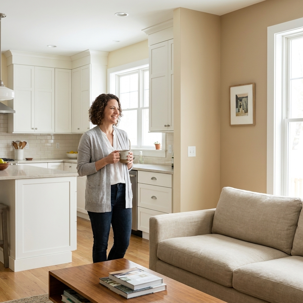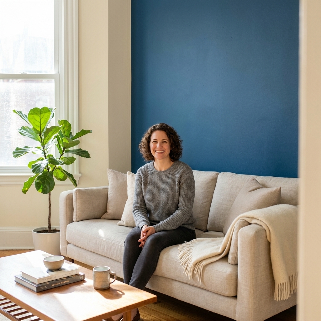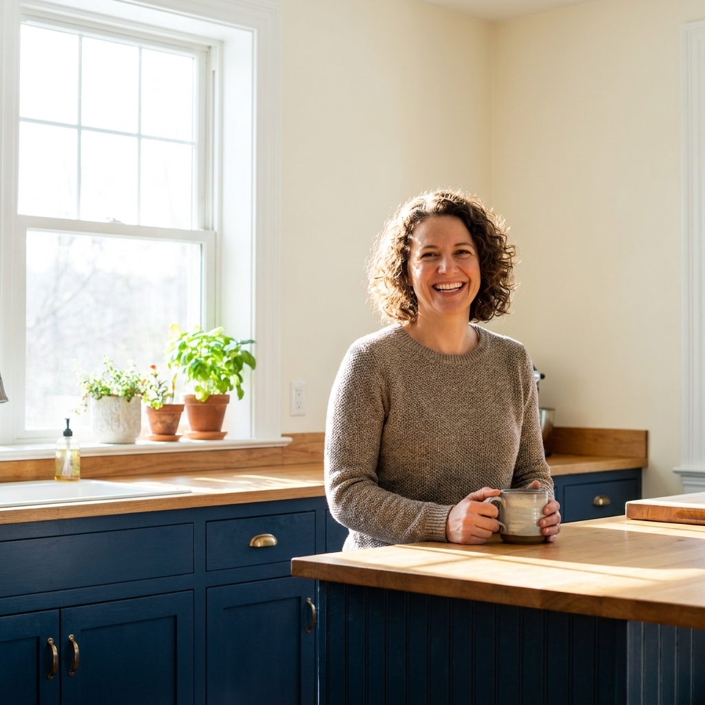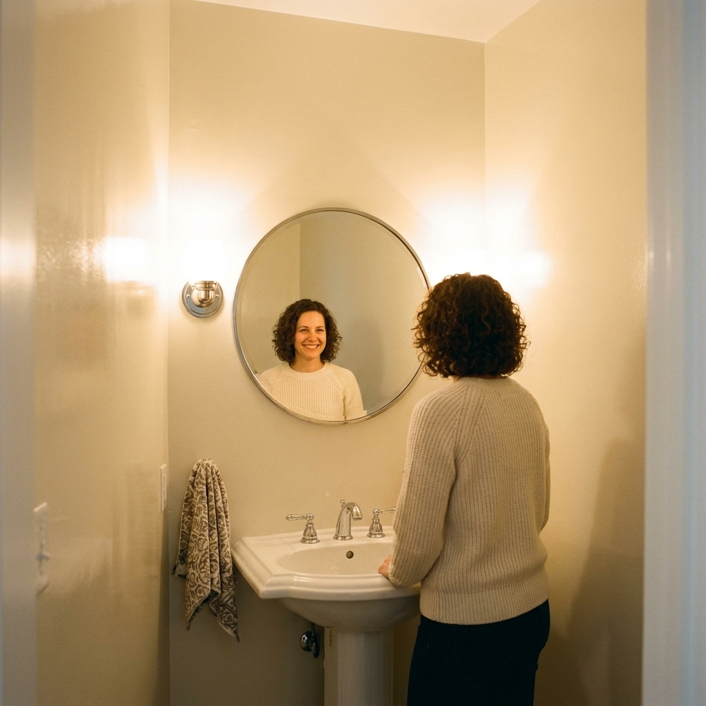
If you have ever stood in the paint aisle holding six “perfect” swatches and suddenly none of them look like they belong together, the 60-30-10 rule is your new best friend. It is not a rigid design law. It is a simple ratio that keeps your room from feeling either too matchy or too chaotic.
Here is the gist: 60% of the room is your dominant color, 30% supports it, and 10% adds punch. When you apply it to paint, you are deciding what gets the most visual real estate, what backs it up, and what gets to be the fun little show-off.
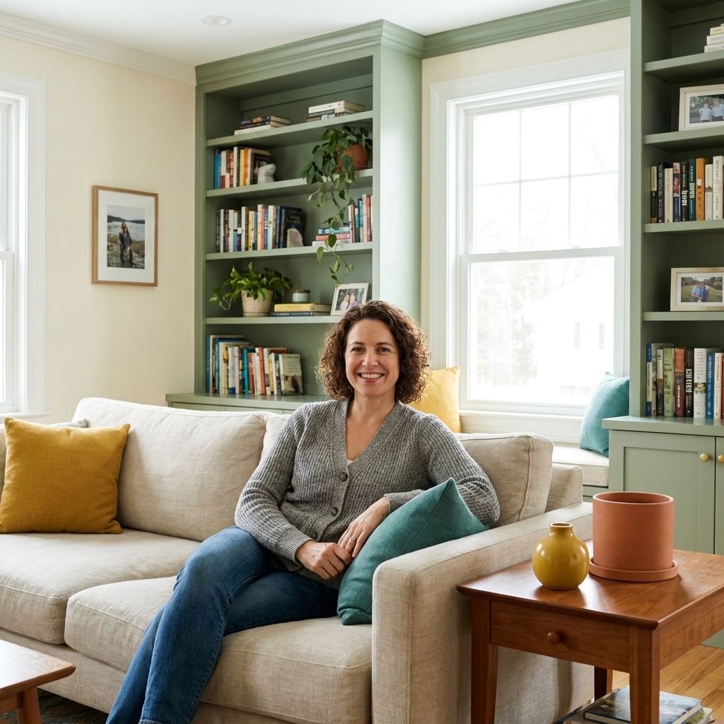
What the rule means for paint
The percentages are about visual weight, not math with a tape measure. In most rooms, walls naturally take up the biggest share, which is why the rule works so well for choosing paint colors.
- 60% Dominant: the main wall color, or the color you see first and most often.
- 30% Secondary: a supporting paint color that adds depth. Think trim, ceiling, built-ins, a large piece of painted furniture, or an accent wall.
- 10% Accent: the smallest, boldest hit. This can be paint on a door, niche, mantel, stool, radiator cover, or even a painted stripe or arch.
If you are renting or avoiding extra painting, that 10% can be a non-paint accent like textiles or art. But since we are here for paint confidence, I will show you where it makes sense to put that accent color with a brush in your hand.
Build a balanced palette in 30 minutes
Step 1: Pick the dominant 60% based on fixed elements
Start with what you cannot or do not want to change: flooring, countertops, tile, a giant sectional, a brick fireplace. Your dominant wall color should play nicely with those.
My shortcut: hold a few light neutrals next to your biggest fixed surface. Look for the swatch that looks calm and intentional, not the one that “matches” perfectly. Matching can read flat.
- Warm fixed elements (honey oak, cream tile) usually like warm whites, greiges, clay-leaning beiges.
- Cool fixed elements (gray tile, blue stone) usually like crisp whites, cooler greiges, soft blue-grays.
Step 2: Choose a secondary 30% that adds contrast, not competition
Your secondary color should be clearly different from the dominant, but still related. Think of it as the supporting actor that makes the lead look even better.
Two easy ways to choose it:
- Same hue, deeper value: If your dominant is a light blue-gray, pick a midtone or deeper version for built-ins or an accent wall.
- Neighbor on the color wheel: If your dominant is warm white, your secondary could be a soft greige, muted sage, or dusty blue.
A common trap: two colors that are close in lightness but different in undertone. That is one of the fastest ways to get the “why does this look muddy?” feeling at 7 p.m. under lamps.
Step 3: Pick your 10% accent last, then go a notch bolder
The accent is where you can have fun, and it is also where most people play it too safe. Because it is only 10%, it can handle more saturation or darkness without overwhelming the room.
Great paint accent picks:
- Inky navy, charcoal, or deep green for a grounded, classic hit.
- Terracotta, ochre, or dusty rose for warmth and personality.
- Black or near-black for crisp definition in modern spaces.
Rule of thumb: if your accent looks “a little intense” on the swatch, it is probably perfect in real life when it is only used in small doses.
Step 4: Decide where each percentage goes
Here are paint-friendly placement shortcuts that naturally land in the 60-30-10 neighborhood.
- 60%: most walls in the room, or all walls if you want an easy win.
- 30%: trim and doors (if you have substantial trim), ceiling (especially in small rooms), built-ins, wainscoting, or one accent wall.
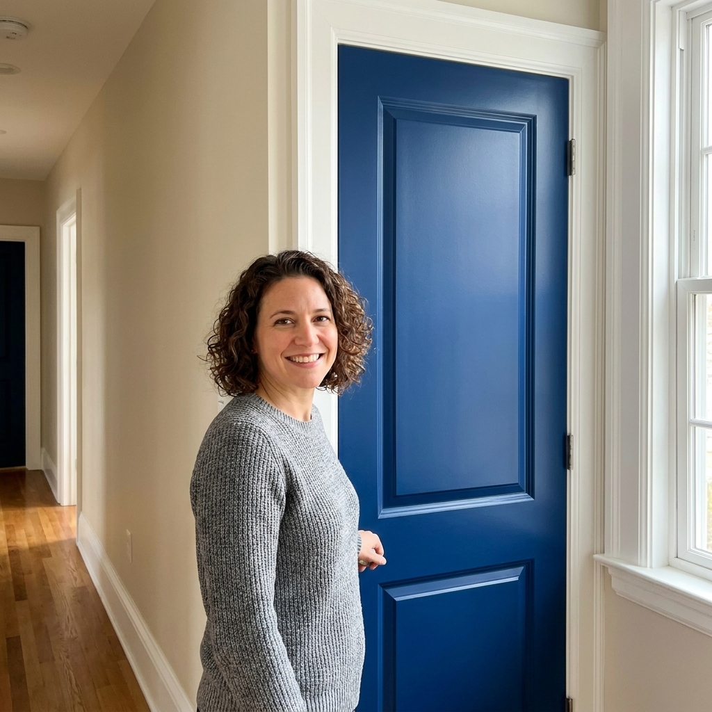
- 10%: a single interior door, a painted niche, the back of a bookcase, a fireplace surround, a powder room vanity, or a small geometric detail like a half-wall line.
Ceiling note: a white ceiling can act like a quiet “extension” of your dominant 60%. A colored ceiling often reads more like a secondary 30% because it is a big visual plane, especially in small rooms.
How to use it in common rooms
Living room
60%: main wall color (a soft neutral or gentle color that can live with your sofa).
30%: a painted built-in, fireplace wall, or trim in a slightly deeper tone.
10%: a small painted moment like the inside back panel of shelves, or a single statement door if the room connects to a hallway.
Pro tip: If you already have a loud rug, keep your 10% accent in paint darker and calmer, like deep olive or charcoal, so the room does not start arguing with itself.
Bedroom
60%: walls in a restful tone.
30%: headboard wall in a deeper shade of the same family, or trim in a soft contrast.
10%: paint the inside of a closet, a vanity stool, or the bedroom door for a surprise pop.
Kitchen
Kitchens are funny because cabinets can dominate more than walls.
- Option A (painted walls lead): 60% walls, 30% cabinets or island, 10% pantry door or a small built-in.
- Option B (cabinets lead): 60% cabinets, 30% walls, 10% island or a single color hit like a coffee nook.
Bathroom
60%: wall color (or tile plus wall color as the dominant field).
30%: vanity color or upper wall if you do a half-wall treatment.
10%: the door, a recessed medicine cabinet, or a tiny painted shelf.
In windowless bathrooms: test your dominant and secondary under the actual bulbs you use. Undertones can get loud fast in artificial light.
The undertone check that prevents mismatches
I am going to save you from the classic mistake: choosing three colors you love individually that do not share the same undertone story.
A quick undertone test
- Grab a bright neutral white swatch and a neutral mid-gray swatch as “controls” (as close to neutral as you can find).
- Hold your dominant and secondary swatches next to the controls in your room.
- Ask: do they lean pink, yellow, green, or blue when compared?
What you want: your 60% and 30% should generally lean in the same temperature direction (both warm-ish or both cool-ish). Your 10% accent can bend a bit, but it still needs to look intentional with the other two.
Three palette formulas to steal
1) Soft neutral + grounded midtone + moody accent
- 60%: warm white or light greige walls
- 30%: medium taupe or soft sage on trim or built-ins
- 10%: deep charcoal or inky green on a door or niche
2) Airy color + clean neutral + warm pop
- 60%: pale blue-gray walls
- 30%: crisp white trim and ceiling
- 10%: terracotta, clay, or muted coral on a small painted element
3) Modern contrast without harshness
- 60%: soft off-white walls
- 30%: deep gray or navy on an accent wall or built-ins
- 10%: near-black on interior doors or a fireplace surround
Finish choices that make it feel intentional
Finish changes how much light bounces around, which changes how strong a color reads. That affects your “percentage” visually, even if you did not change the amount of painted surface.
- Walls (60%): eggshell is my default for most rooms. Matte is gorgeous, and while some mattes scuff more, performance depends a lot on the brand and line.
- Trim and doors (often the 30% or 10%): satin or semi-gloss for durability and a crisp edge.
- Accent details (10%): satin can make an accent color feel richer and more deliberate, especially in darker shades.
If your accent feels too loud: try dropping the sheen (for example, from semi-gloss to satin) before you abandon the color.
Sampling tips that save you repainting
Swatches are great for narrowing, but they can lie when your room has strong light, reflective floors, or colorful furniture nearby.
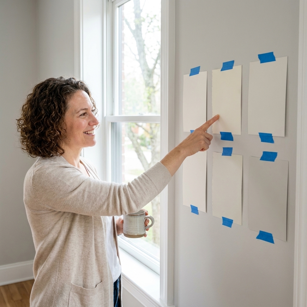
- Go bigger: paint a sample board (or two coats on poster board), then move it around the room. Corners, near windows, and next to the sofa can look like three different colors.
- Test next to trim: your wall color does not live alone. Hold it next to your trim color, especially if you are using a warm white or a cool gray.
- Remember sheen shifts color: the same paint color in matte versus satin can read slightly different because the light bounce changes.
Common mistakes and quick fixes
Mistake: The accent color takes over
Fix: shrink where you use it. Keep the accent to one element, not three separate spots in different corners of the room.
Mistake: Everything is a “safe” neutral
Fix: make the 10% a real color or a darker neutral with personality, like deep olive, iron gray, or navy.
Mistake: The 60% and 30% are too similar
Fix: add separation through either value (go darker or lighter) or finish (walls eggshell, trim satin). If they are nearly the same depth, the room can look accidentally monochrome.
Mistake: It looks good in daylight and weird at night
Fix: check bulbs. Warmer bulbs (often around 2700K) tend to emphasize warmth, while cooler bulbs (often around 3500K to 4000K) can emphasize cooler undertones. CRI, surrounding finishes, and the fixture itself also matter, so test swatches in the morning, afternoon, and after sunset with lamps on.
A simple weekend plan
- Day 1: pick 3 to 5 candidates for your dominant 60%, then tape large samples on multiple walls.
- Day 2: choose your dominant, then select a secondary that is either one to two shades deeper or a neighbor hue that shares undertones.
- Same day: pick an accent and test it on the smallest paintable element you have, like the inside of a closet door or a sample board.
- Before you paint everything: stand in the doorway and squint. If it looks balanced when you squint, you are golden.
FAQ
Does the 60-30-10 rule have to be exact?
No. Treat it like training wheels. If your room has lots of trim or big cabinets, your “30%” might feel larger. Aim for a clear dominant, a clear support, and a small accent.
Can my accent color be on an accent wall?
Often, no. An accent wall is frequently closer to the 30% role because it takes up a big chunk of what you see. If you want a bold color on one wall, that bold color is typically your secondary, and your 10% becomes a smaller detail color.
What if I want a monochromatic room?
You can still use the rule. Make 60% the lightest version (walls), 30% a midtone (trim or built-ins), and 10% the deepest version (door or niche). It will look layered, not flat.
How do I use 60-30-10 in an open concept space?
Keep one dominant color flowing through the connected area, then assign secondary and accent colors to specific zones (like a kitchen island color or the dining area built-in). If you want a concrete approach: keep the same 60% wall color across the whole space, use one consistent 30% (trim or cabinetry), then repeat the 10% accent in two small places (for example, an interior door and a niche) so it feels cohesive.