If your dining room is the place where birthdays stretch into midnight or where you sip coffee while answering emails, wall color matters more than you think. Dining rooms are mood rooms. They can be candlelit and cozy, or breezy and bright, and paint is one of the fastest ways to steer that vibe.
I have painted dining rooms in everything from deep inky blues to pale creamy whites, and the best choice is rarely about what looks good on a tiny swatch. It is about how the room behaves: the light it gets, what your furniture is doing, and the kind of hosting you actually do.
The big difference: atmosphere
Both deep and light palettes can look high-end. They just tell totally different stories.
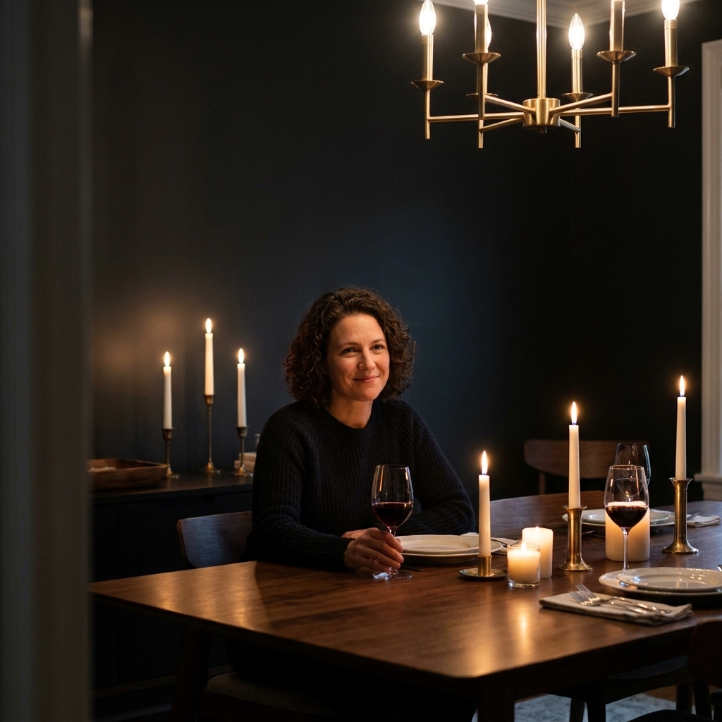
Moody dining rooms
- Feel: intimate, dramatic, “stay for dessert” cozy
- Best at: making average rooms feel intentional and designed
- Visual trick: can blur awkward corners and make art and lighting pop
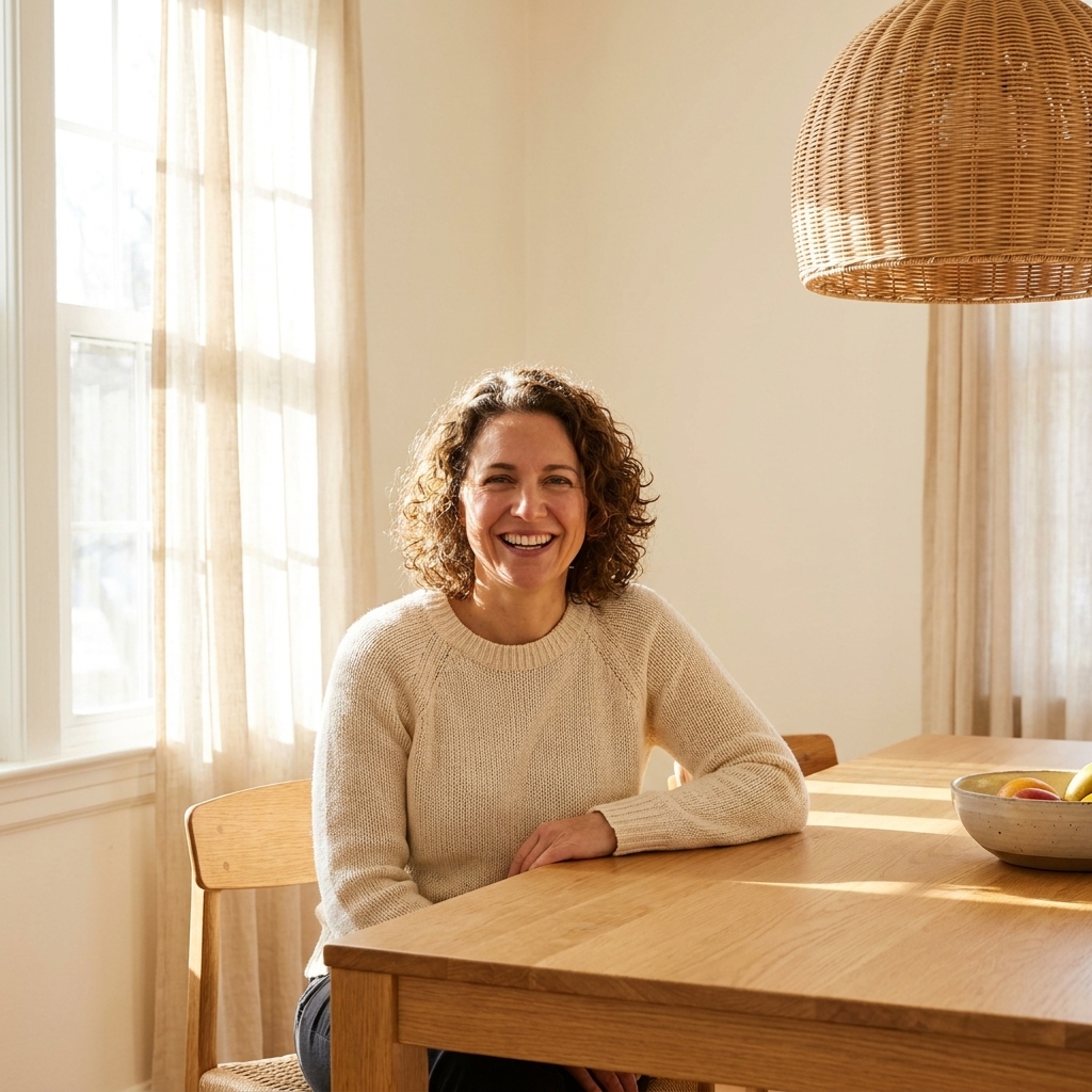
Light dining rooms
- Feel: open, fresh, daytime-friendly
- Best at: making tight rooms feel bigger and brighter
- Visual trick: bounces light around and highlights architectural details
How each palette shifts the room
Dark walls: wrapped and curated
Deep colors often visually pull the walls in, which sounds like a bad thing until you see it done well. In a dining room, that “closer” feeling can read as intentional intimacy, especially at night. Dark walls also make your furniture silhouette stronger. A basic table suddenly looks grounded. A brass fixture suddenly looks expensive.
One detail people miss: dark paint can make a room feel less busy because the walls recede. If you have a lot going on visually, like bold drapes, art, or a gallery wall, deeper paint can calm it down.
Light walls: airy and flexible
Light colors tend to expand space and are more forgiving in mixed-use homes. If your dining room is also your homework zone, puzzle station, or temporary office, lighter walls keep it feeling casual and easy.
Light paint also gives you the widest styling runway. You can swap centerpieces, art, and seasonal linens without fighting the wall color.
Choose based on how you host
Pick moody if the dining room is the destination
Moody paint is made for the host who loves a set table, a playlist, and lingering conversation. Darker walls turn ordinary lighting into ambiance.
- You host dinners more than brunches
- You love candlelight, dimmers, and warm bulbs
- You want a “grown-up” room that feels separate from the rest of the house
Pick light if the room is a workhorse
Light paint is best for the host who wants the room to feel welcoming at 10 a.m. and still pleasant at 10 p.m.
- You do casual meals, kid-friendly gatherings, and drop-in visits
- Your dining room connects to the kitchen and you want flow
- You want the table and textiles to be the stars
Light matters most
People blame size, but light is the real boss. Before you commit, check your dining room at three times: morning, midday, and evening with the lights on.
If you have strong natural light
- Moody walls: look rich and complex. You will see undertones, which is a good thing when you pick intentionally.
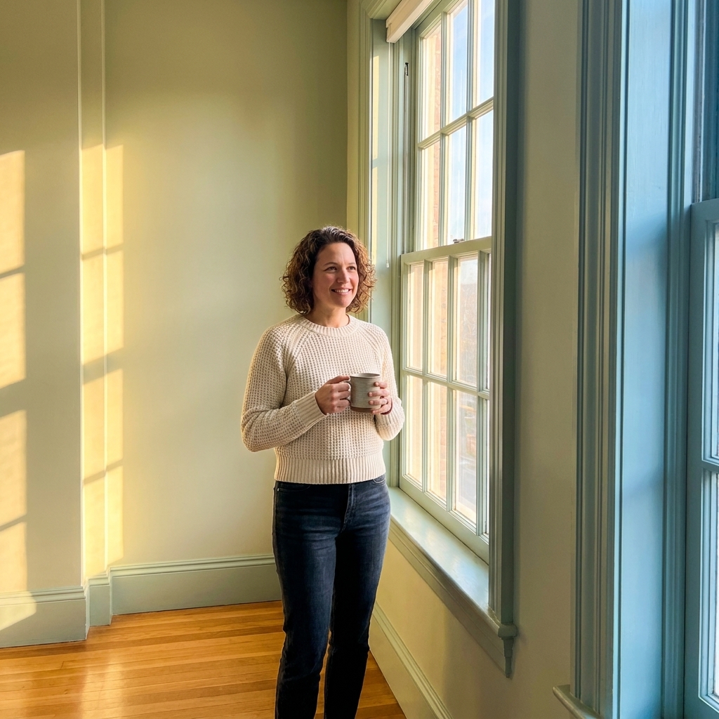
- Light walls: can skew stark or washed out if you choose a crisp white. Warmer off-whites often feel better.
If you have low or north-facing light
- Moody walls: can look stunning, but you will want a lighting plan.
- Light walls: help, but avoid icy grays without testing first. They often go flat and gloomy in dim light.
If you mostly use the room at night
Dining rooms often live their best life after sunset. Dark paint amplifies that cozy evening feeling. Light paint still works, but you may crave warmer bulbs and layered light so it does not feel like a cafeteria.
Palettes that work in real homes
Instead of chasing a single “perfect color,” think in palettes. Dining rooms look finished when the wall color, trim, ceiling, and floors are considered together.
Moody palettes
- Inky blue + warm white trim + aged brass: Sophisticated, not gloomy. Great with wood furniture and warm floors.
- Charcoal gray + creamy trim + black accents: Modern and clean, especially with simple art.
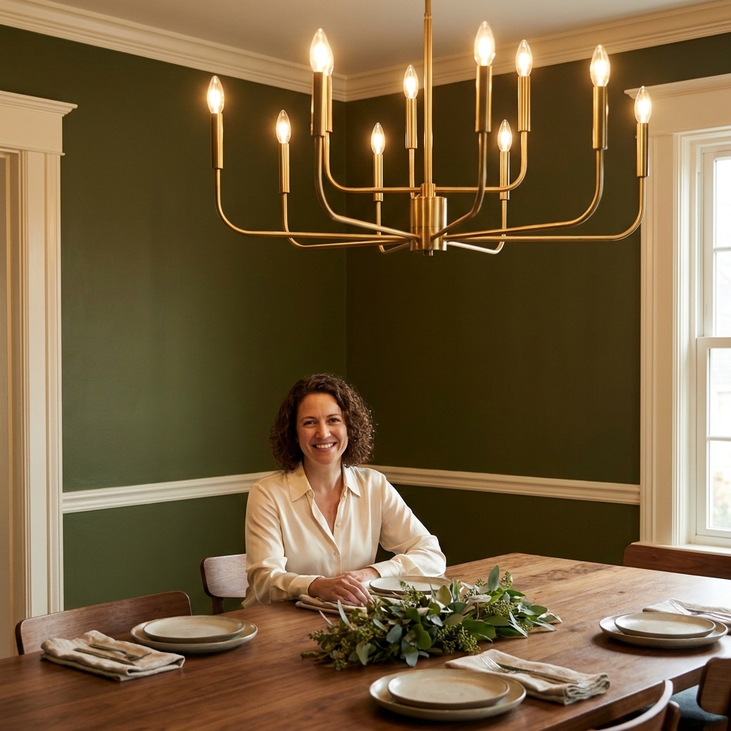
- Deep olive + off-white trim + warm woods: Earthy, cozy, and forgiving with mixed finishes.
- Warm espresso brown + bone-white trim + linen textures: A deep neutral that feels inviting.
Light palettes
- Soft warm white + crisp white trim + natural wood: Classic, bright, and timeless.
- Greige-beige + white trim + black metal: Calm and current, good for open floor plans.
- Pale mushroom + creamy trim + vintage brass: Understated and flattering in most light.
- Light sage + warm white trim + rattan: Fresh, easy, and great with plants.
Undertones without the panic
If you have ever painted a “neutral” and ended up with lavender-gray at night, you have met undertones. Dining rooms are especially sensitive because they shift from daylight to warm artificial light.
What to know
- Dark colors exaggerate undertones. A navy can tip teal. A charcoal can tip purple. This is normal.
- Warm bulbs warm everything. That crisp white may look cream. That beige may look yellow.
- Cool daylight can make warm neutrals look muddy. North-facing rooms do this a lot.
- Floors have undertones too. Honey oak pushes walls warmer. Cool tile can pull a neutral gray-green.
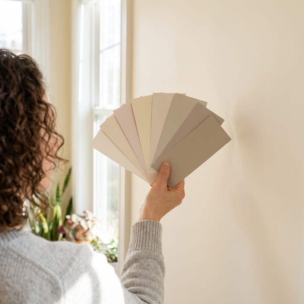
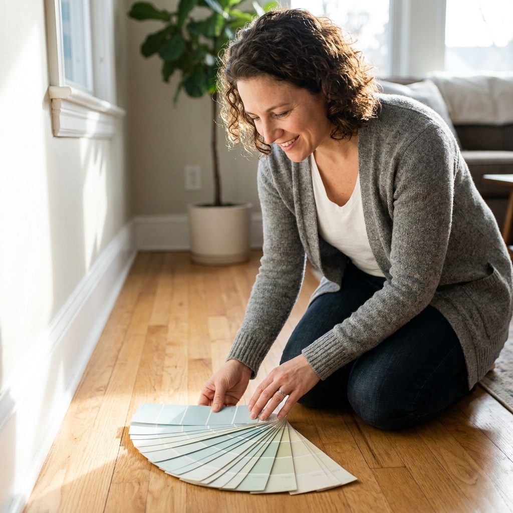
My best practical tip: sample paint on two walls if you can, especially one that gets more light and one that gets less. Go bigger than a tiny chip. A poster board sample (or two) lets you move the color around and see it under your actual bulbs. You are not just picking a color, you are picking how it behaves.
Finishes that hold up
Dining rooms sit in a sweet spot: not as messy as kitchens, but more touched than bedrooms. Chairs bump walls. Hands brush by. Occasionally, red wine happens.
- Best all-around: eggshell or satin for walls. They are wipeable without looking too shiny.
- If you go very dark: lean eggshell or a low-luster, washable matte. Higher sheen can highlight every patch and roller overlap.
- Trim: satin or semi-gloss for durability and a crisp edge.
Lighting that makes it feel intentional
For moody rooms
- Add at least two light sources beyond the overhead fixture, like a buffet lamp and a pair of wall sconces.
- Use dimmable, warm bulbs around 2700K for glow, not glare. If 2700K feels too golden to you, 3000K is a slightly brighter warm option that still flatters food and skin tones.
- Size matters. A too-small chandelier can disappear against dark walls.
If you want a simple “lighting plan” that works in most dining rooms, aim for three layers: overhead (chandelier), eye-level (sconces or a buffet lamp), and a soft accent (a small lamp or picture light). Even one extra layer makes dark paint feel rich instead of murky.
For light rooms
- Layer light anyway. Bright walls do not replace good lighting.
- Consider slightly warm bulbs so whites do not look icy at night.
- If you have lots of windows, control glare with linen shades or light-filtering curtains.
Trim and ceiling
Paint choices feel custom when trim and ceiling are part of the plan.
With moody walls
- High contrast trim: deep walls plus warm white trim feels classic and crisp.
- Low contrast trim: tint the trim a shade lighter for a modern, enveloping look.
- Do not forget the ceiling: a soft white keeps it from feeling heavy. If you love drama, a ceiling one to two shades lighter than the walls can look incredible.
With light walls
- Crisp trim: makes everything feel clean and tailored.
- Warm trim: helps if your floors or furniture run warm and you want a cohesive glow.
Maintenance reality check
A quick heads-up from real life: deep paint colors tend to show dust, fingerprints, and chair scuffs more than lighter ones. They are still worth it, just plan for it.
- Choose a durable finish: a washable matte or eggshell helps.
- Keep leftover paint: touch-ups are easier when you have the exact can and sheen.
- Be patient with patches: touch-ups can “flash” until they fully dry, especially on darker, higher-sheen paints.
A quick decision checklist
- Do you want intimate or open? Intimate points to moody. Open points to light.
- Do you use the room mostly at night? Moody often wins.
- Is the room small but has great light? Either works. Dark can be gorgeous here.
- Is the room dim and you do not want to add lighting? Light will be easier.
- Do you have statement art or a bold rug? Dark paint can make it pop. Light keeps it airy.
The in-between option
If you are torn, you do not have to pick a team.
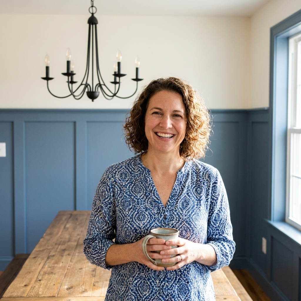
- Try a deeper color on the lower portion with a chair rail and a lighter color above.
- Paint one accent wall in a deeper tone and keep the others light, especially if your room is open to the kitchen.
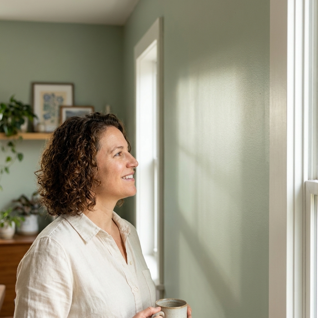
- Go mid-tone, like a smoky blue-gray or a muted green. Mid-tones give you depth without swallowing light.
FAQ
Will dark paint make my dining room look smaller?
Sometimes, but “smaller” is not always “worse.” Dark paint tends to make a dining room feel more intimate and finished. If you have decent lighting and a few bright elements (trim, art, a lighter rug), it can feel cozy instead of cramped.
What is the safest light color for a dining room?
A warm off-white or soft creamy neutral is usually the most forgiving across day and night lighting. It avoids the icy look some bright whites get after sunset.
Can I do a moody dining room with white trim?
Yes, and it is one of my favorite pairings. Choose a warmer white if your deep color has warm undertones (olive, espresso) and a cleaner white if your dark is cooler (navy, charcoal).
What if my dining room is open to the living room?
You can still go moody, just make sure the transition feels intentional. Repeat at least one element across spaces, like the same trim color, similar undertones, or matching metal finishes in lighting.
Bottom line
A moody dining room is for drama, intimacy, and that “let’s open another bottle” energy. A light dining room is for easy everyday living and an open, welcoming feel. Neither is more correct. The right choice is the one that matches your light, your furniture, your floors, and how you actually use the room.
If you want my simplest rule after a decade of painting for real life: go deep when you want the room to feel like an experience, and go light when you want it to feel like a fresh backdrop.