Kitchen color decisions feel higher-stakes than almost any other room because you are coordinating fixed surfaces that sit inches apart. Cabinets, walls, counters, backsplash, floors, and lighting all bounce color onto each other. The good news is that you do not need a perfect eye. You need a repeatable process.
I have painted enough kitchens to learn two things the hard way: undertones matter more than the “color family” on the label, and your light bulbs can push even the prettiest paint into looking wrong. This guide walks you through a dependable way to coordinate cabinet and wall paint colors, whether your cabinets are warm oak, deep espresso, crisp white, or trendy greens and blues.
Start with what will not change
1) Your cabinet undertone (not just the color)
Cabinets read as “white,” “brown,” or “gray” from across the room, but what makes wall paint click is undertone. That hidden lean can be yellow, orange, red, green, blue, or even violet.
- Warm cabinets lean yellow, orange, or red (honey oak, cherry, many “antique white” paints).
- Cool cabinets lean blue, gray, or violet (ash-leaning stains, many modern grays, bright cool whites).
- Earthy cabinets lean green, olive, or taupe (sage and olive paints, and some stains that skew olive-taupe).
Quick check: Hold a plain sheet of bright white printer paper right up against a cabinet door. The cabinet’s undertone will show itself fast.
2) Your countertop and backsplash
If your countertop has a strong pattern, your wall color usually needs to be calmer and more forgiving. If your countertop is quiet, you get more freedom on the wall.
Safe default: pull your wall paint from the countertop’s background color, not the loudest vein. If your slab is subtle (or your backsplash is doing the heavy lifting), you can absolutely pull a secondary color for a more designed look. Just test it larger than you think you need.
3) Your lighting temperature and quality
Warm bulbs (2700K to 3000K) make warm paints warmer and can make some cool grays look muddy. Neutral to cooler bulbs (3500K to 4000K) can make some warm creams look cleaner, but they can also flatten warmth or make certain creams look a little dull, depending on the bulb’s CRI (color rendering index), the fixture, and surrounding finishes.
If you are swapping bulbs, do it before you commit to paint. It is like trying on shoes with the right socks.
Pick the undertone, then pick the contrast
Step 1: Choose blended or contrasted
- Blended means cabinet and wall colors share a similar undertone and are close in depth. It feels calm, airy, and continuous.
- Contrasted means the wall clearly separates from the cabinets. It feels crisp, tailored, and intentional.
Step 2: Use a contrast rule of thumb
For contrast without harshness, aim for about 2 to 4 steps of difference on a paint strip. That is a rule of thumb, not a universal standard, because paint decks vary by brand and collection.
If you want a more consistent way to think about it, look at LRV (light reflectance value). In many kitchens, a difference of roughly 15 to 30 LRV points creates clear separation without looking like a black and white checkerboard. Small, darker kitchens often look better with gentler contrast. Bright kitchens can handle more.
Step 3: Choose a wall finish that matches real life
- Eggshell is my default for kitchen walls: wipeable, not too shiny.
- Satin is great for heavy-traffic kitchens and homes with kids, but it can highlight wall texture.
- Matte can look gorgeous. Traditional mattes can be easier to mark up, but many modern washable mattes clean surprisingly well. Read the label and buy the best line you can.
Wall colors for wood cabinets
Wood is already bringing color, movement, and warmth. Most of the time, the wall color that wins is quieter than you think, with an undertone that either supports the wood or gently cools it down.
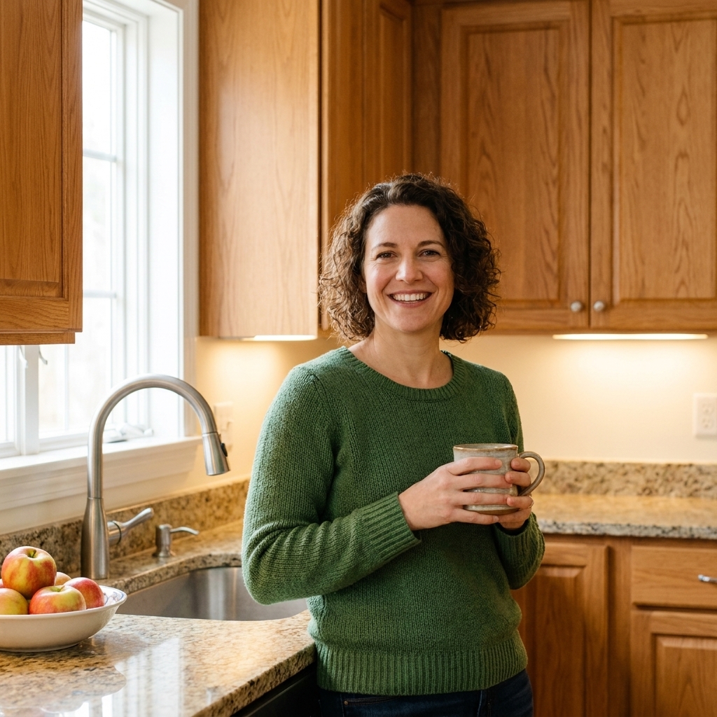
Honey oak and golden oak
Best wall direction: warm whites, soft greiges, gentle muted greens.
- Warm white keeps the space bright without fighting the oak’s yellow.
- Greige (a warm gray-beige) tones down orange without going icy.
- Muted green is a classic with warm wood because it feels grounded and natural.
Avoid (most of the time): sharp cool grays. Next to oak, many “true grays” pick up a blue cast and can make the cabinets look extra orange.
Red-toned cherry and mahogany stains
Best wall direction: creamy off-whites, warm taupes, muted clay-beiges.
Cherry wood has a strong personality. If you want it to feel elevated, keep the walls warm and quiet so the cabinets read rich, not loud.
- Creamy off-white softens the red without making it look purple.
- Warm taupe creates a grown-up, library-like warmth.
Avoid: green-gray walls that are too cool. Against red wood they can lean swampy fast.
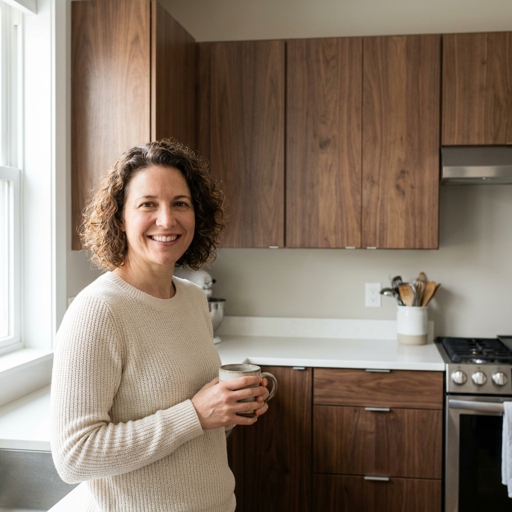
Walnut and medium brown wood
Best wall direction: warm whites, balanced greiges, soft mushroom taupes, muted blue-grays.
Walnut is often fairly neutral brown, so it can play well with both warm and cool walls. The stain and your countertop are usually the tiebreakers.
- Warm white gives you a clean, modern contrast.
- Muted blue-gray can look stunning if your counters are cool-toned and your lighting is not too warm.
Deep espresso and near-black stains
Best wall direction: warm whites, creamy light greiges, soft putty neutrals.
Very dark cabinets need wall colors that keep the room from feeling heavy. If your kitchen has limited daylight, stay on the lighter side and let your contrast do the work.
- Warm white makes dark cabinets look crisp instead of cave-like.
- Light greige adds a little softness and hides everyday scuffs better than pure white.
Watch for: stark cool white walls under warm bulbs. At night, that combo can read oddly yellow.
Wall colors for painted cabinets
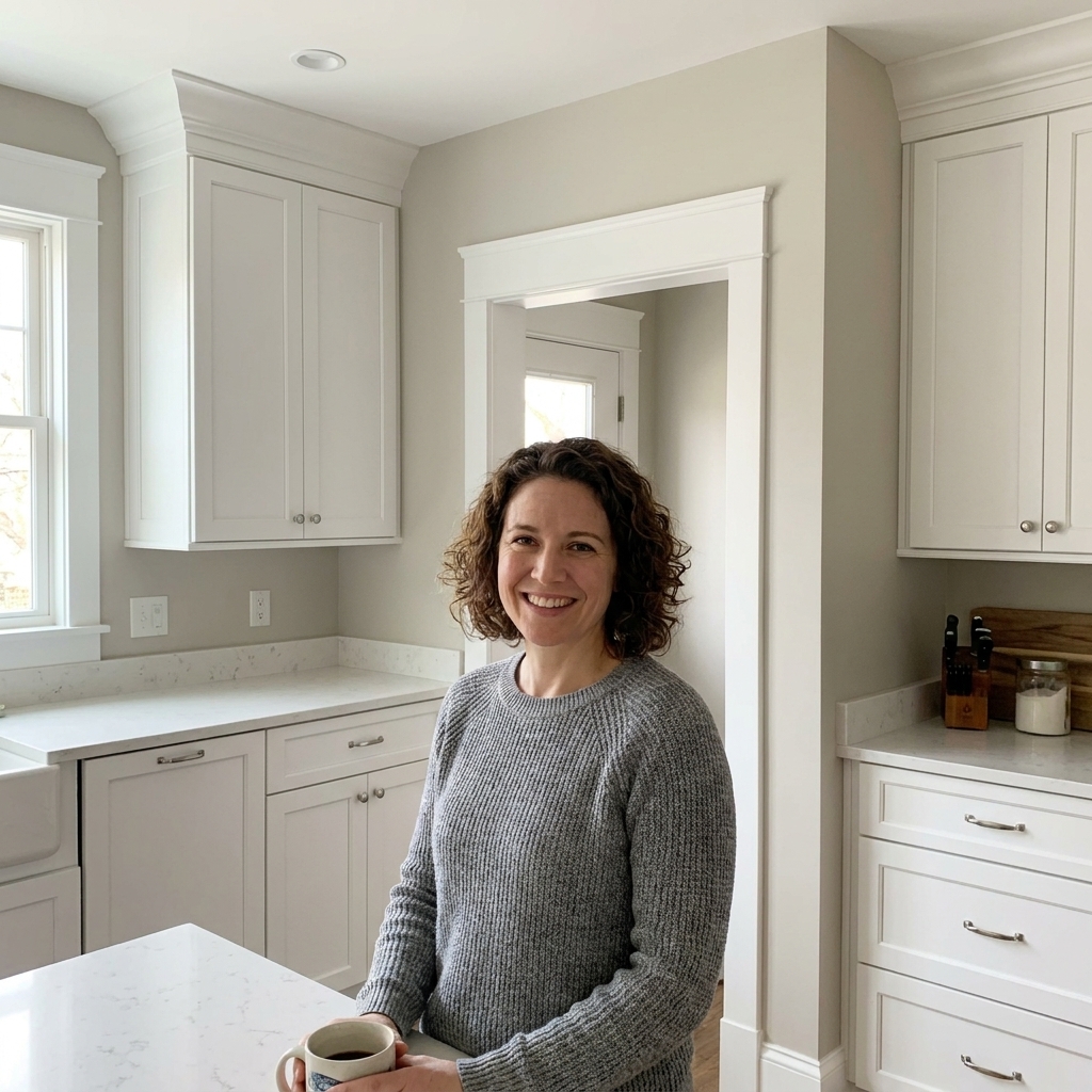
Painted cabinets are simpler than wood in one way: the undertone is usually easier to identify. They are trickier in another way: the cabinet color can reflect onto the wall and shift it, especially with glossier finishes.
White cabinets
Best wall direction: almost anything, but match the white’s undertone first.
- Warm white cabinets (creamy, ivory) like warm off-whites, greiges, and soft earthy colors.
- Cool white cabinets (crisp, bright) like clean grays, soft blue-grays, and cooler pastels.
My favorite safe move: choose a wall color that is slightly deeper than the cabinet white. It creates definition without looking like you tried to match and missed.
Gray cabinets
Best wall direction: warm whites, soft greiges, or a cleaner version of the cabinet undertone.
Gray cabinets can lean blue, green, violet, or taupe. When the wall paint fights that lean, the whole kitchen can look off, even if you cannot explain why.
- If your gray cabinets look blue, try a soft warm white or a very light blue-gray.
- If they look green, try a balanced greige or a muted creamy white.
- If they look violet, avoid yellow-heavy creams and choose a cleaner white or a cool greige.
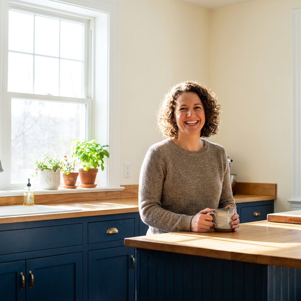
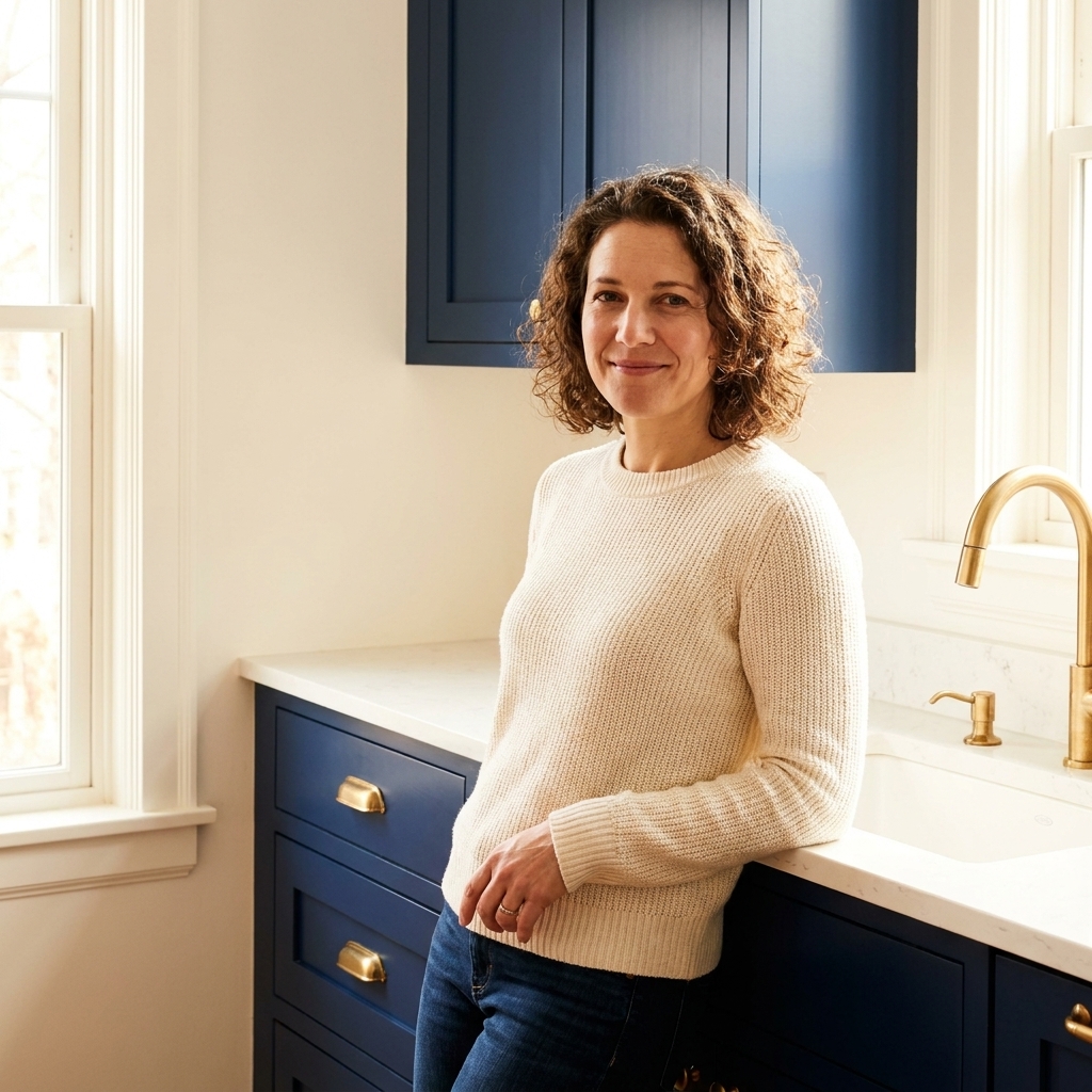
Navy and deep blue cabinets
Best wall direction: warm whites, soft creamy whites, pale greiges, gentle sandy beiges.
Blue cabinets are bold, so the wall should be supportive. Warmer wall colors keep navy from feeling cold and help the room feel welcoming, especially with stainless appliances.
Avoid (in most kitchens): icy gray walls with navy unless you have abundant daylight and warm wood elements to balance it.
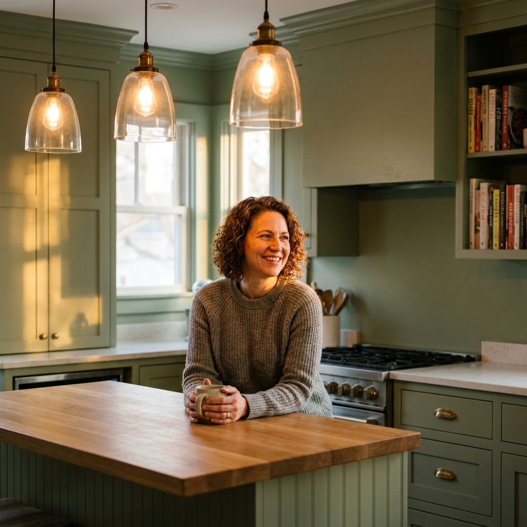
Green cabinets (sage, olive, forest)
Best wall direction: creamy whites, soft putty neutrals, light warm greiges.
Green is surprisingly picky about white paint. Many bright whites make green cabinets look harsher. A slightly creamy wall color is often the sweet spot.
- Sage looks beautiful with warm whites and gentle greiges.
- Olive loves putty, sand, and cream tones.
- Forest pairs nicely with warm white walls and natural wood accents.
Black cabinets
Best wall direction: warm white, soft off-white, or a pale neutral with warmth.
Black cabinets already bring drama. Walls that are too cool can make black feel severe. Walls that are too creamy can look yellow next to black. You want a warm-leaning neutral that still reads clean.
Pro tip: repeat black somewhere else (lighting, hardware, a stool frame) so it feels anchored and intentional.
Easy pairings to steal
If you want a shortcut, these pairings work across a lot of kitchens because they are built on undertone compatibility and forgiving contrast.
- Warm wood cabinets + soft warm white walls for a bright, classic look.
- Warm wood cabinets + muted green walls for cozy, grounded character.
- White cabinets + light greige walls for clean definition without feeling cold.
- Navy cabinets + creamy off-white walls for contrast that still feels welcoming.
- Gray cabinets (blue-leaning) + soft warm white walls to prevent a chilly, steel look.
- Green cabinets + putty neutral walls to make the green look expensive and calm.
Trim, ceiling, and open layouts
Ceilings
If your kitchen is open to another room, keeping the ceiling color consistent usually makes the whole space feel cleaner and taller. In a closed-off kitchen, a classic approach is a flat ceiling in a simple white that works with the trim and cabinets.
Trim and cabinet whites
If your cabinets are white, you do not have to match the trim perfectly, but you do want them to agree. A good rule is to keep trim either the same white as the cabinets, or a white that is clearly different (a touch brighter or a touch warmer) so it looks intentional, not like a near miss.
Mixed lighting and under-cabinet LEDs
Kitchens rarely have one light source. You have daylight, overhead lighting, and often under-cabinet LEDs. If your under-cabinet lights are a different temperature than your ceiling lights, paint can shift from wall to wall. If you can, keep your bulbs in the same neighborhood (for many homes, 3000K to 3500K is a comfortable middle) and look for a higher CRI so colors read more naturally.
Backsplash details that change everything
Backsplash tile is a sneaky color influencer because it sits right between your cabinets and walls.
- Glossy white tile reflects cabinet color onto the wall. If your cabinets are bold (navy, green, black), expect the wall to pick up a tint near the splash zone.
- Warm grout vs. cool grout matters more than people think. Warm grout can make a neutral wall read creamier. Cool grout can make the same wall look grayer.
- Strongly toned tile (blue, green, beige) can act like a big color swatch. When in doubt, test your wall sample right next to the tile, not just next to the cabinets.
How to test paint without wasting money
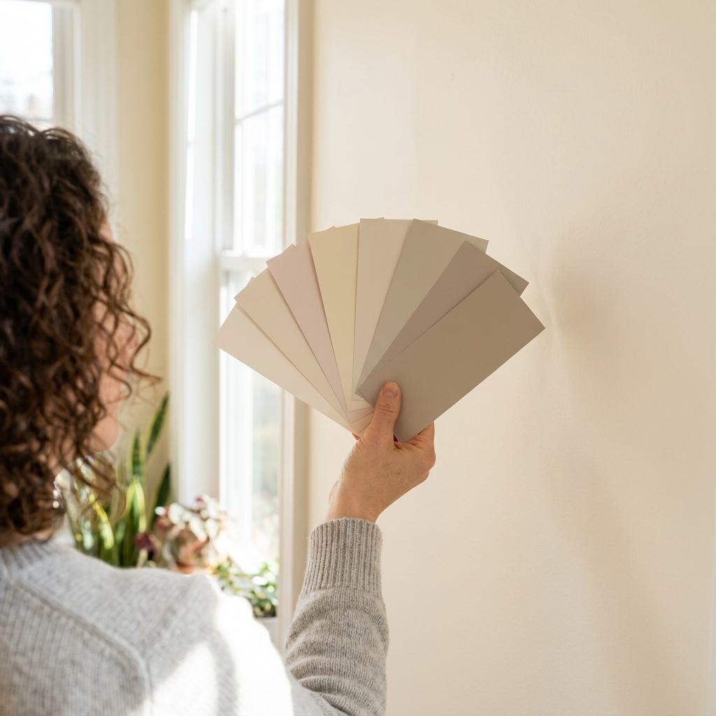
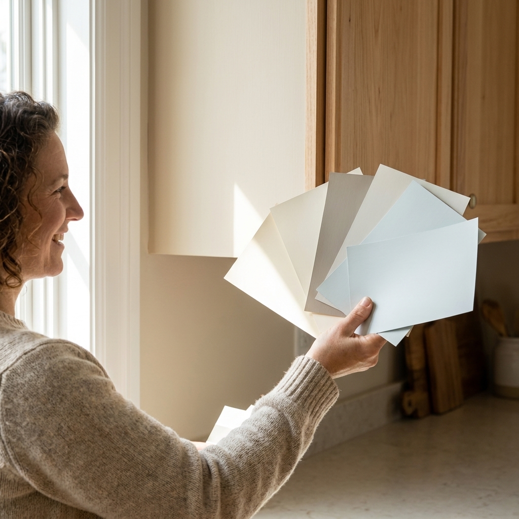
Use large samples, not tiny chips
Kitchen colors bounce. A tiny chip cannot show you how the cabinet color will reflect onto the wall. Get a peel-and-stick sample or paint a poster board at least 18 by 24 inches.
Test next to cabinets and tile
Tape your sample board:
- Right beside an upper cabinet door
- Near the backsplash
- On the wall that gets the most daylight
- On the wall that is mostly lit by artificial light
Check it in three lighting moments
- Morning daylight: often cooler.
- Midday: the truest read.
- Evening lights on: where undertones show their hand.
If the color still looks good at night, you are in great shape.
Common issues and fixes
“My walls look yellow next to my white cabinets.”
Your cabinet white is likely cool or very bright, and your wall white is warmer. Fix it by either warming up the cabinets with decor (wood, warm metals) or choosing a wall color that is a step cleaner and less creamy.
“My gray walls turned blue, and I hate it.”
That is a classic cool undertone showing up in kitchen light. Fix it by shifting to a warmer greige, or adding warmth through bulbs and finishes. Also check for cool daylight from north-facing windows, which can amplify blue.
“My warm wood cabinets look orange now.”
Usually the wall paint is too cool or too stark. Fix it by choosing a warmer wall neutral, or a muted green that visually calms the orange without making the room feel dark.
“Everything is the same beige, and it feels flat.”
Keep the same undertone, but increase contrast. Go either lighter on the walls or a touch deeper. Then add a crisp trim color to create edges.
Quick FAQ
Should kitchen walls match cabinets?
They do not have to match, and I rarely recommend trying. Coordinating undertones creates a cohesive look without the stress of a near-miss match.
Can I use a bold wall color with wood cabinets?
Yes, but let the countertop decide how bold you can go. If you have busy granite, keep walls muted. If counters are simple, you can go deeper, especially on a single wall or a breakfast nook area.
What about open-concept kitchens?
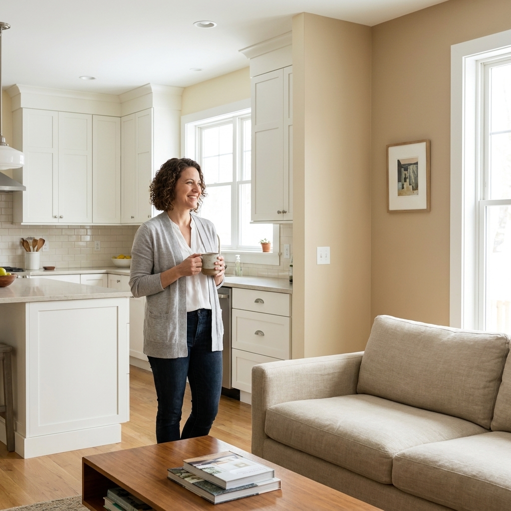
Choose a wall color that flows into the adjacent space, then bring the kitchen personality through cabinets, hardware, and lighting. If you want stronger kitchen contrast, consider painting the island or using a deeper cabinet color rather than changing the wall paint.
Checklist before you buy paint
- Cabinet undertone identified with the white paper test
- Countertop background color noted (and any secondary colors you might pull)
- Light bulb temperature chosen, including under-cabinet lighting
- Two to three wall colors tested on large samples
- Samples checked morning, midday, and evening
- Finish chosen (eggshell or satin in most kitchens)
If you want, tell me your cabinet color (wood species or paint color), countertop material, and whether your kitchen gets strong daylight. I can suggest a short list of wall colors that will behave nicely in your specific lighting.