If you have natural wood trim and doors, you already have a strong “built-in” color story. The trick is letting the wood be a feature instead of fighting it with a wall color that pulls out the wrong undertone. I have painted around honey oak from the 90s, red cherry casings, and deep walnut doors that look like they belong in a library, and the pattern is always the same: the winning paint color is the one that agrees with the wood’s undertone in your lighting.
This guide will help you identify what you are actually working with, then pick wall colors that make your trim look intentional and elevated, even if you are not changing the wood at all.

Start with undertones, not the wood species
People say “oak” or “cherry” like it guarantees a color, but wood finishes vary wildly. What matters is the undertone you see today on your trim and doors.
Quick undertone check (my weekend-project method)
- Hold a true white sheet of paper next to the trim. If the wood suddenly looks orange or golden, you are in warm territory. If it looks pinkish or ruddy, that is red warmth. If it looks more gray-brown or cocoa, that is a cool-leaning neutral.
- Compare to a light warm beige swatch and a light cool gray swatch. The wood will “agree” with one and look a little sick next to the other.
- Check morning vs evening. Wood can look honey-gold in afternoon sun and downright orange under warm bulbs at night.
Three undertone families you will see most
- Golden or orange warmth: common with honey oak, golden oak, many maples, and pine.
- Red warmth: cherry, some mahogany stains, and older red-toned oak stains.
- Brown or neutral depth: walnut, espresso stains, and some “weathered” or “smoked” finishes that read more muted.
Once you know the undertone family, choosing paint gets a lot less stressful.
Don’t forget wood sheen
Sheen changes everything. A glossy polyurethane topcoat reflects light and can amplify warmth, especially at night under warm bulbs. A matte or satin finish reads calmer and more even.
If your trim looks extra orange only in certain spots, it might not be your paint at all. It can be reflection. Test swatches right next to the trim and a foot or two away so you can see both the undertone and the glare.
The rule that keeps wood from looking too orange
If your trim looks more orange than you would like, it is usually because the wall color is either:
- Too cool (icy gray or blue-leaning white), which often makes warm wood look louder by contrast, or
- Too warm in the same direction (peachy beige), which stacks warmth on warmth and can feel dated fast.
The sweet spot is often a soft, balanced neutral with a gentle warm base, or a muted blue-green or green-leaning neutral that helps counterbalance orange tones without going cold.
Best wall colors for honey oak
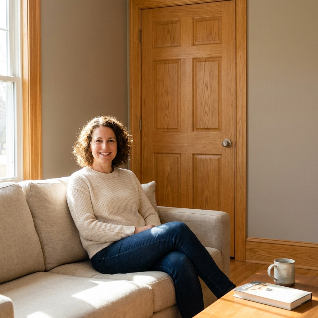
Honey oak usually reads golden with an orange edge. Your job is to calm it down while keeping the room warm and inviting.
Great pairings (in plain English)
- Soft creamy whites: Choose ones that are creamy, not stark. They keep the room from reading yellow.
- Greige (warm gray-beige): A balanced greige is my go-to when a client wants “neutral” but has a lot of honey oak.
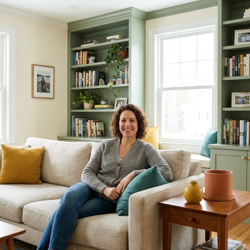
- Muted sage, olive, and blue-green: Green can be a quiet hero with golden wood, but the best “orange-calming” versions usually lean a touch blue or gray. Dusty beats bright every time.
- Clay and putty neutrals: Earthy, muted taupes can look surprisingly fresh with oak.
Colors to be cautious with
- Cool grays with blue undertones: They can make oak look extra orange.
- Bright, clean whites: They can make wood look yellower by comparison.
- Peachy beiges: Too close to the wood undertone, so everything blends into one warm blur.
Best wall colors for maple and pine
Maple and pine often read pale yellow to golden, and they can shift dramatically under warm bulbs. The safest approach is a wall color that is quietly warm and not too saturated.
What works beautifully
- Soft whites with a warm base: Think “cream” rather than “bright white.”
- Light greige: Keeps things airy but not icy.
- Dusty blue-green: If you want color, choose something muted and slightly gray so it does not go minty next to the wood.
What can backfire
- Buttercream yellows: They can push the wood into full-on yellow.
- Very cool, steely grays: They create that high-contrast clash that highlights any yellowing.
Best wall colors for cherry
Cherry trim and doors have that distinct reddish warmth that can feel formal, sometimes even a little heavy. Your best wall colors either soften the red or lean into a moody, intentional palette.
Softening options
- Warm off-whites: A creamy off-white can modernize cherry without making it look pink.
- Muted taupes and putties: These keep the room grounded and reduce the “red pop.”
- Gentle, gray-leaning greens: A subdued sage can balance red tones nicely.
Moody options
- Deep green: Forest or olive walls can make cherry feel rich and intentional.
- Warm charcoals: A brown-based charcoal is gorgeous with cherry, especially in offices and dining rooms.
Skip these if you want cherry to look calmer
- Pink-beige neutrals: They can amplify the rosy undertone.
- Bright primary colors: They can make the wood feel dated and busy.

Best wall colors for walnut and dark stains
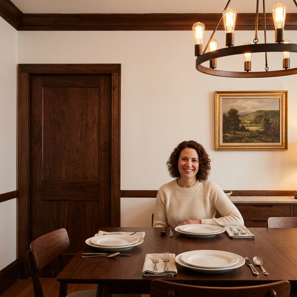
Walnut and darker stains usually read brown, sometimes slightly cool, and they bring instant contrast. With dark wood, you can go two directions: light and crisp for drama, or deep and moody for a cozy envelope.
Light and crisp pairings
- Soft white: Not icy. A gentle white makes dark trim look expensive, not harsh.
- Very light greige: Keeps the vibe relaxed and modern.
Moody pairings
- Deep green: Think library vibes, but still welcoming.
- Inky blue: Works best when it is slightly muted rather than bright navy.
- Warm charcoal: Looks sophisticated and hides scuffs in high-traffic areas.
One warning
If the wood has a cool cast (almost gray-brown), avoid wall colors with a strong yellow undertone. Yellow walls can make cool dark wood look a bit muddy.
Paint examples to anchor your search
If staring at a wall of swatches makes your eyes cross, start here. These are not the only answers, but they are the right type of color to test:
- Warm, soft whites: creamy off-white, ivory white, linen white (avoid stark “gallery white”).
- Balanced neutrals: light greige, putty beige, warm stone (avoid blue-gray labeled “cool” or “steel”).
- Orange-calming color: dusty blue-green, gray-green, smoky sage (avoid yellow-green that reads chartreuse or mint).
- Moody options: olive green, brown-based charcoal, deep muted navy.
When you are looking at options, the words on the label are less useful than the undertone. Two “sages” can behave like totally different colors.
Pick paint with lighting in mind
Lighting is where good pairings become great, or where “why does this look weird at night?” happens.
North-facing rooms
- Use warmer wall colors to keep the room from feeling flat.
- With warm wood, favor balanced warm neutrals over cool grays.
South-facing rooms
- You can handle more depth and more color.
- Warm woods may look extra golden, so muted greens and grounded greiges often look amazing.
Warm LED bulbs (2700K to 3000K)
- They enhance warmth in both paint and wood.
- If your trim already runs orange, consider a wall color that is neutral-warm, not creamy-yellow.
Neutral LEDs (3500K) and daylight bulbs (5000K)
- Neutral can make colors feel “truer.”
- Daylight bulbs can increase contrast, which can make some whites feel stark and make warm wood look more intense.
If you can, choose your bulb temperature before you finalize paint. It matters more than most people expect.
A simple matching process
Step 1: Decide what is not changing
If you are keeping the wood trim and doors, treat them like a fixed finish, just like a countertop or tile.
Step 2: Notice the other fixed finishes
Floors matter, but so do countertops, backsplash tile, stone fireplaces, and even large upholstery pieces you are keeping. If one of those elements has a cool undertone and your wood is warm, a neutral wall color usually needs to be extra balanced to keep the peace.
Step 3: Choose 6 to 10 swatches, not 2
I know this sounds like overkill. It is not. You need a range: a couple off-whites, a couple greiges, one or two colors (like blue-green or sage), and one deeper option.
Step 4: Test big and test on more than one wall
Paint large swatches on the wall (at least 12 inches by 12 inches, bigger is better) right up against the trim. Even better: paint poster board and tape it next to the door casing so you can move it around.
Also test on at least two walls if you can. A color that looks perfect on the sunny wall can shift on the shaded wall.
Step 5: Check it at three times of day
- Morning daylight
- Afternoon daylight
- Evening with the lights you actually use
Step 6: Make sure it plays nicely with floors
If you have wood floors, they are part of the wood story too. Your wall color has to get along with both the trim and the floor. When in doubt, match to the dominant undertone you see most in the room.
Whole-home color in open layouts
If your main floor is open concept, you will see multiple wood tones and multiple light directions at once. In that case, a “whole-home neutral” usually performs best when it is:
- Balanced (not icy-cool, not creamy-yellow)
- Low to medium saturation (so it does not fight the wood from room to room)
- Consistent in different light (a neutral that does not swing pink, green, or blue too hard)
Then you can use deeper colors in smaller rooms where you want mood, and let the trim be the consistent thread.
Easy palette ideas
If you like a ready-made direction, here are a few combinations that tend to work in real homes.
Honey oak
- Walls: warm greige
- Accents: soft black hardware, linen textiles, muted terracotta, aged brass
Maple or pine
- Walls: creamy off-white
- Accents: dusty blue, woven textures, warm metals
Cherry
- Walls: muted taupe or gray-green
- Accents: warm white accessories, antique brass, deep green plants
Walnut
- Walls: soft white or warm charcoal
- Accents: cognac leather, ivory, deep green, warm metals like aged brass or bronze
Common mistakes
“My walls look gray, but my trim looks orange now”
Your gray is probably blue-leaning. Fix it by shifting to a warmer greige or a soft, muted blue-green.
“Everything looks yellow and tired”
Your wall color and wood undertone are stacking. Fix it by choosing a wall color that is more neutral (less creamy) or adding gentle contrast with a grounded greige.
“The room feels too dark with my walnut doors”
Go lighter on walls, increase reflectivity (lighter rugs and curtains), and consider brighter bulbs in the evening. Dark wood needs help bouncing light.
“My white walls look sterile next to the wood”
Your white is likely too clean or too cool. Swap to a soft white with a subtle warm base.
FAQ
Should I paint the walls or the trim first?
If the trim is staying natural, paint the walls first. You will cut in along the wood carefully, then touch up the wall after. If you are repainting trim, many painters prefer trim and doors first, then walls for cleaner lines, but the sequence can vary by crew and method (especially if spraying is involved).
Do I need to match the wood undertone exactly?
No. You need to coordinate with it. A wall color can be slightly opposite (a muted blue-green with honey oak) or slightly adjacent (greige with golden tones) as long as it is not fighting it.
Can I use cool colors with warm wood?
Yes, but go muted. Dusty blue-greens and softened blue-grays can look beautiful if they are not icy and your lighting supports them.
What sheen should I use on walls near wood trim?
Eggshell is my default for most rooms because it usually wipes clean in most mid to high quality paint lines and looks smooth next to wood. Washable matte can also be a great modern option if you like a flatter look. In bathrooms and kitchens, satin is often worth it for durability.
A final tip
If you are stuck between two colors, pick the one that makes the wood look calmer and more intentional in the worst lighting condition, usually nighttime under warm bulbs. Daylight is forgiving. Evening lighting tells the truth.
Natural wood trim and doors can be a beautiful anchor. Once your wall color agrees with the undertone, the whole house feels more pulled together, without sanding a single baseboard.