
Your entryway works harder than almost any other spot in the house. It is your welcome mat, a traffic lane, a drop zone, and the first place your paint color introduces itself. The goal is not just “pretty.” It is inviting, forgiving in real-life lighting, and able to transition smoothly into the rooms you can see from the front door.
I have painted my share of foyers that looked perfect on a swatch and then turned oddly pink at night or slightly green at 7 a.m. The fix is not complicated, but it does require picking a palette with the right undertone, the right sheen, and lighting that does not sabotage your choice. Below are my go-to entryway color families and reliable pairings so your whole home feels cohesive from the first step in.

How to choose the right entryway color
Start with your sightlines
Stand at the front door and look for every room you can see. Your entryway color should be the bridge between those spaces. If you see a warm wood floor and a creamy living room, a cool gray foyer can feel like a hard stop. If you see crisp white trim and cooler tile, a very yellow beige can read dingy.
Know your lighting, then pick your undertone
Directional light is a helpful clue, but it is not the whole story. Window size, landscaping, overhangs, and nearby surfaces all matter too. Still, these tendencies are a solid starting point:
- North-facing or shaded entry: light often skews cooler, so many colors read a bit grayer. Warm neutrals and greiges tend to keep it welcoming.
- South-facing entry: you usually get warmer, stronger light. Colors can look more saturated, so softer versions of your favorites often feel best.
- East-facing entry: bright mornings, flatter afternoons. Balanced neutrals that do not rely on sunshine tend to hold up well all day.
- West-facing entry: calm mornings, warm late-day glow. Watch for paint that goes overly orange near sunset.
Do a quick bulb check before you commit
Night lighting is where “mystery undertones” show up. A warm LED (around 2700K) can make neutrals look creamier or even slightly yellow or pink. Cooler bulbs (3000K to 4000K) can make the same paint read crisper, and sometimes a touch grayer. If you can, pick your bulbs first, then sample paint with those lights on.
Pick a durable sheen you will not regret
Entryways take hits from bags, shoes, pet leashes, and fingerprints. I like:
- Eggshell for most entry walls (cleanable in many standard wall paints, still soft).
- Satin if you have kids, dogs, or a narrow hall that gets brushed constantly.
- Flat or matte only if your walls are in great shape and you are okay with touch-ups, unless you are using a scrub-resistant matte made for high-traffic walls.
Save semi-gloss for trim and doors. It is tough, but it highlights wall texture fast.
Keep trim consistent for instant cohesion
If your entry connects to a hallway or open living area, using the same trim color throughout those connected spaces is one of the easiest ways to make everything feel intentional, even if wall colors change.
Entryway palettes that flow
Each palette below includes a main wall color plus easy pairings for trim, nearby rooms, and the front door. Use them as a set, or swap within the same undertone family to match what you already have.
1) Creamy warm white + soft camel + black accents
Vibe: classic, bright, always welcoming.
- Entry walls: creamy warm white (look for subtle beige, not yellow).
- Trim: crisp but not icy white.
- Adjoining rooms: pale tan, warm greige, or light oatmeal.
- Front door: satin black or deep charcoal for a clean punch.
Why it works: Creamy whites bounce light in small foyers and make ceilings feel higher, while camel and black add structure so the space does not feel blank.
2) Light greige + warm white trim + natural wood tones
Vibe: modern, calm, put-together without being cold.
- Entry walls: pale greige (a gray-beige balance).
- Trim: warm white to keep it soft.
- Adjoining rooms: soft taupe, muted clay, or a slightly deeper greige for depth.
- Front door: medium walnut stain look or deep espresso paint.
Why it works: Greige is a great connector when you have mixed finishes, like warm hardwood plus cooler tile or stone nearby.
3) Soft sage + warm white + brass details
Vibe: fresh, earthy, and quietly cheerful.
- Entry walls: soft sage with a gray base (not neon green).
- Trim: warm white.
- Adjoining rooms: creamy off-white, linen beige, or a muted tan.
- Front door: deep olive, charcoal, or warm black.
Why it works: Sage is welcoming but still neutral enough to flow into most living spaces, especially if you already have plants, wood, or woven textures.
4) Dusty blue-gray + crisp white + warm oak
Vibe: tailored and serene, great for busy households.
- Entry walls: dusty blue-gray (watch that it does not go baby blue).
- Trim: crisp white for contrast.
- Adjoining rooms: warm white, pale greige, or sand tones.
- Front door: deep navy for a classic look.
Why it works: Mid-value colors like many blue-grays often hide scuffs better than very light whites, and they make art and mirrors pop without feeling dark.
5) Mushroom taupe + creamy trim + cozy textiles
Vibe: warm, grounded, and flattering in low light.
- Entry walls: mushroom taupe (a taupe with a whisper of gray).
- Trim: creamy white.
- Adjoining rooms: warm beige, soft terracotta accents, or deeper taupe.
- Front door: classic deep brown, charcoal, or muted burgundy.
Why it works: Taupe reads rich without being loud, which is perfect when your entry opens straight into your living room.
6) Soft clay blush + warm white + dark bronze hardware
Vibe: welcoming, sunny, and surprisingly neutral when done right.
- Entry walls: muted clay blush (think earthy, not bubblegum).
- Trim: warm white.
- Adjoining rooms: warm greige, creamy white, or soft tan.
- Front door: deep bronze, warm black, or espresso.
Why it works: A clay-leaning blush warms up windowless entries fast and pairs beautifully with natural fibers and wood.
7) Deep moody green + bright trim + lighter adjacent neutrals
Vibe: dramatic first impression that still feels classic.
- Entry walls: deep green (forest or hunter, not too blue).
- Trim: bright white to keep it crisp.
- Adjoining rooms: lighter warm white or greige so the house does not feel dark.
- Front door: match the green for a wrapped look, or go black for contrast.
Why it works: If your entry has decent light and you want impact, deep green makes everything look intentional, especially with framed art and a runner.

Make the palette flow
Match undertones, not names
Two paints can both be called “gray” and still clash. Compare swatches by holding them against a sheet of bright white paper in the same lighting where they will live. If one reads lavender and the other reads green, they are not friends.
Use a stepping-stone color when rooms connect
If your entry opens straight into a bold living room, keep the entry a softened version of that undertone family. Example: living room is deep navy, entry is dusty blue-gray, hall is pale greige with a subtle blue lean.
Repeat one element at least three times
To make an entry feel connected, repeat a color or finish in three places: wall color, runner rug, and artwork, or paint color, wood tone, and door hardware.
Use value to make small spaces feel bigger
If your foyer is tight or dim, choose a lighter value color. Lighter paints reflect more light, which is why soft warm whites, pale greiges, and light taupes can visually open up an entry.
Painting tips for an entryway
Do not skip prep in the highest-traffic zone
- Degloss and clean: wipe walls and trim with a gentle degreaser or cleaner, especially around light switches and door frames.
- Fill and sand: patch nail holes and scuffs, then sand smooth. Entryway light is brutal for showing bumps.
- Caulk trim gaps: a thin bead where trim meets wall makes everything look newer.
Prime when you need it
Prime patched areas so they do not “flash” through your finish coat. Prime also helps if you are covering stains, going from oil to latex, or making a dramatic color change (like deep green over bright white).
Sample paint the way your entry behaves
Paint a large sample (at least 12 by 12 inches) on two different walls. Check it in morning light, evening light, and with your entry light fixture on. Many foyers look totally different after sunset.
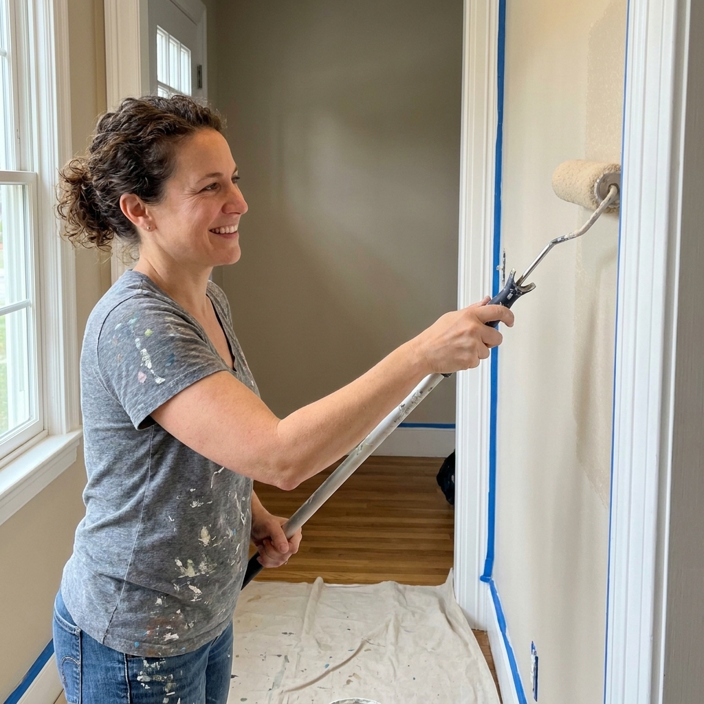
Use painter’s tape strategically
Tape baseboards and door trim if you are not confident with a brush, but still cut in slowly. The clean line comes from patient brushwork more than tape.
Entryway color FAQs
Should an entryway be lighter or darker than the rest of the house?
Most homes feel best when the entry is slightly lighter than adjoining rooms, especially if the foyer is small or has limited natural light. If you want drama, go darker in the entry and keep the next room lighter so the transition feels intentional, not cave-like.
What paint colors make a small foyer look bigger?
Soft warm whites, pale greiges, and light mushroom taupes tend to expand a space without looking stark. Pair with bright trim and a ceiling that is a clean white to lift the whole entry.
What is the best paint finish for an entryway?
Eggshell is my default in many standard wall paints. Satin is a smart upgrade for busy households or narrow entries where walls get bumped a lot. If your walls are textured or imperfect, matte can hide flaws, but it is usually less forgiving to clean unless you choose a scrub-resistant formula.
How do I choose a front door color that works with my entry?
As a starting point, pick a door color that is about 2 to 4 shades deeper than your entry walls, staying in the same undertone family. Warm entryway walls often look best with warm blacks, deep browns, olives, and rich navies. Cooler entries tend to pair well with charcoal, true black, and blue-grays.
How to commit with confidence
If you are stuck, choose one of these safe but not boring starting points: creamy warm white, light greige, or soft sage. They flatter most flooring, they adapt to changing light, and they help adjoining rooms feel connected. Then add personality with a bold runner, a mirror, and a front door color that makes you smile every time you come home.