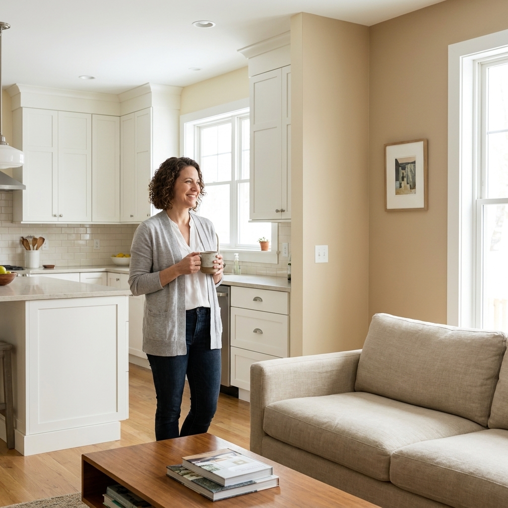
If you have ever stood in a doorway holding two paint chips and thought, why do these look great separately but weird together, you are in the exact right place. A smooth paint transition is not about picking colors that are “close enough.” It comes down to choosing the right relationship between colors and giving your eye a logical place to stop and start.
Below are the strategies I use to move from room to room through hallways, adjoining doorways, and open layouts without that awkward, chopped-up feeling.
Start with the three things that control transitions
Before you fall in love with a random swatch, check these first. They are the difference between “designer flow” and “why does this feel off.”
1) Undertone, not color family
Two colors can both be “greige” and still clash if one is violet-leaning and the other is green-leaning. Undertone is what your eye catches across a sightline.
- Warm undertones: yellow, red, orange (think creamy off-whites, warm taupes).
- Cool undertones: blue or violet (think crisp whites, blue-grays).
- About gray: gray is not automatically cool. Many grays are warm (beige, brown, or green-leaning) and some are cool (blue or violet-leaning).
- Green undertone: can read warm or cool depending on the lighting and surrounding finishes.
Quick check: Put both samples on the same wall, right next to each other, and view them in morning and evening light. If one suddenly looks pink or muddy, you have an undertone mismatch.
2) Value (lightness vs darkness)
Value does the heavy lifting in transitions. You can change hue dramatically if the value shift feels intentional, but a random mid-tone to mid-tone jump often looks accidental.
- Easy mode: keep values within one to two “steps” of each other (light to light, mid to mid). This is a personal rule of thumb, not a formal scale.
- If you want a more objective check: compare LRV (light reflectance value). Adjacent spaces often feel smoother when their LRVs are relatively close, especially when you can see both rooms at once.
- High contrast: works best when you give the transition a boundary, like a doorway, trim change, or a short hall run.
3) Sheen and texture
Even if the color is perfect, a sheen shift can read like a mistake across an open sightline. If one room is eggshell and the next is matte, the reflectivity changes at the threshold.
- For connected spaces, I like one wall sheen throughout (often eggshell).
- Save higher sheen for bathrooms or kitchens, but keep the change subtle if the rooms are visible from each other.
Pick a method that fits the layout
There is no one “right” way to stop a color. The best method depends on what your eye can see at once.
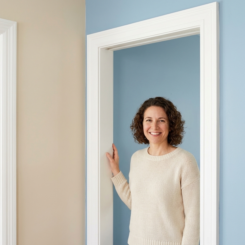
Doorways: stop at the inside corner
In most homes, the cleanest place to change color is the inside corner of the doorway return, not the door itself. Paint the room color up to the corner, then switch when the wall plane changes.
- Why it works: corners naturally create a visual break.
- Best for: bedrooms, offices, bathrooms branching off a hall.
- Pro tip: paint the door casing the same trim color on both sides. Consistent trim is your reset button.
Hallways: treat the hall like a room
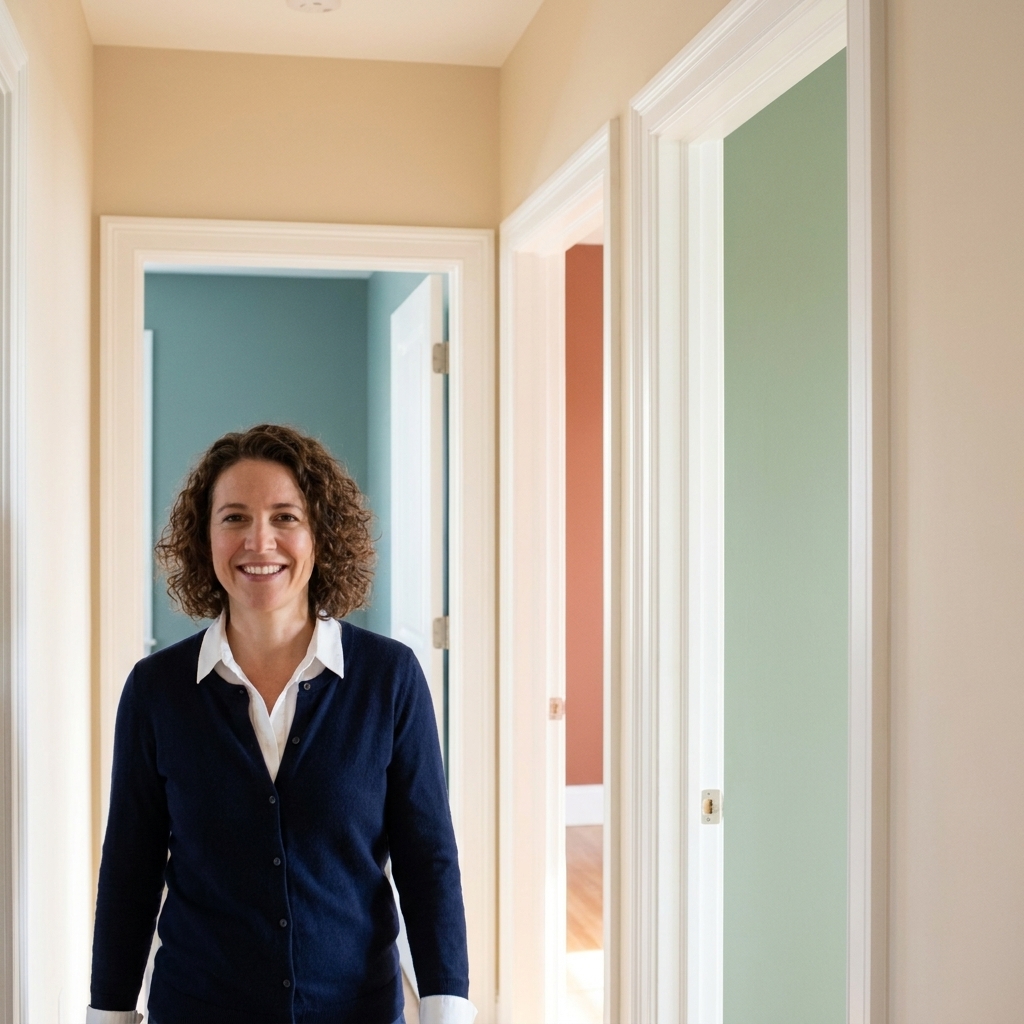
A hallway is the connective tissue of your home. If you paint it like an afterthought, transitions feel choppy. Pick a hallway color that plays nicely with the rooms it touches.
- Best hallway strategy: a light neutral that shares undertones with both adjacent spaces.
- If your rooms are bold: keep the hall calmer so the bold colors feel intentional when you enter each doorway.
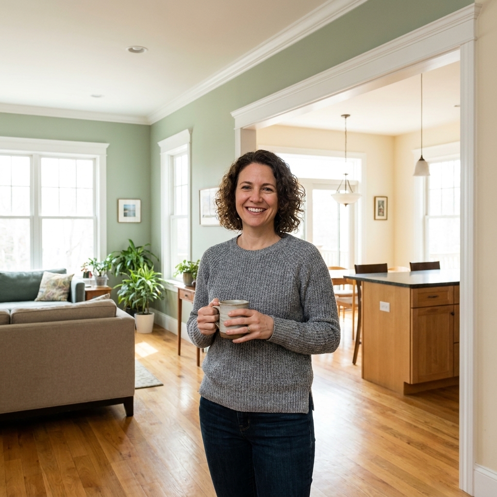
Open sightlines: choose one dominant color
In open-concept spaces, sudden color breaks can look like someone ran out of paint. Instead, choose one dominant wall color for the connected area, then create a deliberate change on an architectural boundary.
- Change color on a natural stop: a bump-out, fireplace wall, built-in wall, or a cased opening.
- If there are no natural stops, consider keeping walls unified and using accent color via cabinetry, furniture, or a single feature wall that has a clear edge.
Modern openings with little or no trim
If you have a clean, casing-less opening, you still need a stopping point. Use the change in plane as your guide.
- Best option: carry Room A color through the opening until you hit the first true inside corner of Room B, then switch.
- If there is no corner: keep the continuous wall plane one color and shift color only on a different plane (a perpendicular wall, a niche, or a bump-out). A mid-plane color change rarely looks intentional.
My favorite bridge strategies
If you want different colors in different rooms but you also want flow, bridging is the secret. You are creating a shared thread so the change reads cohesive.
Use a shared undertone
This is the simplest approach and the one I use most often. For example:
- Warm-neutral home: creamy white hall, warm greige living room, clay-toned dining room.
- Cool-neutral home: crisp white trim, pale gray hall, blue-gray bedroom, deeper slate office.
Repeat one color at least twice
When a color appears in more than one place, it stops feeling random. If you paint the dining room a moody green, echo that green in the entry console area, a powder room, or even a painted built-in.
Rule of thumb: in a sightline-heavy floor plan, repeat each statement color at least twice.
Step through values on purpose
If you are going from light to dark, make it feel deliberate by stepping through medium values in the transition zone.
- Example: soft off-white (hall) → light greige (living) → mid-tone olive (kitchen) → deeper navy (office).
Let trim unify the story
If your wall colors vary a lot, keep trim consistent. A single trim color throughout (and ideally a consistent finish like satin or semi-gloss) makes every doorway feel framed, which calms the change.
Where to stop and start color
This is the part that makes people freeze with a roller in hand. Here are the stopping points that look the most finished.
Best stopping points
- At an inside corner where the wall plane changes.
- At the edge of casing when you have traditional trim around a doorway.
- At a clear architectural break like a column, built-in, or soffit line.
- At a change in material such as a shiplap section, wainscoting, or tile boundary.
Stopping points that often look awkward
- Mid-wall with no break unless you are intentionally doing color blocking.
- Mid-opening in a cased opening where you can see both colors at once and there is no corner to separate them.
- Changing on the door itself (painting one side of a door a different wall color can look unintentional unless it is a deliberate design move).
Small upgrades that make it feel intentional
Paint the ceiling strategically
Most of the time, a consistent ceiling color helps spaces flow. If you want separation, you can also use the ceiling as a design cue.
- For flow: keep ceilings the same white throughout.
- For gentle zoning: carry a wall color onto the ceiling in a small room like a powder room, especially if that room is off a neutral hallway.
Use one white in connected spaces
Nothing makes a home feel disjointed faster than three different whites arguing with each other. Pick one white for trim, and if you use a white wall color anywhere, choose one that plays nicely with that trim white.
Get lighting consistent
Lighting is the sneaky culprit behind “this looked fine until nighttime.” If one room has warm 2700K bulbs and the next has cool 4000K, your paint will shift dramatically at the threshold.
- In connected areas, aim for consistent Kelvin temperature (often 2700K to 3000K for cozy homes).
- For truer color, try to keep quality consistent too. Look for bulbs with a high CRI (90+ is a solid target) so undertones do not get weird from room to room.
Use fixed finishes as your anchor
Paint is flexible. Your flooring, cabinets, countertops, and stone are not. When transitions feel tricky, start here.
- Match undertones to what cannot change: wood floors often pull warm, marble and many quartz read cooler, and some tiles lean pink or green.
- Use the biggest finish as the referee: if the floor runs through multiple rooms, let it guide the paint undertone so everything feels related.
Two-room combos that work
If you like having a starting point, here are transition pairings that tend to behave well in real homes because their undertones and values cooperate.
Neutral living room → colored bedroom
- Living room: warm off-white or light greige
- Bedroom: dusty blue, muted sage, or soft clay
- Why it works: neutral space acts like a buffer, bedroom color reads like a destination
Warm kitchen → cooler adjacent room
- Kitchen: warm white or creamy beige to complement cabinets and countertops
- Next room: soft blue-gray or gray-green with a touch of warmth
- Why it works: you avoid the “yellow room next to icy gray” clash by choosing a cool color with warmth baked in
Bold dining room → calm hallway
- Dining: deep green, navy, or charcoal
- Hall: light neutral with matching undertone
- Why it works: high contrast feels intentional when the hallway acts like a clean frame
How to test before you commit
I am a huge fan of doing a little extra testing up front because repainting a wrong transition is the kind of project that haunts you.
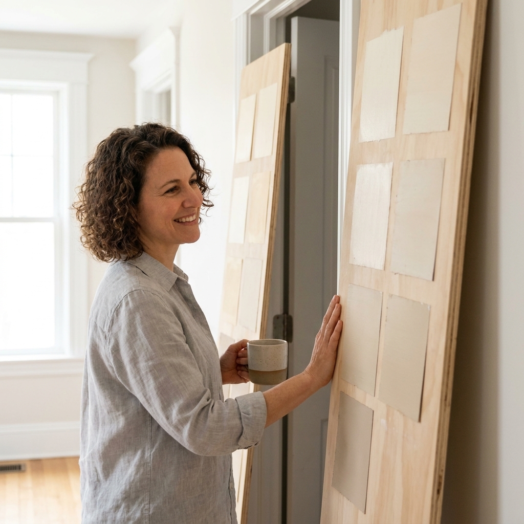
Paint test zones, not tiny squares
Do at least two large samples per color, ideally 12 inches by 12 inches or bigger. Put them where you will see them together from the hallway or main sitting spot.
Test at the threshold
Paint one sample on the wall just inside Room A, and the other just inside Room B. Then stand in the doorway. That is where your eye will judge the relationship.
Check day and night
Look in:
- morning light
- late afternoon light
- evening with lamps on
Clean execution matters
Even perfect colors can look messy if the cut line is wobbly. This is where patience pays off.
My go-to method for crisp edges
- Prep: patch dings, sand lightly, and dust off trim. Paint highlights every bump.
- Tape: use painter’s tape only on clean, dry surfaces. Press it down firmly with a putty knife.
- Seal the tape: brush a tiny amount of the base color along the tape edge first. Let it dry. Then paint the new color. This helps prevent bleed.
- Remove tape: pull it back on itself slowly while paint is still slightly tacky.
When to skip tape
If you have a steady hand and a quality brush, cutting in at an inside corner can look more natural than taped lines. Corners are forgiving because they already create a shadow break.
Quick troubleshooting
- If it looks great in daylight but wrong at night: check Kelvin and CRI first.
- If it looks like a different color from room to room: confirm you used the same sheen and the same product line.
- If the transition feels abrupt: compare LRVs and consider adding a buffer (a calmer hall color, or a stepped value between light and dark).
- If it clashes with the floor or cabinets: reassess undertone against those fixed finishes, not just against a paint chip.
Quick FAQ
Should adjacent rooms be the same color?
Not at all. What matters is that the colors share a common thread, usually undertone, value, or a repeated accent. The doorway and trim give your eye a place to reset.
What is the easiest way to make different rooms feel cohesive?
Keep trim color consistent, use one wall sheen across connected spaces, and choose wall colors that share an undertone.
Can I use different whites in different rooms?
You can, but it is risky in open sightlines. If you want multiple whites, make sure they have the same undertone and compare them at the threshold in both daylight and lamplight.
How do I transition if I have an arched opening with no door?
Stop the color at the inside corner where the wall plane turns, or keep the opening wall color consistent and shift color only once you enter the next room’s main wall plane. Avoid changing color mid-curve unless it is a deliberate statement.
If you are stuck, use this rule
If you want a no-overthinking rule: pick one unifying neutral for the connector spaces (hallways and main open areas), then let rooms that branch off be where you play with deeper or more colorful shades. It is the fastest path to a home that feels collected, not chaotic.
And if you are mid-project right now, my most practical advice is this: test at the doorway, commit to clean stopping points, and let consistent trim do its job. It is the quiet hero of seamless transitions.