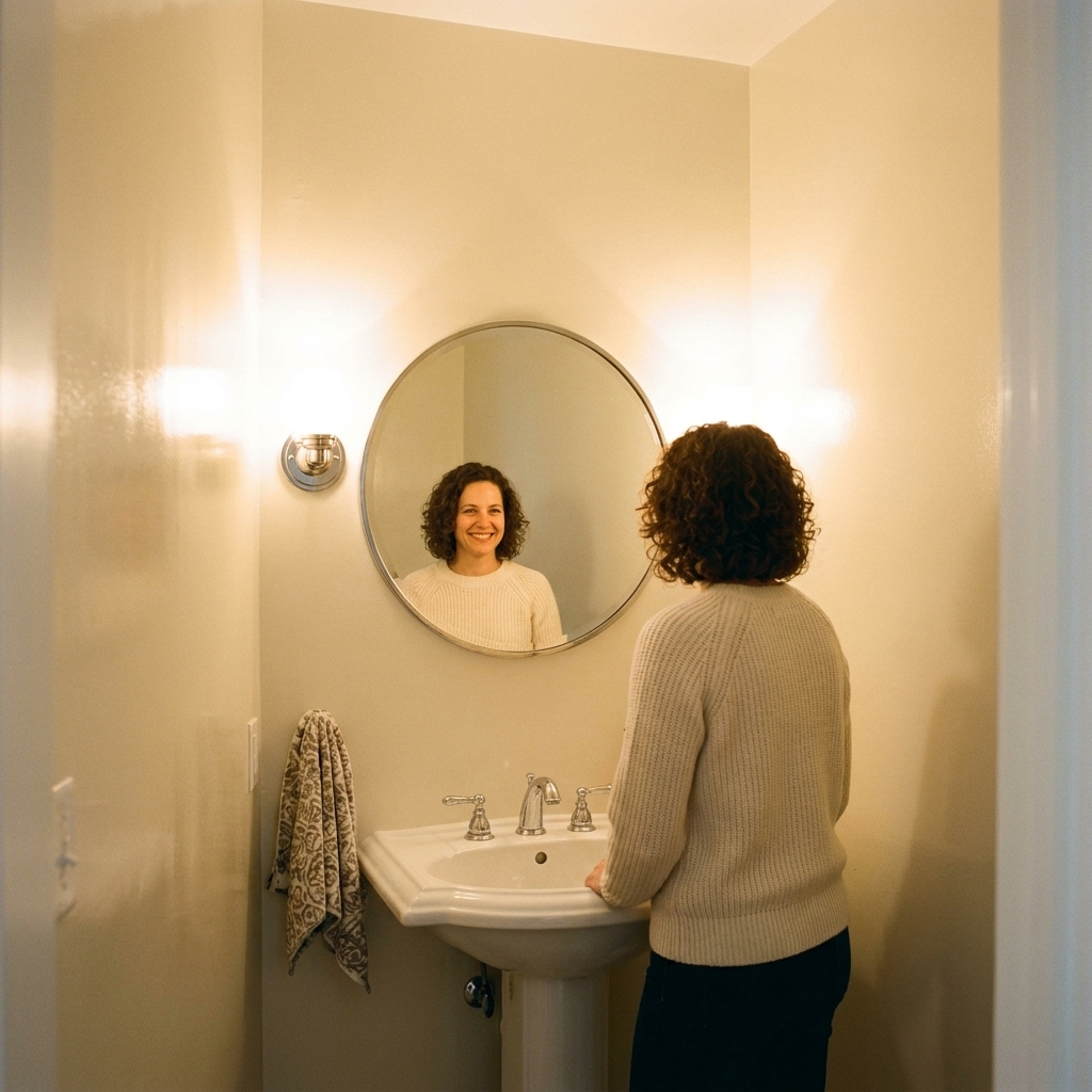
A windowless bathroom is basically a little light trap. The good news is paint can do a lot of heavy lifting here, but only if you pick a color that plays nicely with your bulbs, your tile, and the shadows that love to gather behind the toilet and under the vanity. I have painted more interior half-baths than I can count, and the winning formula is always the same: high light reflectance, gentle undertones, and a sheen that bounces light without screaming “glossy.”
What makes a windowless bathroom look bigger
In a room with no daylight, your goal is even light, not bright white at all costs. These are the three paint traits that create that open, breathable look:
- High light reflectance (LRV): LRV is how much visible light a paint color reflects. In windowless baths, colors in the 70 to 85 range often work beautifully. Many popular “bright bathroom” whites land in the 80s, while plenty of beloved off-whites sit lower. Your lighting, finishes, and contrast in the room matter just as much as the number.
- Soft undertones: Because all your light is artificial, undertones show up louder. A “simple” white can suddenly look pink, green, or gray once the lights flip on.
- The right sheen: Bathrooms need washable paint, but shiny walls can spotlight every bump and create glare right where you do your makeup or shave.
Best sheen for small, dark bathrooms
If you take only one practical tip from me, make it this: finish matters as much as color in a windowless room.
Best choice for most walls: satin or pearl
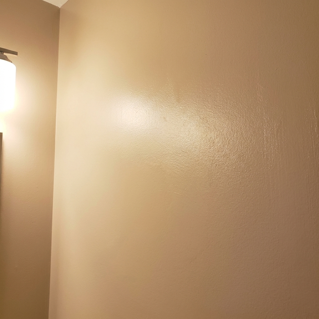
Satin (sometimes called pearl, depending on the brand) is my go-to for powder rooms and full baths. It is wipeable, moisture-resistant, and reflects just enough light to brighten the space without turning your walls into a spotlight. It can also highlight wall texture a bit, so prep matters.
When eggshell works
If your bathroom is strictly a half-bath with decent ventilation, eggshell can be fine and it is very forgiving on imperfect walls. Just know it will not bounce as much light as satin.
Skip this on walls: high-gloss (usually)
High-gloss is durable, but it exaggerates texture and can cause harsh glare under vanity lights. I love it for trim and doors in tiny baths though, because shiny trim frames the room and adds crispness without overwhelming you.
Ceiling tip
In a windowless bathroom, a flat ceiling is still fine, but consider a bathroom or kitchen-and-bath paint in a matte finish if you deal with moisture. Labels vary by manufacturer, so look for “mildew-resistant” or “bath” on the can. If the ceiling is low, a slightly brighter ceiling color than the walls can subtly lift it.
Best paint colors for windowless bathrooms
Below are the shades that consistently make small interior bathrooms feel cleaner, taller, and less cave-like. I am listing specific, widely available colors as starting points. Always sample in your actual lighting for a full day, because undertones shift a lot in windowless spaces.
1) Creamy off-whites (warm, not yellow)
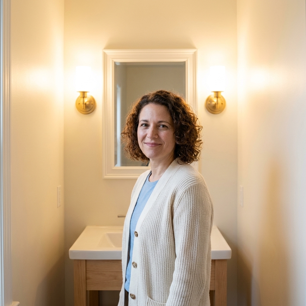
If your lighting is warm (2700K to 3000K) or you have beige tile, a creamy off-white makes the room feel welcoming and bright, not clinical.
- Sherwin-Williams Alabaster (SW 7008): Soft, creamy white that stays calm under warm bulbs.
- Benjamin Moore White Dove (OC-17): A balanced warm white that looks clean without going icy.
- Farrow & Ball School House White (No. 291): Muted, gentle warmth that hides shadows well.
Why it works: Creamy whites reflect light while softening harsh shadow lines around corners and behind fixtures.
2) Soft greige (the quiet background hero)
Greige is magic in windowless baths when you want something not-white that still brightens. The key is choosing a light greige that does not go muddy under artificial light.
- Benjamin Moore Pale Oak (OC-20): Airy, light greige that feels spa-like in tight spaces.
- Sherwin-Williams Accessible Beige (SW 7036): Reads warm and grounded, especially with white trim.
- Sherwin-Williams Agreeable Gray (SW 7029): A flexible light greige that can lean warmer or cooler depending on bulbs.
Why it works: Greige adds depth without stealing light the way deeper taupes do.
3) Pale blue-gray (fresh, reflective, flattering)
A whispery blue-gray can make a windowless bathroom feel crisp and open, like you borrowed daylight from another room. Keep it light so it does not turn stormy.
- Benjamin Moore Palladian Blue (HC-144): Light, airy blue-green that brightens without feeling cold.
- Sherwin-Williams Misty (SW 6232): A soft blue-gray that reads calm and clean.
- Benjamin Moore Woodlawn Blue (HC-147): Gentle and buoyant, great with white tile.
Why it works: Light, cool-leaning colors can visually make walls feel like they recede a bit, which often reads as more space.
4) Light green-gray (great under harsh bulbs)
If your bathroom lighting is a little unforgiving, a pale green-gray can be surprisingly flattering and it plays well with both warm and cooler bulbs.
- Benjamin Moore Healing Aloe (1562): A soft green with gray that feels bright, not minty.
- Sherwin-Williams Sea Salt (SW 6204): A classic for small baths, especially with warm white trim.
- Benjamin Moore Gray Owl (OC-52): A light gray with subtle green undertones that can look very clean in powder rooms.
Why it works: A touch of green can balance that sallow cast some bathrooms get under warm bulbs and yellow-leaning finishes.
5) Blush-tinted whites (warmth without beige)
This is my little secret for powder rooms where you want pretty but still bright. The key is choosing a barely-there blush, not bubblegum.
- Benjamin Moore Swiss Coffee (OC-45): Warm off-white that can read slightly rosy in some lighting.
- Sherwin-Williams White Flour (SW 7102): Soft and warm, lovely with brass hardware.
- Farrow & Ball Setting Plaster (No. 231): A muted pink-beige that feels elevated in a small space.
Why it works: A hint of warmth makes skin tones look nicer in the mirror and keeps the room from feeling stark.
Colors to be careful with
None of these are never, but they are common troublemakers when your only light is a couple of bulbs.
- Bright, icy whites: They can go blue or sterile under cool LEDs and highlight every shadow. They also tend to show scuffs and dust faster in high-traffic powder rooms.
- Dark paint on all walls: Moody can be gorgeous, but it rarely makes a tiny, lightless bath feel bigger. If you want drama, try dark paint on the vanity or trim instead.
- Strong yellow beiges: Under warm bulbs, they can look dingy or overly amber fast.
- Cool grays with heavy blue undertones: These can read cold and shadowy, especially next to warm white fixtures.
My quick pick-a-color method
- Identify bulb temperature: If you can, check the box. Warm is 2700K to 3000K, neutral or bright white is usually 3500K to 4000K, and daylight is around 5000K. Windowless bathrooms often look best around 3000K to 3500K if you want a clean look without going icy.
- Match paint undertone to fixed finishes: Look at tile, countertop, and flooring. Are they warm (cream, tan) or cool (gray, white with blue)? Choose a paint family that agrees with that direction.
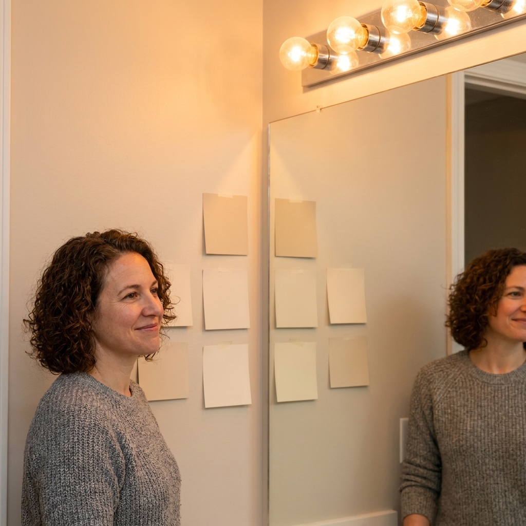
- Pick 3 sample colors: One safe neutral, one slightly warmer, one slightly cooler. This keeps you from feeling trapped.
- Sample on two walls: Paint big swatches or use sample sheets and test near the mirror and behind the toilet. Those areas always reveal weird undertones.
- Decide at night and morning: Even windowless rooms change depending on whether you are using overhead lights, vanity lights, or both.
Humidity and prep that actually matter
In bathrooms, the best color in the world will still fail if the surface is damp, stained, or already peeling.
- Ventilation first: If you have an exhaust fan, use it during showers and for at least 20 minutes after. If you do not have one, crack the door and consider upgrading. Paint does better when the room can dry out.
- Choose the right product: Look for a bathroom or kitchen-and-bath paint with mildew resistance. It is not just marketing. These formulas are built for frequent moisture.
- Prime problem areas: If you have water stains, old patchwork, or peeling edges, use a bonding primer and, for stains, a stain-blocking primer before topcoat. Otherwise, you can get flashing or bleed-through that makes walls look blotchy.
- Give it time to cure: Paint dries fast, but it cures slower. Keep airflow moving and treat fresh walls gently for the first couple of weeks so the finish hardens up.
Lighting tips that make paint look better
Since your bathroom has no daylight, your bulbs are basically the sun. Two quick upgrades make a huge difference:
- Match bulb temperatures: Mixing a 2700K vanity bulb with a 5000K overhead is a fast way to make paint look weird. Keep them consistent.
- Prioritize high CRI: For mirror lighting, look for LEDs with a CRI of 90+. It makes skin tones look more natural and helps your paint read truer.
Extra tricks that make paint work harder
Paint is powerful, but in a tiny windowless bathroom, a few supporting moves can double the effect.
- Go brighter on trim: A crisp white semi-gloss on baseboards and door casing helps define edges and makes wall color feel lighter.
- Paint the ceiling a touch lighter: Even one step lighter can make a low ceiling feel higher.
- Use one color family throughout: Too many high-contrast breaks make a small room feel choppy. A soft wall color with slightly brighter trim reads more continuous.
- Upgrade bulbs before repainting: If your bulbs are old, mismatched, or very cool, you are judging paint under the worst conditions.
- Keep sheen consistent: Mixing eggshell and satin on adjacent walls can create odd patches of reflection, which makes the room feel smaller.
FAQ
Should I paint a windowless bathroom white?
White can be a great choice, but pick the right white. In windowless bathrooms, I prefer soft, slightly warm whites over icy bright whites. They reflect light without emphasizing shadows.
What LRV is best for a small bathroom with no windows?
If your goal is to make it look bigger, LRV 70 to 85 is a strong place to start. It is not a hard rule though. Lighting temperature, tile color, and how much contrast you have in the room can make a lower LRV look bright or a higher LRV look harsh.
Is satin too shiny for bathroom walls?
Most of the time, no. Satin is usually the sweet spot: cleanable, moisture-friendly, and gently reflective. If your walls are very textured, choose a lower-sheen option like eggshell to avoid highlighting bumps.
How do I avoid paint looking gray or dingy in a windowless bathroom?
Two fixes help immediately: choose a color with a touch of warmth (cream, warm greige, soft blush) and use neutral-white bulbs around 3000K to 3500K. Dinginess is often an undertone plus lighting issue, not a bad paint issue.
What is the easiest foolproof color if I am stuck?
If you want safe and bright, start with Benjamin Moore White Dove or Sherwin-Williams Alabaster in a satin finish. They are forgiving in windowless spaces and play nicely with most white fixtures.
A final tip before you commit
In a windowless bathroom, paint is doing theater lighting work. If you are between two shades, choose the one that looks a little warmer and a little lighter under your bulbs. That is the version that tends to feel clean, spacious, and welcoming once everything is back in place and the door is closed.