When I help friends pick a home office color, I ask two questions before we even touch a swatch: What kind of work do you do, and what’s your lighting like? The goal is not just “pretty walls”. It’s a color that keeps your brain steady through a long day and also reads clean and confident on video calls.
While color and productivity is not one-size-fits-all, some research and plenty of real-world experience suggest that cooler hues and nature-based tones can support calm attention, while very saturated colors or high contrast can feel stimulating in a way that turns distracting over time. Below are seven paint color directions that consistently perform well in real homes, plus the practical details that make them look professional on camera.
Before you pick: what helps focus
Most of us concentrate best in spaces that feel predictable and low in visual noise. In paint terms, that usually means:
- Lower to mid saturation: calmer, easier to live with for 8 hours straight.
- Balanced undertones: avoids that surprise “why does this look purple at night?” moment.
- Soft contrast: enough separation from trim and furniture to feel crisp, not so much that it reads harsh on camera.
Also, webcams and laptop cameras often flatten contrast and shift color because of auto exposure and auto white balance. Subtle paint colors can look even subtler, while strong colors can look louder and sometimes cast odd tones on skin. Keep that in mind as you read the options.
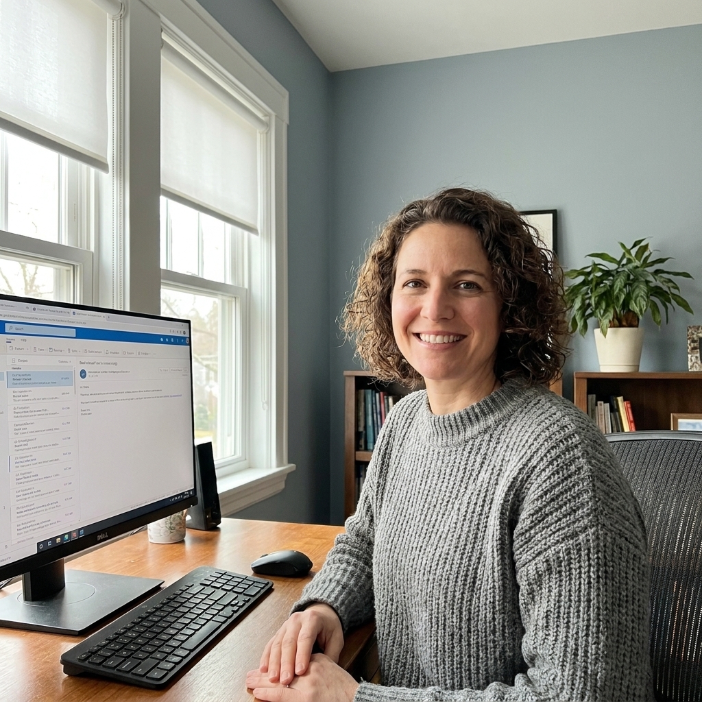
1) Soft blue-gray
Why it works: Blue is often associated with calm and task focus, and a gray base keeps it from feeling childish. In my experience, blue-gray is the safest “I need to get things done” color that still looks stylish in almost any home.
What to look for: A blue-gray with a slightly muted quality, not a bright sky blue. On video calls, this reads professional and helps background clutter fade a bit.
Lighting notes: In north-facing rooms, blue-gray can lean cooler and feel a little steely. In warm afternoon light, it softens and can show a tiny green edge depending on the undertone.
Best finishes: Eggshell for most walls. If you have lots of texture imperfections, matte can be more forgiving, but choose a washable formula.
If you want a starting point: Look at classics in this family like Benjamin Moore’s Boothbay Gray or Sherwin-Williams’ Mist Mist (always sample first).
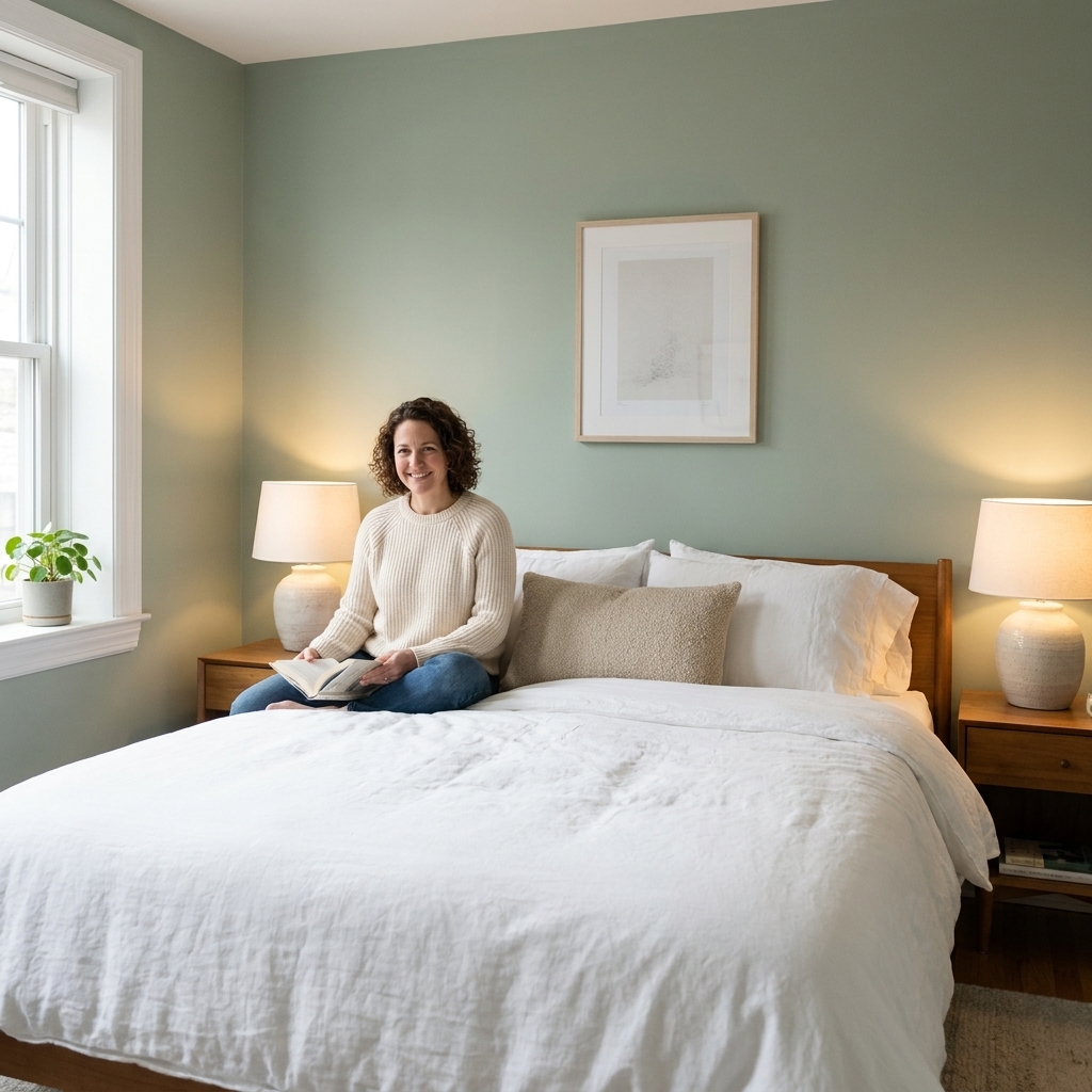
2) Sage green
Why it works: Green is strongly tied to nature cues. Many people find it restful in a way that makes long stretches at a desk feel less draining. Sage keeps the vibe grounded and mature, not bold or trendy in a way you might tire of.
What to look for: A sage that is gray-leaning or slightly dusty. That dustiness is a reliable way to get a good video call background because it does not compete with your face.
Lighting notes: Sage can flip fast. Under warm bulbs at night, it can look a touch more khaki. Under cool LEDs, it can look crisper and slightly minty.
Where it shines: Offices with lots of wood furniture, woven textures, or plants. It makes everything look intentional.
If you want a starting point: Try sampling a soft, muted sage like Benjamin Moore’s Saybrook Sage or Sherwin-Williams’ Clary Sage.

3) Greige
Why it works: If your workday already has a lot of visual input, greige is your friend. It is neutral enough to disappear, but warmer and more welcoming than a flat gray. That warmth can be especially helpful in small offices that risk feeling clinical.
What to look for: A greige with a balanced undertone. Too pink and it can read rosy on camera. Too green and it can look a bit muddy in low light.
Lighting notes: Greige changes more than people expect. It can look beige in warm daylight, and more gray at night. Always sample on at least two walls.
Pro tip from my “swatch binder” days: Put a bright white sheet of printer paper next to your sample. It reveals whether the greige is secretly pink, yellow, or green.
If you want a starting point: Two common crowd-pleasers are Sherwin-Williams’ Agreeable Gray and Benjamin Moore’s Edgecomb Gray.
4) Muted teal
Why it works: Teal sits between blue and green, so it can feel both calming and mentally fresh. I like it for people who do creative work, strategy, writing, or anything where you want steady focus but not total neutrality.
What to look for: Choose a teal that is muted and slightly grayed. High-chroma teal can get loud, and on video it may reflect onto skin, especially if your lighting is bright and close.
Lighting notes: Teal is sensitive to bulb temperature. Under warm bulbs it can lean greener. Under cooler daylight it reads bluer.
Where to use it: Consider teal as an accent wall behind your monitor if you want personality without surrounding yourself in color.
If you want a starting point: Look at muted teals like Benjamin Moore’s Smoke or Sherwin-Williams’ Riverway, then adjust lighter or darker from there.
5) Warm white
Why it works: A warm white office can feel like a fresh notebook page. Less visual distraction, more mental clarity. It is also the easiest route to a crisp, professional look on camera.
What to look for: A white with a soft warm undertone, not a stark blue-white unless you have very warm light and warm furnishings to balance it.
Lighting notes: If you work under cool LEDs, an already cool white can look icy and a little harsh. In that case, warmer white is usually more flattering for skin tones on video calls.
Finish warning: Avoid high sheen on large wall areas in an office. On video calls, reflected hotspots can be distracting. Stick to matte-washable or eggshell.
If you want a starting point: Popular warm whites include Benjamin Moore’s Swiss Coffee and Sherwin-Williams’ Alabaster.

6) Mushroom taupe
Why it works: Mushroom taupe is a cozy, grounded neutral that still feels sophisticated. It is great if your office doubles as a guest room or sits off the living room and you want continuity.
What to look for: A taupe with a gentle gray base. True browns can feel heavy and make a small office feel smaller, especially with limited daylight.
Video call perk: Mushroom tones tend to be excellent backdrops. They are quiet, flattering, and they do not throw weird color casts.
Pairing tip: This color sings with creamy trim, brass accents, and medium to dark wood desks.
If you want a starting point: Try sampling Benjamin Moore’s Revere Pewter or Sherwin-Williams’ Accessible Beige if you want a taupe that behaves nicely across lighting.
7) Soft charcoal
Why it works: Dark walls can reduce light reflection and glare and create a cocoon effect that some people find incredibly focus-friendly. The key is picking a charcoal that is soft and complex, not a flat black that reads harsh.
What to look for: A charcoal with a hint of blue or brown to keep it from feeling like a basement. This is one of those colors where undertone matters more than you think.
Lighting notes: If your office gets minimal natural light, add layered lighting: a warm desk lamp, overhead ambient light, and a monitor light bar or task lamp. Dark paint is gorgeous, but it is not forgiving in dim rooms.
Video call tip: Make sure your face is lit from the front. A ring light or a window in front of you prevents you from turning into a silhouette against dark walls.
If you want a starting point: Two dependable charcoals to sample are Benjamin Moore’s Kendall Charcoal and Sherwin-Williams’ Iron Ore.

Video call setup
- Avoid super saturated color behind you unless your camera and lighting are excellent. Muted shades look calmer and more natural on screen.
- Pick a finish that does not glare. Eggshell is my go-to for offices. It wipes clean but does not flash reflections like satin can.
- Keep contrast controlled. Bright white trim with very dark walls can look high contrast on camera. If you love dark paint, consider a slightly softer white, or paint the trim a warmer white.
- Mind bulb temperature. Mixing a cool overhead light with a warm desk lamp can make your wall color look inconsistent. Try to keep bulbs in the same temperature family.
- Skip colored LEDs during calls. RGB strips behind a monitor or on shelves can tint your walls and your skin. If you love the vibe, keep them for after-hours and switch to plain white for meetings.
- Do a quick white balance check. If your app allows it, turn off “auto” and set a fixed white balance, or at least lock exposure. Your wall color will stop shifting mid-call.
Trim and ceiling basics
If you want your office to feel calmer and look more polished on camera, coordinate these two things from the start:
- For low-contrast calm: Use a soft white for trim and ceiling rather than a super bright, icy white. It keeps edges quieter on video.
- For maximum brightness: Keep the ceiling a clean white, then choose trim that is either the same white or one step warmer. (A ceiling that is too cool can make warm wall colors look dingy.)
- For tiny rooms or sloped ceilings: Painting the ceiling the same color as the walls, or a lighter version, can feel soothing and reduce visual breaks.
Sheen and durability
Finish matters more in a home office than people think, especially if the room pulls double duty.
- Matte-washable: Great for hiding wall flaws and keeping glare down. Quality varies by brand, so look for “scrubbable” or “washable” on the label.
- Eggshell: The sweet spot for most offices. More wipeable than matte, still camera-friendly.
- Satin: Useful if you have kids, pets, or lots of scuffs, but it can show shine hotspots under lamps and webcams.
Sampling made easy
If you do one thing from this article, let it be this: do not judge paint from a tiny swatch. Undertones come out when the color has room to breathe.
- Buy peel-and-stick samples if available, or paint a 12 inch by 12 inch square on poster board.
- Move it around to the wall behind your desk, the wall opposite the window, and the wall you see most often.
- Check it three times: morning, afternoon, and night with your typical work lighting on.
- Do a quick webcam test. Sit where you normally sit, open your camera preview, and see what the color does to your skin tone and exposure.
Quick FAQ
Is blue really the best color for productivity?
Blue and blue-gray are consistently popular for focus because they read calm and steady, but “best” depends on your space. If your room is cold and north-facing, a warmer neutral or sage green may feel better all day.
What color hides office clutter the most?
Mid-tone, muted colors like sage green, greige, and mushroom taupe are great at visually quieting shelves and cords. Very bright white can make clutter pop, and very dark charcoal can make dust and dings more noticeable.
What is the safest professional background color?
A warm white or a soft greige. They look clean, timeless, and rarely fight with camera exposure.
Should I paint the ceiling the same color as the walls in a home office?
If your office is small or has awkward angles, painting the ceiling a lighter version of the wall color can feel soothing and reduce visual breaks. If you want maximum brightness, keep the ceiling a clean white.