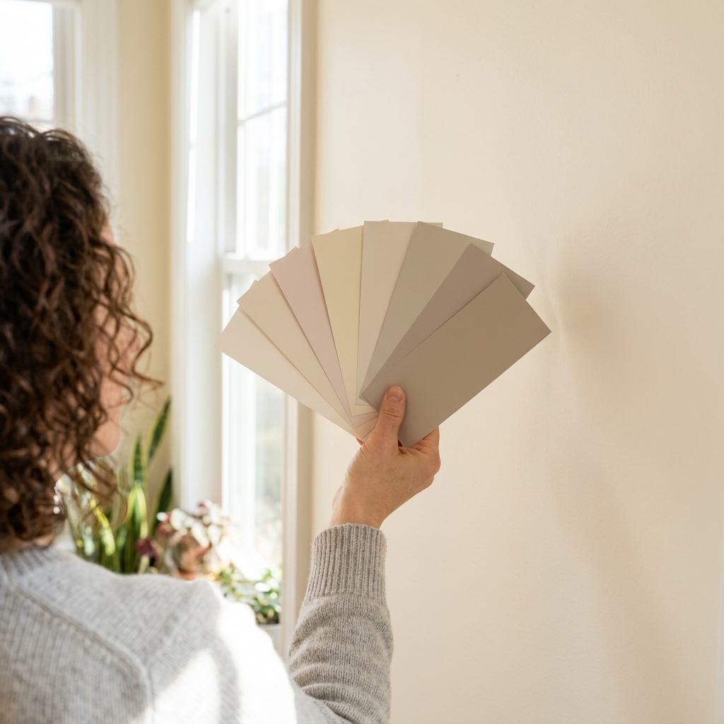
A monochromatic palette sounds simple: pick one color, paint everything, call it done. In real life, that can go one of two ways: effortlessly elevated or weirdly blank, like your room forgot the finishing touches.
The difference is layering. When you build a monochromatic scheme with intentional undertones, controlled value shifts (light to dark), and smart sheen changes (matte to satin), you get depth without visual chaos. It is one of my favorite tricks for making a home feel calm and pulled together, even on a very normal budget.

What “monochromatic” means
Monochromatic does not mean one exact can of paint everywhere. It means one base hue (blue, green, taupe, blush, etc.) expressed through:
- Shades: the hue plus black (deeper, moodier versions)
- Tints: the hue plus white (lighter, airier versions)
- Tones: the hue plus gray, meaning a less saturated, more muted version
The goal is a family of related colors that feel like they belong in the same room because they literally come from the same color DNA.
One quick note on language: I use “monochrome” as shorthand for “monochromatic.” Same idea, fewer syllables.
Start with undertone
If you only remember one thing: undertone is the boss. Undertone is the subtle color bias inside your “main” color, and it is why two paints both labeled “soft blue” can look totally different on the wall.
How to spot undertone fast
- Hold swatches against true white paper. The undertone jumps out next to a clean reference.
- Check it morning and evening. Light changes throughout the day, and bulb temperature matters at night.
- Compare three neighbors. Instead of staring at one swatch, look at it next to two similar options. Your eye will spot the green, purple, or yellow lean instantly.
Lighting tendencies are helpful, but not laws. Many north-facing rooms tend to read cooler, and many late-day rooms tend to read warmer, but latitude, season, window size, trees outside, and nearby buildings can change the story. That is why testing in your actual room beats any rule of thumb.
When you commit to one undertone, your monochrome palette gets that high-end “this was designed” feeling. When you mix undertones, you get patchy, off vibes that are hard to diagnose after the fact.
Build a 5-step ladder
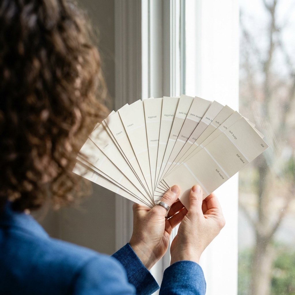
I like a simple ladder because it keeps you from overcomplicating. Choose your base color first, then add two lighter steps and two deeper steps.
The 5-step ladder
- Step 1: Brightest tint (ceiling or highest wall area)
- Step 2: Light supporting color (most walls in small rooms)
- Step 3: Your main midtone (anchor wall color in most spaces)
- Step 4: Deeper shade (built-ins, an accent wall, or lower wall paneling)
- Step 5: Deepest shade (doors, a powder room vanity wall, or a dramatic niche)
If you are nervous, keep Steps 2 through 4 closer together and use Step 5 sparingly. If you love drama, widen the jump between Step 3 and Step 5.
How much contrast is enough?
On a paint strip, “two squares apart” is subtle. “Four squares apart” is noticeable. “Six squares apart” is bold. For most homes, a sweet spot is 2 to 4 steps of separation between your main wall color and your deepest accent.
One caveat: paint strips are not standardized across brands, so a “two-step jump” can mean different things depending on the line. If you like a slightly nerdier check, look at LRV. A rough guideline: 10 to 20 LRV points often reads as a clear but livable shift, while 25+ is usually a statement. (Not every color family has perfect ladder spacing, so treat this as guidance, not gospel.)
Sheen is a secret color
Sheen changes create dimension even when the color is identical. This is my go-to move for monochrome spaces that need depth without adding a new hue.
Sheen basics
- Flat or matte: hides wall texture, looks soft and modern. Best for most walls and ceilings.
- Eggshell: slightly more wipeable, still subtle. Great for living rooms, hallways, and kid zones.
- Satin: more durable and reflective. Ideal for kitchens, baths, trim in busy spaces.
- Semigloss: crisp and shiny. Traditional for trim, doors, cabinets, but it will highlight imperfections.
My go-to sheen recipe
- Ceiling: same hue as walls, one to two ladder steps lighter (or try a 25 to 50 percent strength mix if your paint store offers it) in flat
- Walls: midtone in matte or eggshell
- Trim and doors: same hue, 1 to 2 steps deeper in satin or semigloss
This creates quiet contrast that reads intentional, especially in rooms where you want calm: bedrooms, offices, and open living spaces.
Also, a real-world heads-up: the “same color” can look different across different paint lines, bases, and sheens. If you are painting walls in one product and trim in another, sample the exact product and sheen you plan to use. Monochrome is less forgiving about mismatches.

Where each shade goes
Think of your darkest shade like eyeliner: best when placed strategically. A little defines. Too much can feel heavy, especially in low-light rooms.
Placement ideas
- All-over walls: Use your midtone (Step 3). It is the most forgiving and easiest to live with.
- Ceiling: Go lighter than the walls if your room is small or light-challenged. Go same color if you want a cozy wraparound effect.
- Trim: Either a lighter tint for airy contrast or a deeper shade for a moody, tailored look. Both are monochromatic if the undertone stays consistent.
- Accent wall: Choose the deeper shade, and pick a wall with a natural “job” like behind the bed, fireplace wall, or a wall with built-ins.
- Architectural features: Niches, paneling, beams, and interior doors are perfect for Step 4 or Step 5.
If your room already has strong contrast from flooring or stone, keep your paint ladder tighter. The room is already doing a lot.
For open floor plans, think in sightlines: keep your deepest value to fewer focal planes so you do not feel surrounded. One strong Step 4 zone you can see from multiple angles often looks more intentional than three different dark moments competing for attention.
Add texture, not new colors
When you limit the palette, texture becomes your best friend. You can keep the walls monochrome and still get that layered designer feel by varying surfaces.
- Roller nap choices: A smoother finish (1/4-inch to 3/8-inch) looks more polished on smooth walls. A thicker nap (1/2-inch) can disguise imperfect drywall. For heavier texture, you may need 3/4-inch.
- Limewash or mineral paint: adds soft movement and depth in one color, especially beautiful in bedrooms and dining rooms.
- Paneling or board-and-batten: paint it one shade deeper than the wall above for instant dimension.
- Roman clay style finishes: great in entryways and powder rooms when you want drama without a busy color story.

Best colors for monochrome
Almost any hue can work, but a few families are especially forgiving and gorgeous on walls.
Blue
Blue reads calm and timeless, but watch for purple undertones under warm bulbs and green undertones in shaded rooms. Monochrome blues look best when you keep the temperature consistent: either crisp and cool or soft and dusty.
Green
Greens are sensitive to light. Some rooms push green grayer and moodier, others pull it warmer. Test large swatches and check them at the times you actually use the room.
Warm neutrals
Beige, greige, and taupe are the MVPs for monochrome because the shifts are subtle but still read as layered. Undertone matters most here: pink-beige and yellow-beige do not play nice together.
Charcoal and near-black
Monochrome darks can look stunning and expensive, but they demand good prep. Patch, sand, and prime, because shinier trim in a deep color will highlight every wobble.
Test without repainting
Step 1: Choose three candidates
Pick three versions of your base hue that have the same undertone. If you start with ten, you will spiral. I have been there.
Step 2: Paint sample boards
Use two coats on 12-by-12 or larger boards. Move them around the room. Tape them near trim, next to the sofa, and in the darkest corner.
Step 3: Check three lighting moments
- Morning natural light
- Afternoon light
- Nighttime with your actual bulbs on
The winner should look good in all three, not perfect in only one.
Step 4: Lock the ladder
Once you have your midtone, building the ladder is easy: go lighter for ceilings and adjacent spaces, deeper for trim or a single feature.
If you are planning multiple sheens, sample those too. The color can read slightly different in matte versus satin, even from the same brand.

Prep that makes it work
Monochrome rooms look expensive when the surfaces look crisp. A little prep goes a long way, especially if you are color-drenching or going dark.
- Prime with a plan: If you are jumping from light to deep (Step 5), use a quality primer, and consider tinting it toward your finish color to improve coverage.
- Caulk the gaps: A thin bead where trim meets wall makes monochrome transitions look clean instead of choppy.
- Sand between coats: Especially on trim and doors. Smooth trim plus satin sheen is what gives you that tailored finish.
Common mistakes
Everything is the same value
Symptom: The room feels flat.
Fix: Add one deeper shade on trim, doors, or a feature wall, or shift sheen so trim is satin while walls are matte.
Undertones are fighting
Symptom: The colors technically match but look “off.”
Fix: Re-select within one undertone lane. For example: dusty blue with a gray undertone across all steps, not one gray-blue and one green-blue.
Trim is too shiny
Symptom: Every dent and brush mark shows.
Fix: Use satin instead of semigloss, and sand trim between coats. A higher sheen finish is not forgiving.
The bulb is the problem
Symptom: Beautiful in daylight, weird at night.
Fix: Swap to consistent bulb temperatures room-to-room. Warm bulbs can yellow some neutrals, and cool bulbs can make warm colors look dull.
Room formulas
Soft and airy
- Ceiling: Step 1 tint, flat
- Walls: Step 2, matte
- Trim: Step 2 or Step 3, satin
- One accent: Step 4 on a single wall or built-ins
Cozy and tailored
- Ceiling: Step 2, flat
- Walls: Step 3, matte
- Trim and doors: Step 4, satin
- Optional: Step 5 for a powder room door or niche
Modern color-drench
- Walls, trim, and doors: Step 3 in matte on walls and satin on trim
- Ceiling: same color in flat, or one tint lighter if you want more lift
This is the look that makes even basic builder trim feel intentional, because the shadows become the contrast instead of a bright white outline.
FAQ
Can I use white trim?
You can absolutely use white trim. It just becomes a contrast element instead of part of the monochrome family. If you want a true monochromatic look, tint your trim within the same undertone lane.
What is the easiest monochrome color?
Warm neutrals and muted blue-grays are forgiving because the value shifts look natural and the palette hides minor wall imperfections better than bright, saturated colors.
How do I keep it from feeling boring?
Use at least two value levels (midtone plus one deeper or one lighter), and change sheen somewhere. Then add texture through fabrics and finishes: linen curtains, a nubby rug, wood tones, metal, and a little greenery.
Can I do monochrome in an open plan?
Yes, and it is a great strategy. Pick one base hue for the main area, then shift value by zone. For example, living room walls in Step 3, dining nook in Step 4, hallway in Step 2. Same color story, gentle variety.
Before you commit
Monochromatic design is not about playing it safe. It is about being intentional. When you pick one undertone, build a clear value ladder, and let sheen do some quiet heavy lifting, your walls look layered, calm, and expensive in the best way.
If you are standing in the paint aisle feeling stuck, choose your midtone first. Everything else gets easier from there.