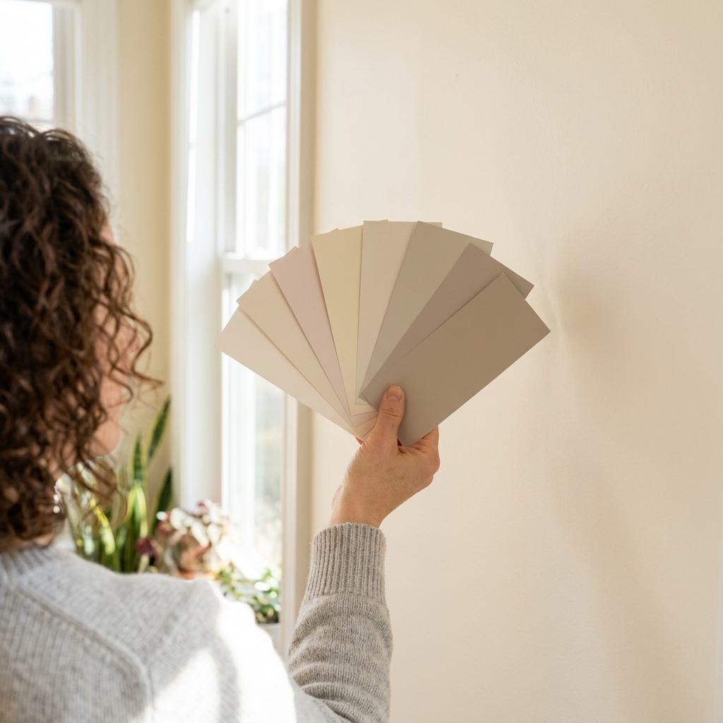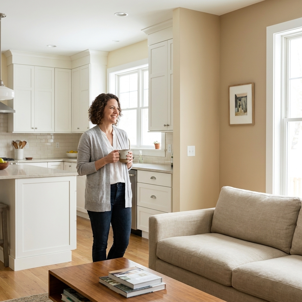
Hardware is basically jewelry for your home. Metals are picky, though. A paint color that looks perfect next to a brass sconce can make chrome feel icy, and the same “safe” greige can turn matte black hardware into a flat silhouette.
Let’s make this easy: your wall color should either echo the metal’s temperature (warm with warm, cool with cool) or create clean contrast (warm metal on cool paint, cool metal on warm paint) without fighting undertones. Once you learn to spot undertones in both the paint and the finish, the pairings get a lot less stressful.
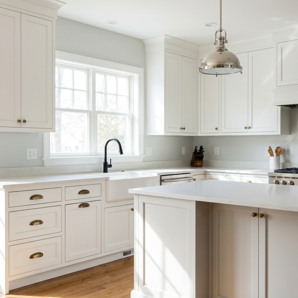
Start with undertones
Two whites can be wildly different. Same with two “silvers.” Before you commit to a palette, identify what’s quietly steering the look.
Quick undertone check (my weekend-painting method)
- Hold a plain white sheet of paper next to the wall, the metal, and any big fixed items (countertops, tile, flooring). White paper makes undertones jump out.
- Compare metals in the same light. Brass that looks warm at night can look slightly greenish in daylight, especially if it is unlacquered or antique.
- Watch for green and purple shifts. They are common culprits when a room feels “off,” especially in grays and greiges.
- Check morning and evening. North light cools everything down; warm bulbs can make a neutral paint suddenly look yellow.
If your space is open concept, do this in the room that gets the most consistent light, then walk the swatch around. Paint does not behave the same in a windowless hallway as it does in a sunny kitchen.
Brass hardware
Brass reads warm, but the finish matters. Polished brass is bright and reflective, brushed brass is softer, and antique or unlacquered brass can lean earthy or even slightly green as it patinas.
Paint families that flatter brass
- Warm whites and creamy off-whites: These make brass feel intentional and classic instead of shouty.
- Greige with a warm base: Great if you want neutral walls without making brass look too yellow.
- Earthy greens and olive tones: A favorite for brass because it feels tailored, grounded, and a little vintage in the best way.
- Clay, terracotta, and muted blush: These flatter brass especially well in dining rooms, powder rooms, and bedrooms.
Color ideas to try
- Warm white: creamy white, antique white, soft ivory
- Warm neutral: oatmeal, mushroom, warm taupe
- Green: sage, olive, laurel green, deep moss
- Moody: deep navy, charcoal with a warm undertone
Common brass pitfalls
- Too-cool gray walls can make brass look orange or cheap because the contrast is harsh.
- Very yellow paint can make brass disappear and the whole room turns “sepia.”
- Pink-beige paint with greenish antique brass can read a little muddy, especially in low light.
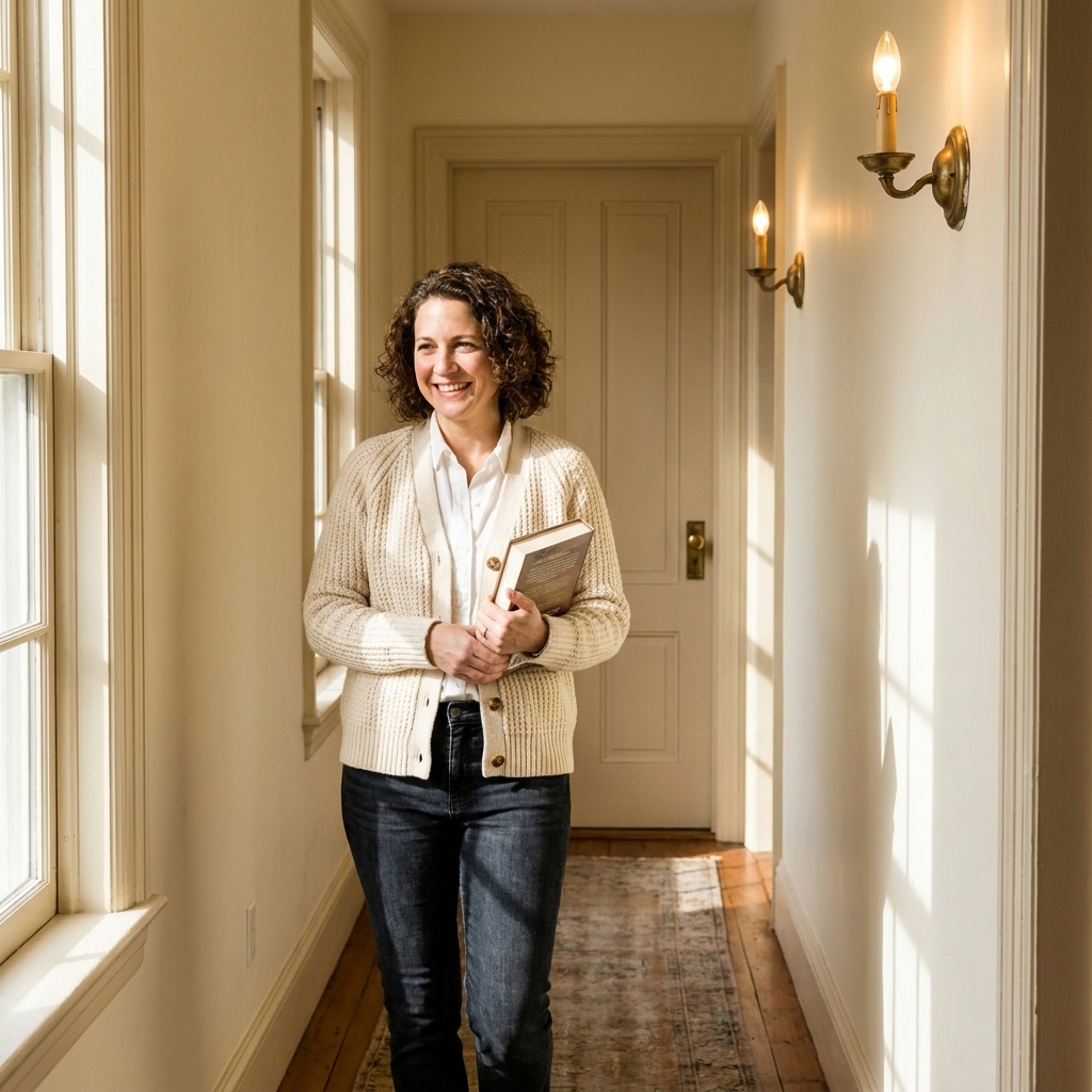
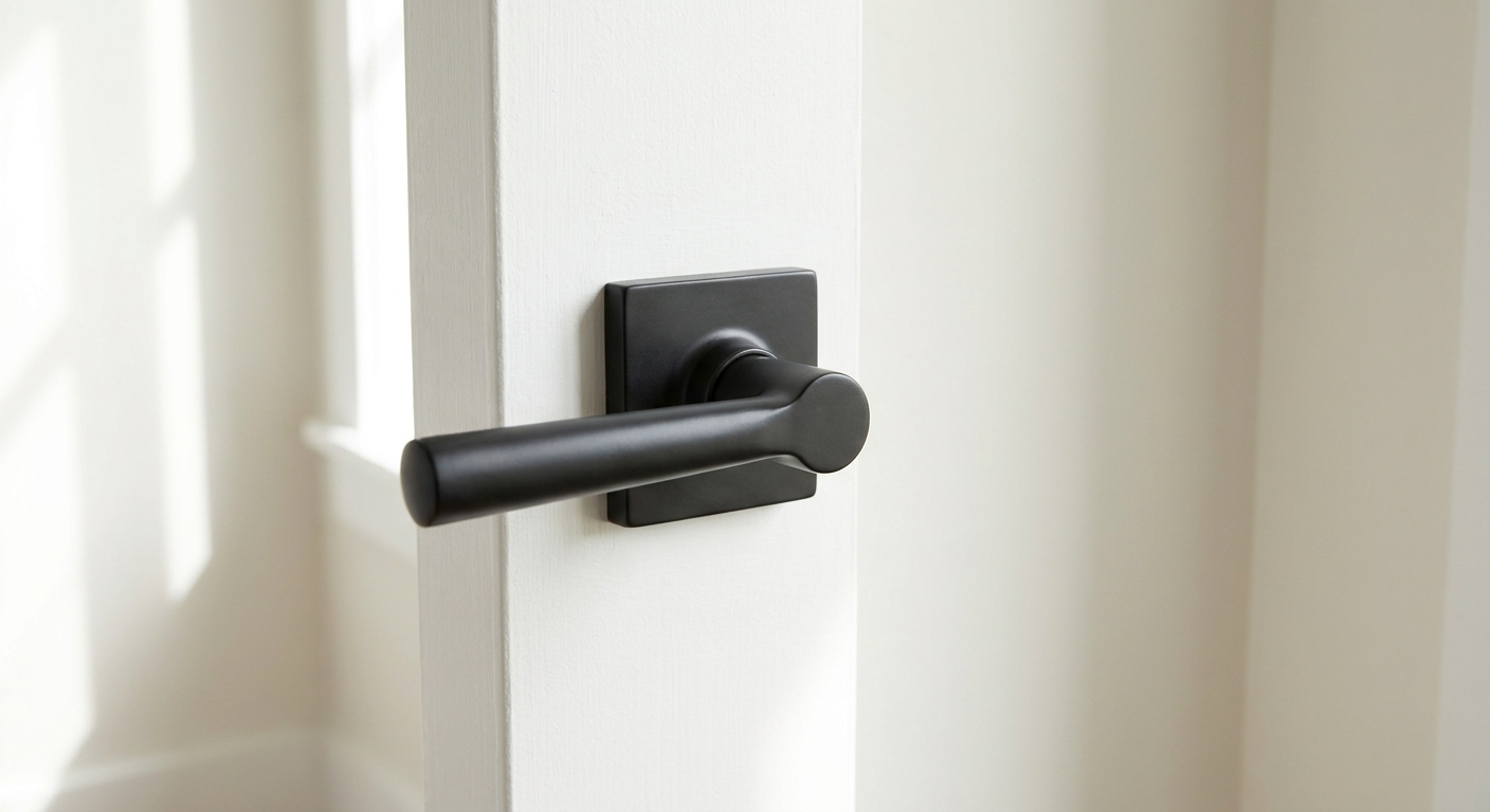
Matte black hardware
Black hardware is bold and graphic, but it can feel harsh if the wall color is dreary or if undertones clash. The goal is to keep black looking clean and intentional, not like an outline.
Paint families that work with black
- Soft warm whites: Black pops, but the room still feels welcoming.
- Cool whites and bright whites: A modern, high-contrast look that works beautifully in kitchens and baths.
- Dusty blues and blue-grays: Black reads sleek against blue-based colors.
- Greens from sage to forest: Black + green feels earthy and elevated.
- Moody color done right: Deep charcoal, inky navy, or near-black walls can look stunning with black hardware if you add texture and lighting.
Color ideas to try
- Light: crisp white, soft white, pale greige
- Mid-tone: blue-gray, eucalyptus green, muted teal
- Dark: deep navy, dark olive, charcoal
Common black pitfalls
- Flat gray walls can make black feel dull and the whole room can go lifeless. If you want gray, pick one with either a clear blue base or a warm greige base.
- Too-warm beige can sometimes make black look a bit “dusty.” Adding a cleaner white trim or shifting to a warmer white wall color usually fixes it.
- Not enough contrast. If your walls are medium-dark and you have black hardware, bring in contrast through trim, textiles, or lighting so the hardware does not disappear.
Silver hardware (chrome and nickel)
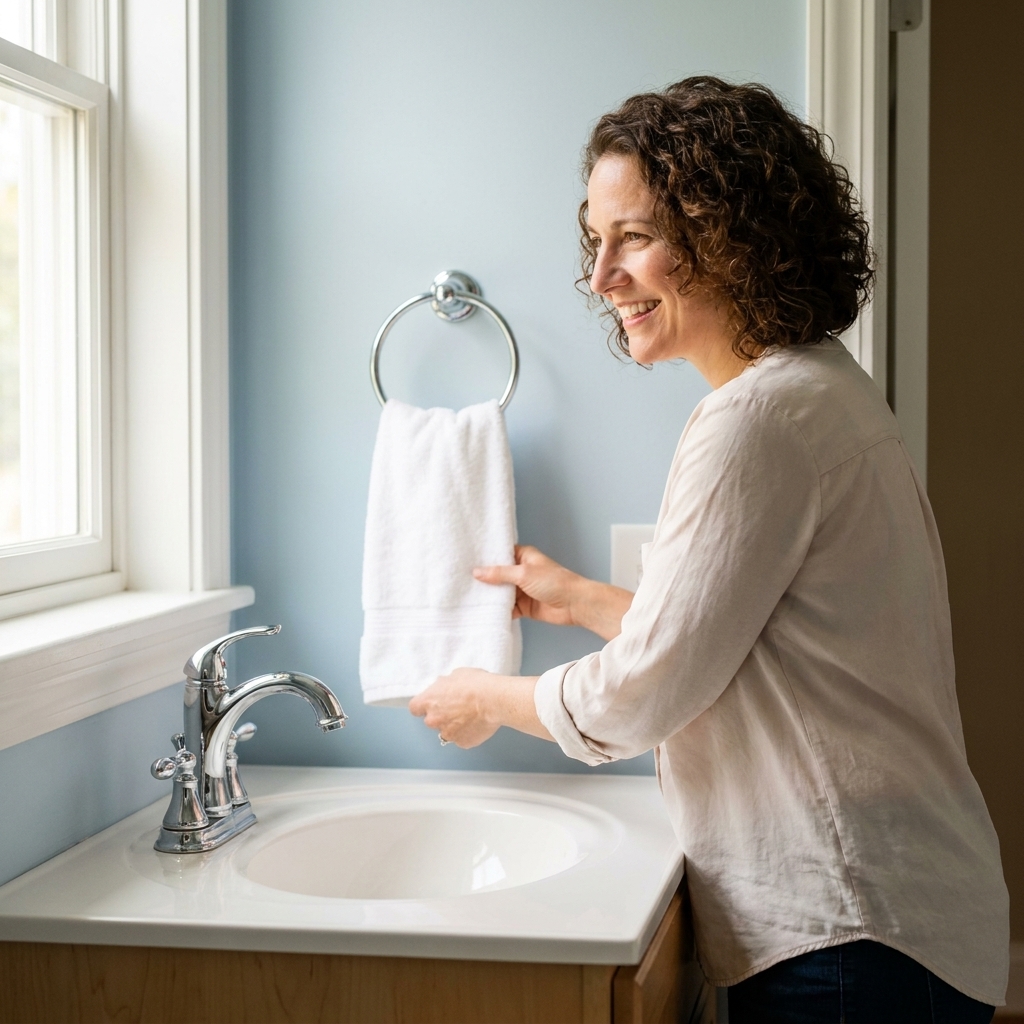
“Silver” can mean a few things. Chrome is mirror-like and reads cooler. Brushed nickel is softer and can lean slightly warm or neutral depending on the brand. Stainless often sits in the middle but can still look cool in certain lighting.
Paint families that flatter silver
- Cool whites and clean neutrals: These make chrome and nickel feel fresh and cohesive.
- Blue-grays and airy blues: Especially good with chrome in bathrooms and kitchens.
- True greige (balanced): Great with brushed nickel if you want warmth without turning the metal yellow.
- Soft charcoal and cool deep tones: Silver looks sharp against deeper, cooler walls.
Color ideas to try
- White: bright white, cool white, soft white with a gray base
- Neutral: light greige, pebble gray, putty
- Color: pale blue, slate blue, blue-gray, smoky green
- Dark: deep teal, cool charcoal, blue-black
Common silver pitfalls
- Too-warm creamy paint can make chrome look a little stark, like it belongs to a different decade than the walls.
- Purple-leaning grays can sometimes make brushed nickel look slightly greenish, especially under warm bulbs or in low natural light.
- Warm light bulbs everywhere can make silver feel “blue.” Try a neutral white bulb in the 3000K range for a more balanced look.
Bronze and copper (quick note)
If you have oil-rubbed bronze, aged bronze, or copper hardware, treat them like warm metals. They tend to look best with creamy whites, warm taupes, soft clay tones, and earthy greens. Very cool grays can work, but the contrast is sharper and can bring out muddy undertones fast.
Easy palette recipes
If you want a quick decision, choose the metal you have the most of, then grab a palette that supports it. These combinations work because the undertones stay consistent.
Before you commit (quick checklist)
- Lead metal: what you see most (hardware, faucet, main lighting)
- Big fixed finishes: floors, countertops, tile, grout, stone
- Wood tones: cabinets, trim, furniture stain
- Lighting: bulb temperature and how much daylight the room gets
Brass-forward palettes
- Classic warm: creamy white walls + warm white trim + brass + natural wood
- Earthy modern: soft mushroom walls + brass + olive accents + black as a tiny supporting actor (frames, hooks)
- Moody and rich: deep navy walls + brass + crisp white ceiling + warm lighting
Black-forward palettes
- Clean contrast: bright white walls + black hardware + light oak + a touch of brass in lighting
- Soft modern: warm white walls + black + camel leather + muted clay accents
- Organic: sage walls + black + cream textiles + warm stone
Silver-forward palettes
- Fresh and airy: cool white walls + chrome + pale blue accents + marble or quartz
- Neutral calm: balanced greige walls + brushed nickel + soft white trim + linen textures
- Deep and tailored: cool charcoal walls + polished nickel + white trim + glass lighting
Mix metals on purpose
Yes, you can mix brass, black, and silver in the same home, and even in the same room. The secret is repetition and a clear “lead metal.”
A simple mixing rule
- Pick a lead metal (about 60 to 70 percent of what you see): cabinet hardware, most lighting, or faucets.
- Add a supporting metal (about 20 to 30 percent): mirrors, picture frames, a secondary light, small furniture legs.
- Use an accent metal (about 10 percent): one standout piece like a sconce pair, a bar cart, or a statement mirror.
In practice: If your kitchen has stainless appliances (silver) and you love brass pulls, let brass be the lead on cabinets, keep silver as the built-in supporting player, and use black as an accent through a faucet or pendants.

Lighting changes everything
I have watched a perfect paint color turn weird simply because the bulbs were too warm or too cool. Metals reflect whatever light you give them, which is why hardware can look different at 9 a.m. versus 9 p.m. Also worth knowing: not all LEDs render color the same way, so two bulbs with the same Kelvin number can still look a little different.
Quick Kelvin guidance
- 2700K (very warm): cozy, but it can push creams yellow and make chrome look colder by contrast.
- 3000K (warm-neutral): my favorite middle ground for most homes, especially mixed metals.
- 3500K to 4000K (cooler): crisp and bright, great for task-heavy kitchens and baths, but it can make warm paint feel less warm.
If you are repainting a bathroom with chrome, a cooler bulb can make the whole space feel fresh. If you are leaning into brass and creamy walls, a too-cool bulb can drain the warmth right out of the room.
Test paint by the hardware
My rule: test the paint where the metal lives. A swatch on the far wall does not help you decide how a brass knob will look on a door right next to it.
Fast, low-mess testing steps
- Paint poster board with two coats of your sample color. Let it dry fully.
- Tape it near the hardware and also in the shadiest corner of the room.
- Check it under your real lighting at night with lamps and overheads on.
- Look at it from the doorway and from up close. Hardware is a detail, but you experience a room at distance first.
- Decide based on undertone harmony, not whether the sample looks perfect at one specific hour of the day.
Quick FAQ
Is brass warm or cool?
Most brass reads warm, but antique and unlacquered brass can lean earthy and slightly green. Warm whites, warm greige, and olive-based colors are usually the safest pairings.
What wall colors make black hardware look modern?
Bright whites for high contrast, soft warm whites for a gentler look, and blue-grays or sage for a more layered, designer feel. Avoid muddy mid-grays unless the undertone is very clear.
Does silver hardware go with warm paint?
It can, especially brushed nickel, but choose a warm paint that is more balanced than creamy-yellow. If the walls are very creamy, chrome can look stark.
How do I choose paint if my room has mixed metals?
Choose paint based on your lead metal and the biggest fixed finishes in the room (tile, countertops, flooring). Then repeat each metal at least twice so the mix looks intentional.
One final nudge
If you are torn between two colors, choose the one that makes your hardware look more expensive. Hardware is small, but it’s the thing your hand touches all day. When your paint supports that finish, the whole room feels pulled together, even if the rest of your decor is still in progress.
And please, learn from my younger self: tape carefully, cut in slowly, and do not skip the light sanding if your walls are even a little glossy. Great color pairing deserves a smooth finish.