Room Tint
Room Tint
interior paint colors and painting walls
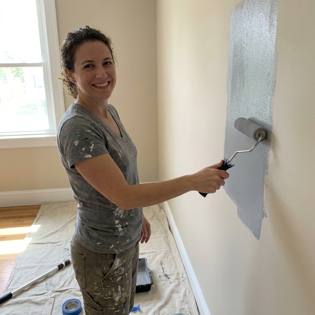
Paint Latex Over Oil Paint Without Peeling
If you have older interior walls, trim, or doors, there is a decent chance you are dealing with oil-based paint under the surface. And if you have ever heard “latex over oil will peel,” that warning is real. The good news is that it is not a forever problem. Oil paint is not unpaintable. It just...
Read more →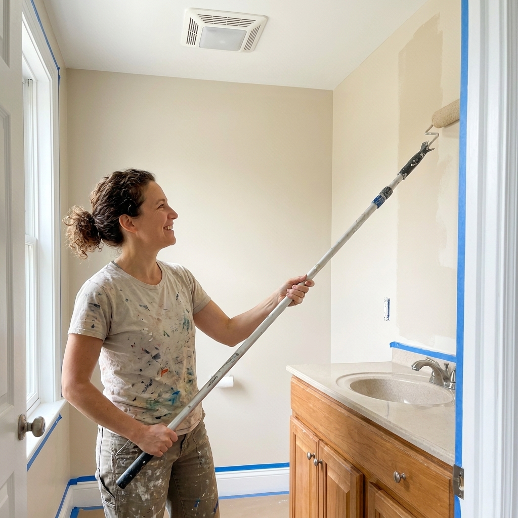
Best Bathroom Paint Types and Finishes
Bathrooms are small, steamy, and unbelievably hard on paint. If you have ever watched fresh paint bubble near the shower or spotted mystery peeling above the towel bar, it is usually not “bad luck.” Most often, it comes down to the wrong paint type , the wrong finish , or paint going onto a surface...
Read more →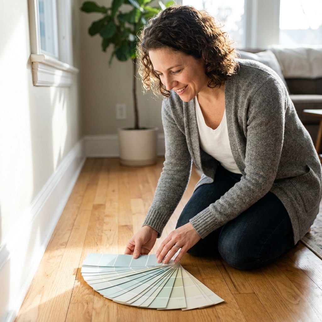
Pair Wall Paint with Hardwood and Tile Floors
If your floors are staying put, they’re the biggest “color sample” in your house. I have watched plenty of friends fall in love with a wall color on a tiny swatch, paint the whole room, and then realize the floor makes it look oddly pink, sickly green, or just… off. The fix isn’t magic; it’s...
Read more →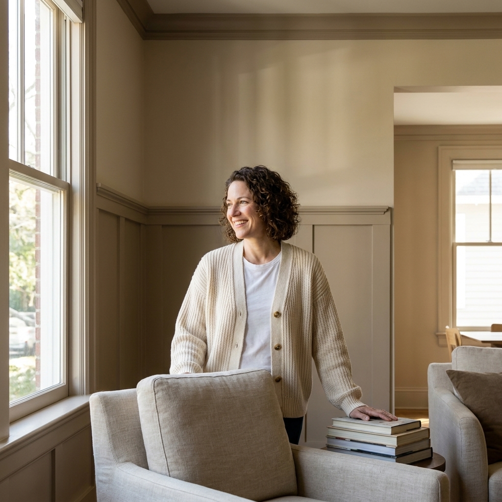
Monochromatic Color Palettes That Don’t Look Flat
A monochromatic palette sounds simple: pick one color, paint everything, call it done. In real life, that can go one of two ways: effortlessly elevated or weirdly blank, like your room forgot the finishing touches. The difference is layering. When you build a monochromatic scheme with intentional...
Read more →
Beyond White: Choosing a Ceiling Color That Works
Most of us were taught that ceilings are supposed to be white, full stop. And honestly, a classic white ceiling can look crisp and clean. But if your room has ever felt a little unfinished, like the walls are doing all the work and the top of the space just disappears, your ceiling color is a big...
Read more →
How Light Direction Changes Your Paint Colors
If you have ever carried the same paint swatch from room to room and thought, “Wait, is this even the same color?” you are not imagining it. Natural light direction is one of the biggest reasons a perfectly coordinated palette in the store turns into a weird undertone party at home. Light coming...
Read more →
Mixing Warm and Cool Paint Colors: Dos and Don’ts
Mixing warm and cool paint colors in one space is one of my favorite ways to make a room feel layered and lived-in. It is also one of the fastest ways to end up with a room that feels slightly… queasy. Not because warm and cool cannot coexist, but because undertones rarely forgive. The good news:...
Read more →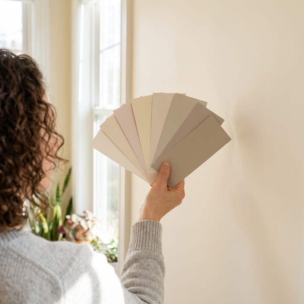
How to Spot and Match Paint Undertones
Undertones are the reason a “simple” greige can lean pink at night, a clean white can look a little dull next to your trim, and your dreamy sage can suddenly feel minty. The good news is you do not need perfect color vision or a designer degree. You need a repeatable process and a couple of...
Read more →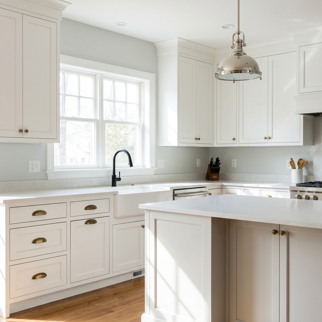
Paint Colors That Work with Brass, Black, and Silver Hardware
Hardware is basically jewelry for your home. Metals are picky, though. A paint color that looks perfect next to a brass sconce can make chrome feel icy, and the same “safe” greige can turn matte black hardware into a flat silhouette. Let’s make this easy: your wall color should either echo the...
Read more →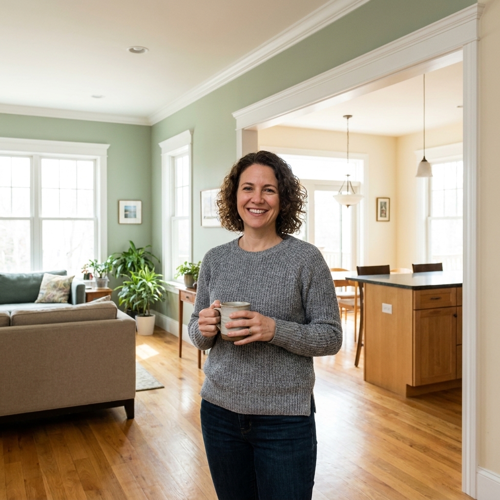
Seamless Paint Color Transitions Between Rooms
If you have ever stood in a doorway holding two paint chips and thought, why do these look great separately but weird together , you are in the exact right place. A smooth paint transition is not about picking colors that are “close enough.” It comes down to choosing the right relationship between...
Read more →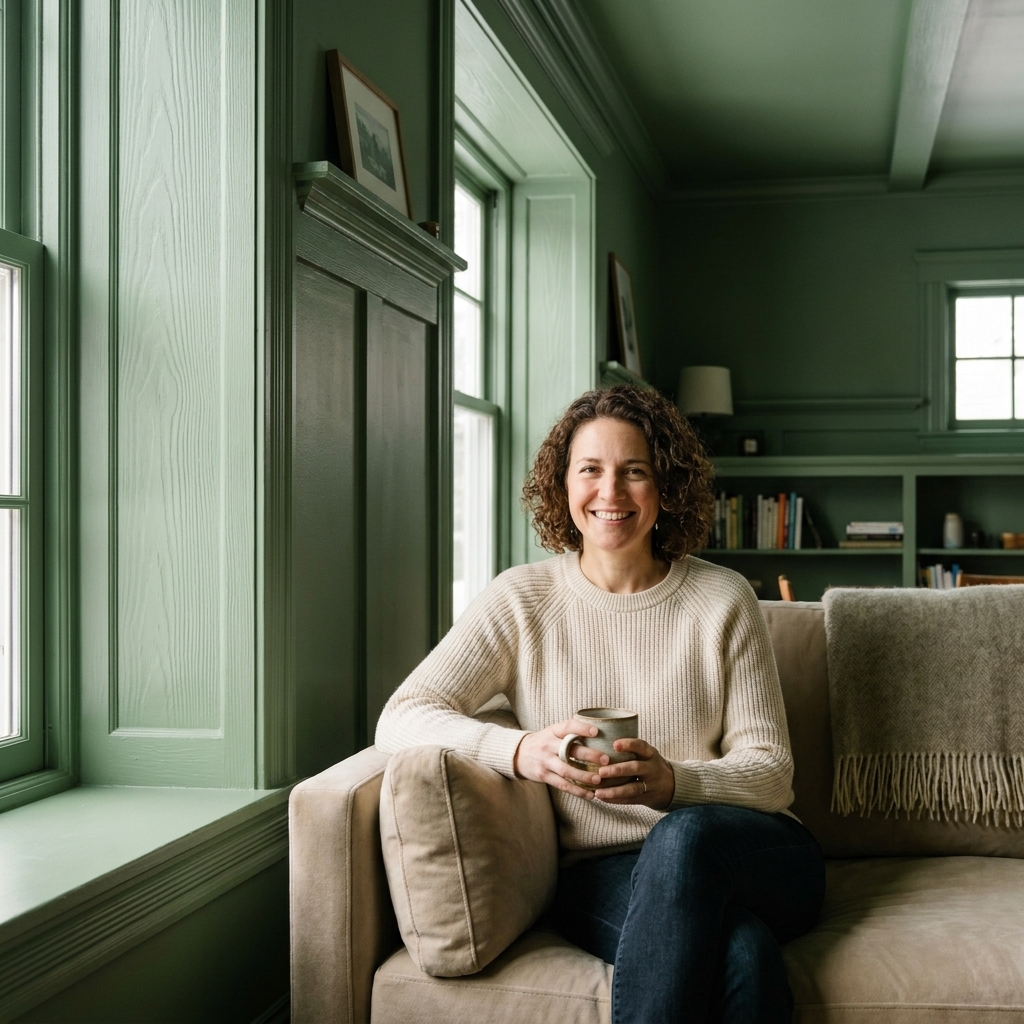
Color Drenching vs. High Contrast: Walls and Trim
There are two very different ways to “frame” a room with paint. You can color drench , meaning walls, trim, and often the ceiling all go the same color. Or you can go high contrast , the classic approach where trim and doors are noticeably lighter, darker, or simply crisper than the walls. I have...
Read more →
Matching Wall Paint with Natural Wood Trim and Doors
If you have natural wood trim and doors, you already have a strong “built-in” color story. The trick is letting the wood be a feature instead of fighting it with a wall color that pulls out the wrong undertone. I have painted around honey oak from the 90s, red cherry casings, and deep walnut doors...
Read more →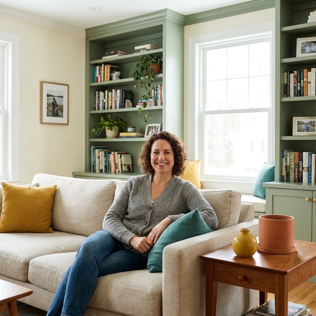
The 60-30-10 Color Rule for Room Paint
If you have ever stood in the paint aisle holding six “perfect” swatches and suddenly none of them look like they belong together, the 60-30-10 rule is your new best friend. It is not a rigid design law. It is a simple ratio that keeps your room from feeling either too matchy or too chaotic. Here...
Read more →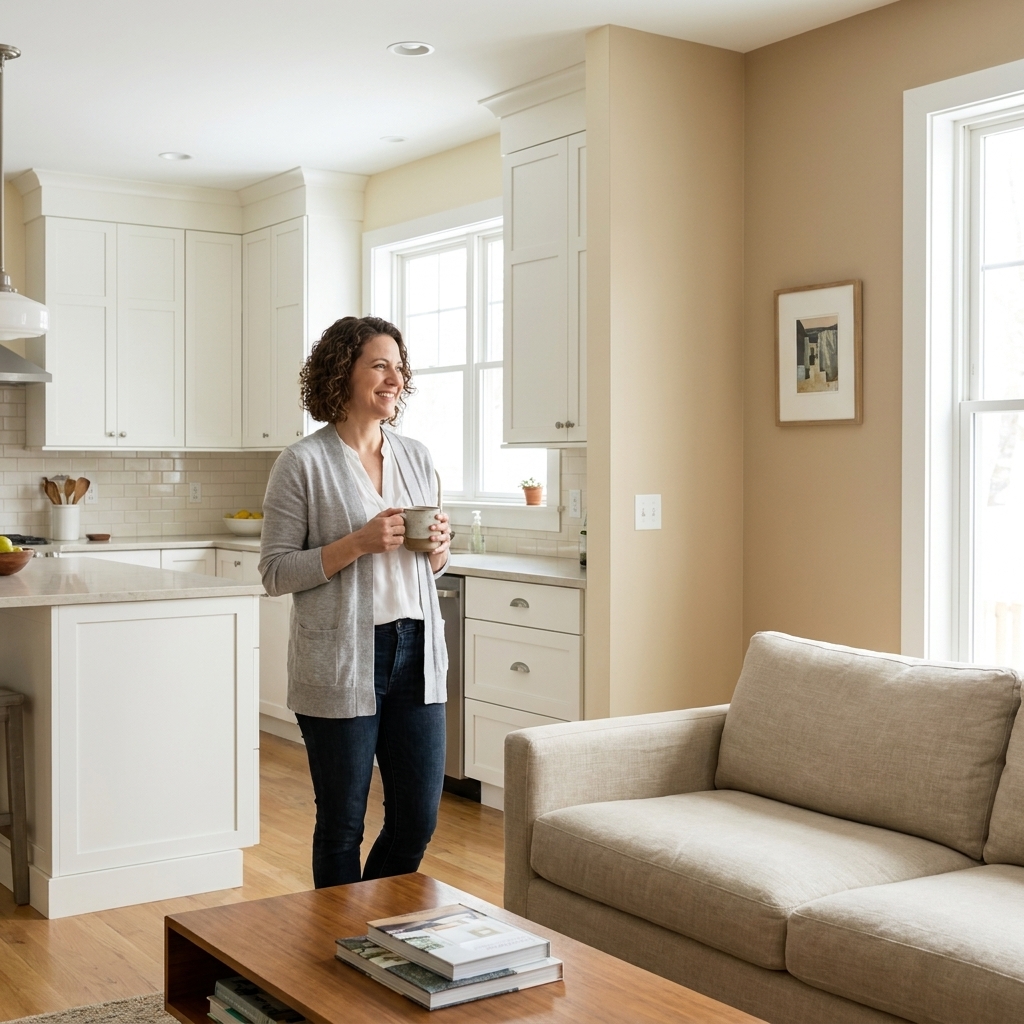
Cohesive Paint Colors for Open Concept Kitchens and Living Rooms
Open concept spaces are wonderful until you're standing in the paint aisle holding six “warm whites” that somehow all look different in your house. The trick isn't forcing one color everywhere. It's building a small, intentional palette that repeats, transitions, and makes the kitchen and living...
Read more →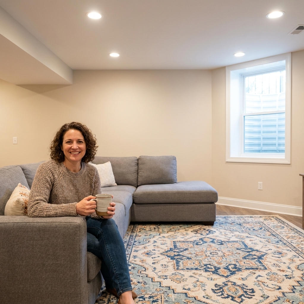
Basement Paint Color Ideas for Low Light
Basements are tricky because paint does not just “become lighter” when you choose a pale color. Downstairs light is usually limited, cool-leaning, and uneven (think: bright pools under cans and darker corners everywhere else), so the wrong undertone can turn a soft neutral into something that looks...
Read more →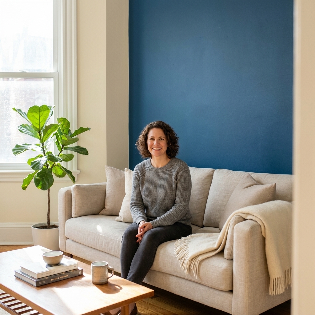
Choosing the Perfect Living Room Accent Wall Color
An accent wall is basically the living room’s spotlight. Done well, it adds depth, cozy contrast, and a little personality without demanding you replace your sofa. Done poorly, it can feel like your room is wearing a loud shirt it cannot pull off. The secret is not finding the boldest color. It is...
Read more →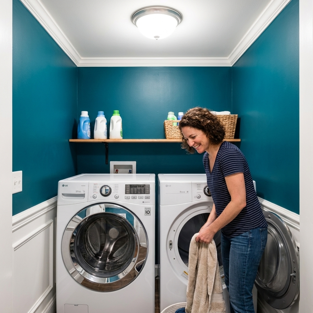
Bold Laundry Room Paint Colors
If you have ever stood in your laundry room staring at the water heater, the lint trap, and a suspicious sock pile and thought, this space deserves nothing , I get it. But that is exactly why the laundry room is one of the best places for bold paint colors. It is a utility space, yes, but it is...
Read more →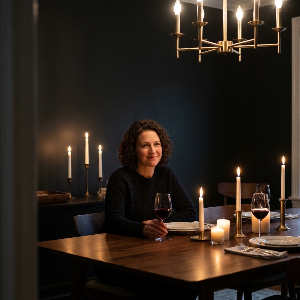
Moody vs. Light Dining Rooms: Choosing the Right Paint Palette
If your dining room is the place where birthdays stretch into midnight or where you sip coffee while answering emails, wall color matters more than you think. Dining rooms are mood rooms. They can be candlelit and cozy, or breezy and bright, and paint is one of the fastest ways to steer that vibe....
Read more →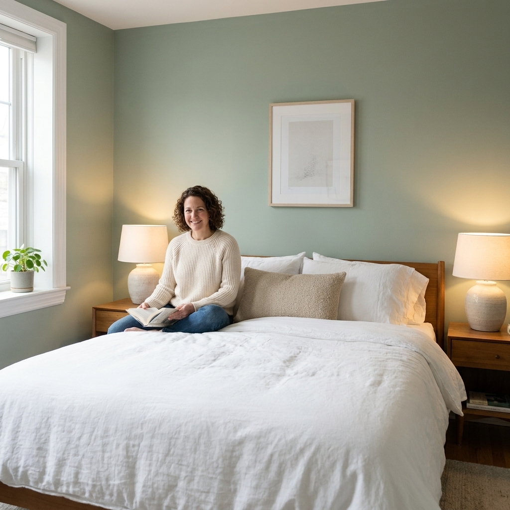
10 Calming Paint Colors for Primary Bedrooms
Your bedroom walls are one of the biggest drivers of the room’s mood. When the color is too sharp, too bright, or just a little bit off under your nightstand lamps, your whole space can feel busy even when it is tidy. If you want a more restful feel at bedtime, aim for a color that stays soft in...
Read more →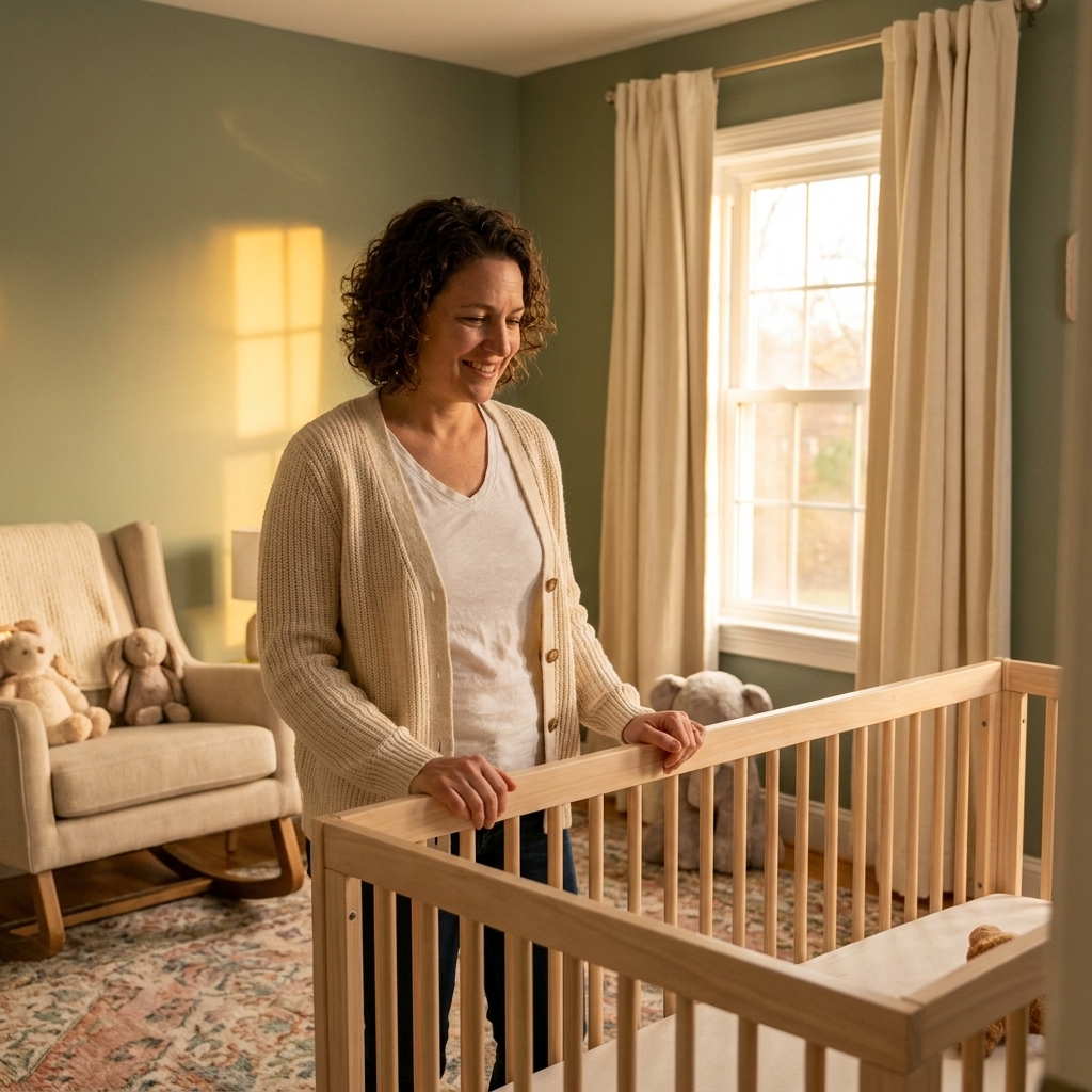
12 Gender-Neutral Nursery Paint Colors That Grow With Your Child
Picking a nursery color sounds simple until you are standing in that paint aisle, holding six “almost the same” swatches, wondering which one will feel calm at 2 a.m. and still look cool when your kid is thirteen. My favorite gender-neutral nursery colors do two things well: they play nicely with...
Read more →